Is Bootstrap the Right Choice for WordPress Theme Development?

wordpress-theme-bootstrap-1

Is WordPress theme development with Bootstrap still a valid option? Let’s find out.

When it comes to building a website, there are a few methods you can choose from. The first is the from-scratch approach, which involves hiring skilled developers to create a custom solution tailored to your needs. While effective, this method can be costly.

Alternatively, you can use a site builder that offers pre-designed templates and basic features. This allows you to get your site up and running quickly, but it may lack a professional look and feel.

But what if there was a way to combine the best of both worlds? Enter WordPress theme development with Bootstrap. Many companies are now choosing WordPress as their platform of choice and customizing their themes using Bootstrap.

In this post, we’ll explore whether WordPress theme development using Bootstrap 5 truly provides businesses with the value they desire.

Introducing Bootstrap: The Ultimate CSS Framework

wordpress-theme-bootstrap-2

What is Bootstrap?

For those unfamiliar with Bootstrap, it is a CSS framework designed to create responsive user interfaces. Initially developed by Twitter to streamline their back-end engineers’ workflow, Bootstrap’s source code was publicly released in 2011.

Today, Bootstrap reigns as the most popular CSS framework across the internet, with 165k stars on GitHub at the time of writing.

The magic of Bootstrap lies in its responsive capabilities. By providing a collection of HTML, CSS, and JavaScript files, it simplifies site development through pre-defined CSS classes (built on Object-Oriented CSS).

Take, for instance, aligning an image using a native Bootstrap class:

<img class="img-fluid" src="example.jpg" alt="Example Image">

Bootstrap achieves flawless responsiveness by incorporating media queries that adapt to specific screen sizes. It effortlessly transforms WordPress themes into mobile-friendly layouts:

@media (max-width: 768px) {

 /* Styles for small screens */

}
 
@media (min-width: 769px) and (max-width: 1024px) {

 /* Styles for medium screens */

}
@media (min-width: 1025px) {

 /* Styles for large screens */

}

Furthermore, Bootstrap integrates a 12-column grid system built on top of flexbox (starting from Bootstrap 4), complete with predefined classes. Below is a code snippet that creates three equal columns across various screen sizes:

<div class="row">

 <div class="col-sm-4">

   <!-- Column 1 -->

 </div>

 <div class="col-sm-4">

   <!-- Column 2 -->

 </div>

 <div class="col-sm-4">

   <!-- Column 3 -->

 </div>

</div>

With Bootstrap, developers can effortlessly craft visually appealing and highly responsive websites.

The Key Advantages of Bootstrap for WordPress Theme Development

Bootstrap offers a range of benefits beyond its ability to create beautifully responsive websites. Here’s a quick overview of these advantages:

Bug-Free and Browser Compatible

wordpress-theme-bootstrap-compatibility

Ensuring a website performs flawlessly across different browsers is crucial for any web developer. With traditional approaches, browser incompatibility can be a persistent issue. However, Bootstrap is a game-changer. Thanks to its extensive community of contributors, any reported issues are quickly addressed. This means websites built with Bootstrap render impeccably, regardless of the browser being used.

Efficient Web Development Process

Time is money, and Bootstrap understands that. By taking care of routine tasks like font handling, media queries, and layout, Bootstrap frees up valuable time for developers. This enables them to focus on building custom features without distractions.

Additionally, Bootstrap provides comprehensive documentation, ensuring developers have immediate access to answers and solutions on various forums.

Flexible Customization

One standout feature of Bootstrap is its flexibility. It’s like going shopping – you can choose the elements you need from the Bootstrap library and create a custom collection.

Furthermore, you can customize the standard Bootstrap library by modifying mixins and reassigning variables directly in the framework’s source code. This allows you to tailor Bootstrap to meet your project’s specific requirements. If you encounter any technical challenges along the way, the skilled front-end developers at the Site Slinger are always available to assist.

Seamless Integration, Minimal Plugins

wordpress-theme-bootstrap-plugins

Often, websites require numerous interactive features, leading developers to rely on various jQuery plugins. However, excessive plugin usage can lead to compatibility issues and version mismatches. The latest version of Bootstrap (starting from version 5) has transitioned completely to vanilla JavaScript, making integration with your site effortless and hassle-free.

Now that you understand the power of Bootstrap in speeding up and enhancing the web development process, the question remains: “Is Bootstrap suitable for WordPress Theme Development?”

WordPress Theme Development with Bootstrap: Is It Worth It?

wordpress-theme-bootstrap-benefits

WordPress is powerful and flexible. As the most popular content management system on the market, choosing WordPress for your site is a smart decision.

WordPress offers a wide range of free and paid ready-made themes that even beginners can easily install. If you have some knowledge of HTML and CSS, you can customize a theme to make it unique and stand out from the rest.

However, these cosmetic changes may not bring you the desired benefits. That’s why many site owners prefer to build a custom WordPress theme. A custom theme provides a truly unique interface with all the necessary features for your specific business.

Creating a one-of-a-kind theme can be a time-consuming process that requires knowledge and skill. Developers not only need to build the theme, but also test it for compatibility with different browsers and devices. This is where WordPress theme development with Bootstrap comes in handy.

While Bootstrap was not originally designed for creating WordPress themes, you can integrate it into your custom theme in several ways. For example, you can include links in your project files to retrieve Bootstrap’s compiled CSS and JavaScript from a CDN (Content Delivery Network).

Developing a WordPress theme with Bootstrap involves creating a specific project structure and following essential steps. However, we won’t delve into those details here.

What’s important is that once you have integrated Bootstrap and WordPress, you can leverage all the great features of the framework, including its built-in classes and the responsive grid system using flexbox. The result will be a theme that works perfectly across different browsers and devices.

In addition, there are many WordPress Bootstrap plugins available that can enhance the functionality of your site. For example, you can use a plugin to add a Bootstrap carousel or transform your navigation menu into a Twitter-style one. The possibilities are endless.

Does WordPress Theme Development With Bootstrap Come With Any Challenges?

wordpress-theme-bootstrap-limitations

While there are numerous benefits to using the Bootstrap framework for WordPress site owners, it does come with its own set of limitations. Here are some well-known challenges that you may encounter when using the CDN version of Bootstrap. However, by opting to work with source files, you can avoid these issues altogether.

Excessive Code Bloat

Bootstrap provides a wide range of classes for creating various web page components. However, this can become overwhelming as not every project requires all of the framework’s classes. Why burden your website with unnecessary code when you only need a select few?

Rigid Breakpoints

The framework employs predefined breakpoints in its media queries. Customizing these breakpoints to meet unique design requirements can be a labor-intensive task for developers. If you’re seeking a truly distinct design, be prepared for some unexpected hurdles.

Uniformity Among Themes

While easy WordPress theme development with Bootstrap is a boon, it also has its drawbacks. Due to its simplicity in installation and operation, Bootstrap has gained immense popularity, leading to a plethora of themes that appear strikingly similar. Many users opt for basic, functional themes without delving deeper to make them truly distinctive.

It’s important to note that these limitations should not discourage you from using Bootstrap. Seasoned developers, such as the front-end professionals at the Site Slinger, possess the necessary expertise to overcome these challenges effortlessly.

Wrapping Up

In conclusion, the Bootstrap CSS framework offers a wealth of benefits for WordPress theme development. Among its key advantages are browser compatibility, efficient web development processes, flexible customization options, and seamless integration with minimal plugins.

However, it’s equally important to recognize potential challenges such as code bloat, rigid breakpoints, and theme uniformity. Despite these challenges, the framework’s advantages far outweigh its limitations.

Bootstrap’s potential in enhancing and hastening the web development process, and its compatibility with WordPress makes it an invaluable resource for creating unique, responsive themes.

Why Responsive Web Design? Here’s 3 Reasons

In today’s digital age, If you want to make sure your business succeeds, you have to make sure that you have an effective online presence. There are lots of ways to engage customers online – including social media and e-mail marketing campaigns – but one of the most important and effective ways to maximize your online business is through a well-designed website – and, more specifically – a responsive one.

In today’s digital age, If you want to make sure your business succeeds, you have to make sure that you have an effective online presence.

There are lots of ways to engage customers online – including social media and e-mail marketing campaigns – but one of the most important and effective ways to maximize your online business is through a well-designed website – and, more specifically – one using responsive Web design.

Responsive Web Design

A website designed responsively is able to detect what screen size is being used to view your site  and adjust itself accordingly so the user has an optimal experience. User experience is the main, and perhaps most obvious, reason behind responsive design.

A responsive site functions at its best possible level, no matter what device the user is viewing it on, and it guarantees the smoothest, most cohesive experience for a user. This encourages people to have a pleasant experience while checking out your service or product – leading to a greater chance at conversion.

UX and “wow” factor aside, there are some great behind-the-scenes reasons to implement responsive design on your website. Need more proof? Keep reading.

Reasons You Should Use Responsive Web Design

1. SEO

One of the best ways to attract new customers online is by appearing in search engine results – and to make sure you do that, you need to make sure you have a high SEO ranking. SEO rankings control how high you show up in search engine results, and they are essentially a measure of a website’s popularity and quality.

One factor that influences your SEO is by the number of clicks it gets, and if you have to design multiple versions of your website – for mobile and non-mobile devices – then your clicks will be split across multiple links. Also, responsive design helps boost SEO because your content isn’t duplicated across multiple sites on the web – which is another factor that can decrease your SEO ranking. If you have a high SEO ranking, you will show up high in search engine results, increasing the chances that you attract new customers online.

2. Time & Money

If you don’t design responsively, you’ll have to design multiple versions of your website, so that it works for customers trying to use your site across a huge range of devices: desktop, tablet and mobile. Developing multiple sites requires multiple updates every time you update your site, which means your developer will have to take more time and energy updating your site.

With a responsive site, you only have to make one update, and all versions of your site will appear with that update. Paying a developer to update multiple versions of a site inherently takes more time and in turn will cost you more money in the long run. A responsive design is more cost-effective and, calculating cost over time, a responsive site is much more financially and resource-efficient.

3. Tracking

If you have multiple versions of your website for mobile and non-mobile devices, it is hard to track the number and type of visitors you are getting accurately. Keeping track of site statistics is important for an online company in order to  tailor your business to the people who are actually interested in it – because they are often not the people you were originally targeting or expected to attract. Am I right?

Site statistics can both allow you to see where people are using your site and at what time, which will allow you hone it to suit who is actually using it – and convert potential customers to paying customers. Having a responsive site makes tracking easy, since your traffic will be coming through one site version and not split across multiple – so you won’t have to do the work required to piece together statistics from different sites.

A Necessity, Not a Trend

Responsive design is the forerunner in web design strategies today – and if you want your business to succeed online, it’s important to realize that responsive Web design is more than just a bandwagon. You’ll save yourself time, money, and headaches by choosing to have your site designed and coded responsively. There are multiple approaches – you can do this with or without a framework.  Just ask us for more info!

Bootstrap 3 Released!

The long awaited update to the premier responsive framework has arrived! On August 19th, the folks behind Twitter Bootstrap took the latest version out of beta and announced the release of Bootstrap 3, coinciding with the two-year anniversary of the original release. Here’s a few things about the release worth calling out.

Twitter-Bootstrap-Logo

The long awaited update to the premier responsive framework has arrived! On August 19th, the folks behind Twitter Bootstrap took the latest version out of beta and announced the release of Bootstrap 3, coinciding with the two-year anniversary of the original release.

Here at The Site Slinger, we’ve received many inquiries about Bootstrap 3 and have been waiting to get our hands on the latest, stable version. We’re excited to code up more responsive websites using the new Bootstrap, with all of its great improvements! Submit your PSD to Bootstrap 3 project today!

Here’s a few updates in the release worth calling out

  • Mobile first and always responsive! Nearly everything has been redesigned and rebuilt to start from your handheld devices and scale up. With Bootstrap 3 we’ve gone deep on responsive and mobile first—it’s built in and no longer requires a separate stylesheet. That’s great for most folks, but not everyone needs or wants an adaptive web site or application. To help, we’ve added some documentation and an example that disables the adaptive or responsive features with some extra CSS. Check out the Disabling responsiveness section or head right to the non-responsive example to learn more.
  • Better box model by default. Everything in Bootstrap gets box-sizing: border-box, making for easier sizing options and an enhanced grid system.
  • Super-powered grid system. With four tiers of grid classes—phones, tablets, desktops, and large desktops—you can do some super crazy awesome layouts.
  • New Glyphicons icon font! While they were gone for a while, we’ve since restored the Glyphicons to the main repo. In 2.x, they were images, but now they’re in font format and include 40 new glyphs.
  • Overhauled navbar. It’s now always responsive and comes with some super handy and re-arrangable subcomponents.
  • Modals are way more responsive. We’ve overhauled the modal code to make it way more responsive on mobile devices
  • Dropped Internet Explorer 7 and Firefox 3.6 support. For Internet Explorer 8, you’ll need to include Respond.js for all the media queries to work correctly. You can read more about browser support in the docs.
Source: Official Bootstrap Blog 

You can read the official Bootstrap blog post about the release, complete with a celebratory Montell Jordan – “This is How We Do It” music video — AWESOME!

In case you’re wondering what the heck Bootstrap even is…

Twitter Bootstrap was created by a couple of guys at Twitter to maintain consistency across many internal tools. In public form, it’s a free, yet powerful framework for front-end development of websites and web applications. It uses HTML and CSS-based layout templates for typography, and interface components like forms, buttons and navigation elements. The key is that it’s a highly flexible framework built for the new era of responsive web design. Learn more about our PSD to Bootstrap conversion process here.

bs-docs-bootstrap-features

Have questions or a design ready for us to review? Submit your Bootstrap 3 projects today!

Useful Terms for PSD to HTML Services

We know how important effective communication is for our clients on any web development project. So, we’re offering up this handy ‘glossary of terms’ that you will find helpful for your next PSD to HTML project, or if you’re just beginning to learn about the design-to-code process.

We know how important effective communication is for our clients on any web development project. So, we’re offering up this handy ‘glossary of terms’ that you will find helpful for your next PSD to HTML project, or if you’re just beginning to learn about the design-to-code process. This list of web development definitions is especially helpful for creatives and designers who are migrating from print to the web space.

PSD to HTML Definitions

  • PSD to HTML – PSD to HTML is the process of taking Photoshop design files (“PSDs”) and coding them into HTML. Each PSD design file is hand-coded by a front-end developer. No code generators or automation here, pure hand-coded HTML and CSS goodness!
  • PSD – A Photoshop design file. Technically, it stands for Photoshop Document. Photoshop is the tool most widely used for web design and development and works best the design-to-code process. A “good” PSD is layered, well organized using folders, as well as layer comps to show different pages and states.
  • HTML – HyperText Markup Language. This is a simple way to refer to HTML5, CSS, and  JavaScript, the basic languges of the Web. This is the code that makes your design function as  website. Read more about HTML5 on our blog post.
  • Design to code – This is the general term for converting the visuals (design files) into code (HTML). Technically, not all design to code involves PSD files, and other filetypes like PNG and Adobe Illustrator’s AI filetype are acceptable in some cases.
  • Email template – This is the theme for a reusable email employed by businesses with an email marketing campaign. We take designs for email templates and code them, just as with a website.
  • Bootstrap  – Bootstrap refers to the Twitter Bootstrap framework, a responsive front-end development framework that is sleek and powerful. Especially useful for application development teams, it allows you to design and code in a consistent and reliable manner based on a grid which adapts to a user’s screen size, such as smartphones. It’s one of our favorites. Read more about it on the official page.
  • Responsive – The feature of being adaptable to various screen sizes, usually at least 3 breakpoints: desktop, tablet, and mobile device. Recommended widths for responsive websites are 1024px, 768px, and 320px, respectively. We break it down in further detail in this post. While Bootstrap is a favorite, we also work with Foundation, 960gs, and others.
  • WordPress – The most popular, and arguably most powerful, content management system (CMS). With SEO friendly URL management and easy page templating, WordPress is a great choice as a platform for your website.
  • jQuery – The most widely used front-end JavaScript library used to implement animation and functions such as dropdowns, tooltips, sliders, lightboxes and more.
  • Pixel perfect – The highest standard for execution of the PSD to HTML process.We aim to have our deliverables match, down to the pixel, your designs as you presented them.
  • Pop-up modals – A ‘page’ that pops up or otherwise animates into the screen upon completion of a certain action, like a button click.
  • Long page – In line with modern web design trends, we often see long pages with aim to put as much information into a page as possible, usually in the form of horizontal sections. These can be considered as two pages for coding purposes.
  • Slice – Basically, this means cutting up your Photoshop design into pieces, which are then put in order by HTML and styled/positioned by CSS. Read more about slicing on our blog post.
  • NDA – Non-disclosure agreement. We abide by NDA as a standard practice and guarantee that information about you or your project will not be made public. As this is our default policy, there’s no need to sign an explicit NDA, though we are happy to do so if you feel this is absolutely necessary. Your privacy is key, so we offer our products as white-label.
  • White-label – We produce the code for your organization, but do not brand or otherwise sign our markup in any way.
  • Markup – This is the code that we present back to you once we’ve converted your PSD files. ‘Markup’ refers to the finished product in the PSD to HTML process.
  • W3C – Shorthand for The World Wide Web Consortium. This is the international community that develops open standards to ensure the quality and growth of the Web. Our code complies with the standards established by this organization, which can reviewed here. They also offer a markup validation service.

If there’s anything else you need clarified, please let us know. We’re happy to add to this list to make the PSD to HTML process easier!

30 Brand New PixelsDaily PSD & CSS Design Freebies

Loads of new freebies and open source codes are placed online every day. Web & mobile designers can learn a lot by studying newer interface trends and design layouts.


featured-pixelsdaily-screenshot-image-freebies

Loads of new freebies and open source codes are placed online every day. Web & mobile designers can learn a lot by studying newer interface trends and design layouts. PixelsDaily is one such website which publishes freebies and premium content. This is an excellent resource for designers who want to dig a bit deeper into constructing usable layouts for the web.

In this roundup I have put together 30 of the latest freebies from PixelsDaily. You will find both PSDs and HTML/CSS codes mixed in with each other. Some freebies actually offer both graphics and the code together! But no matter what items you’re looking for, this showcase is bound to have something cool.


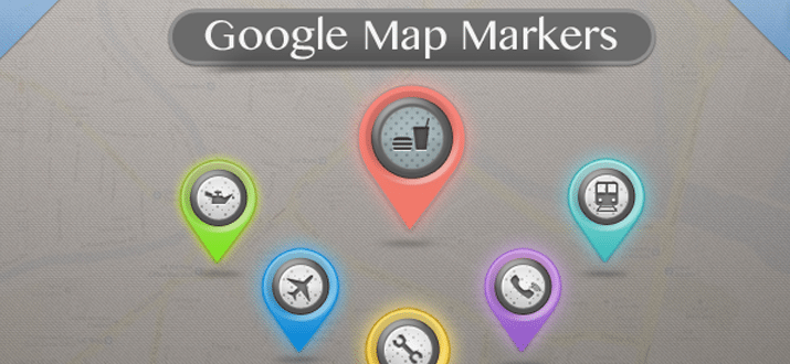
Google Maps Markers (PSD)

These varied Google Map Makers are a fantastic set of resources to have in your design collection. They represent different things — a restaurant, telephone, gas, airport, rail station, and mechanic. It’s simple to implement these into an embedded Google Map!

photoshop freebie psd download googlemaps

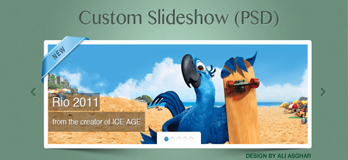
Custom Slideshow (PSD + CSS)

This custom slideshow is provided both as a PSD, or fully coded in CSS and HTML. It’s wrapped up in a delightfully simple design, with subtle shadows, borders, and textures. It’s simple to make a few tweaks to add your own images, captions, and information. Enjoy!

freebie jquery slideshow html css webdesign download

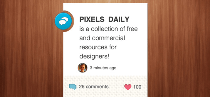
Info Widget (PSD)

This is a tidy little information widget for a blog post, containing the title, author information, comments, and likes. Presented as a well organised PSD file to integrate into your own designs!

psd freebie information widget website

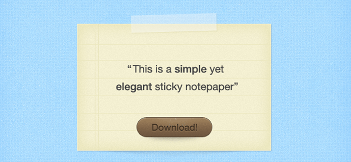
Sticky Note Paper (PSD)

A “Sticky Notepaper” — a piece of paper with lined paper, a download button, and some sticky tape that wraps it all together! Really simple, but a useful starting point for your own note-style interface.

sticky notepad paper designs psd freebie

Windows 8 Metro Buttons (CSS)

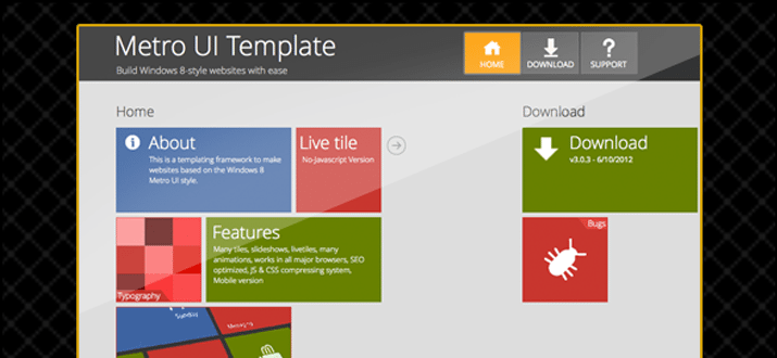
A selection of Metro style, Windows 8 buttons and icons. All coded using HTML and CSS, so they’re incredibly easy to drop into your own design, customise colours, and so on. Add a little simplistic metro style to your next interface!

css3 html windows win8 buttons

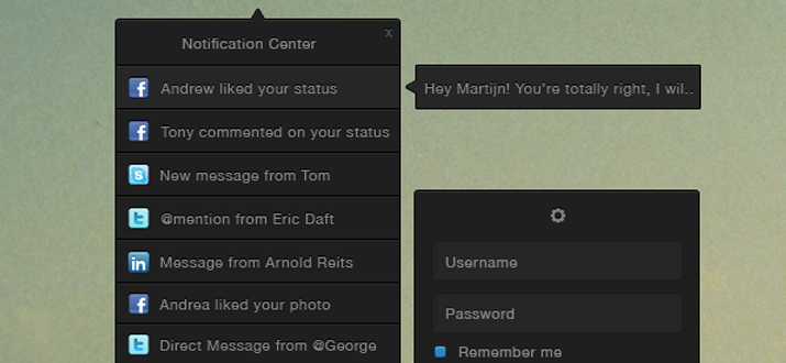
Notification Centre UI (PSD + CSS)

A versatile PSD of a notification style interface. It includes a drop-down list of recent notifications/messages, a login/connect window, and pop-out messages with more information as well. Packed with potential functionality for your next app, and we’ve also added a fully coded CSS/HTML version. Enjoy!

notification center user interface webdesign psd freebie

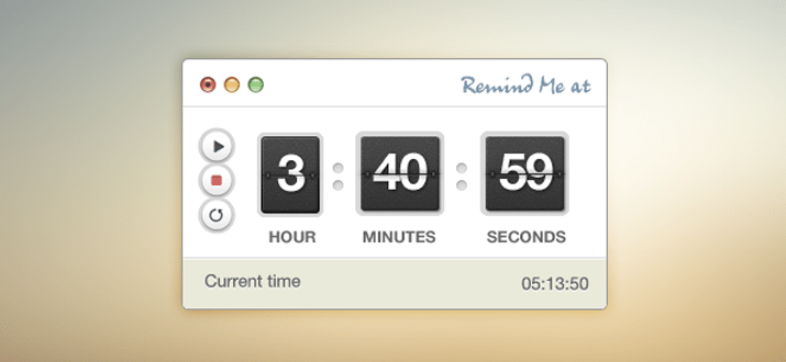
Timer Interface (PSD)

A stylish countdown/stopwatch/timer interface, with play/stop/restart buttons, countdown digits, the current time, and some simple OS X chrome.

stopwatch timer psd freebie ui interface

Yellow Subscribe Box (PSD)

A stylish subscription box, giving your readers the information they need to subscribe to your site. It contains two options — one for an email newsletter subscription, and another for RSS. The base colour is yellow, but it’s easy to tweak to fit in with your own design.

yellow email subscription box freebie download

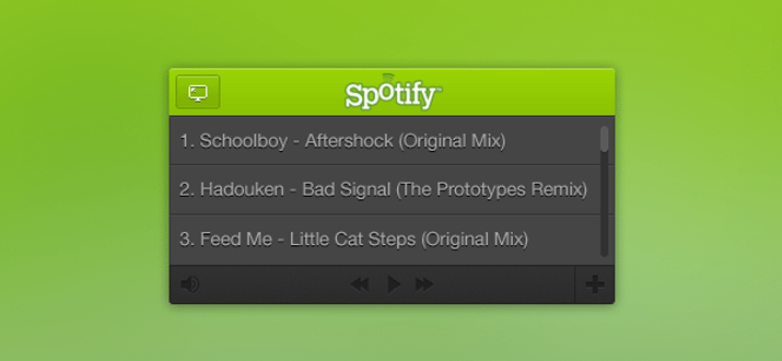
Spotify Mini Player (PSD)

A stylish mini-player interface for Spotify. It contains a track listing, simple play/volume controls, and a full-screen graphic. The perfect way to get started with a media player, whether for Spotify, or any other third party service!

green user interface mini music player freebie

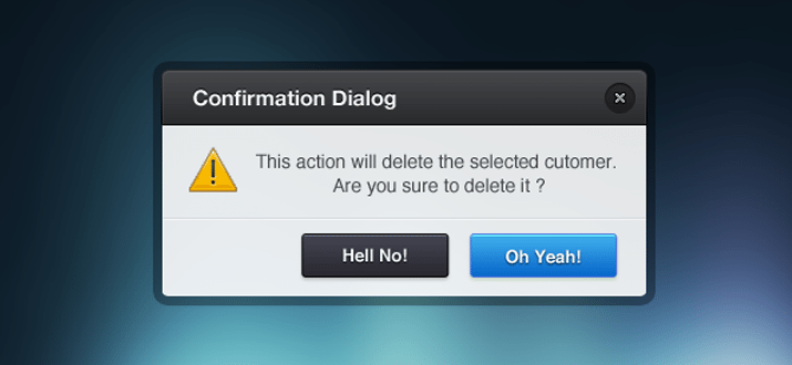
Confirmation Dialog (PSD)

A beautiful confirmation dialog box with a subtle set of gradients and textures, a header, close button, two different button styles, and some explanatory text. A really gorgeous interface on which to build upon!

freebie windows modal box popup psd freebie website

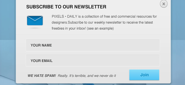
Newsletter Signup Form (PSD)

A detailed newsletter sign-up form PSD, including a description of the mailing list, fields for name and email address, an anti-spam message, and a prominent “Join” button. Enjoy!

signup popover window modal design freebie download

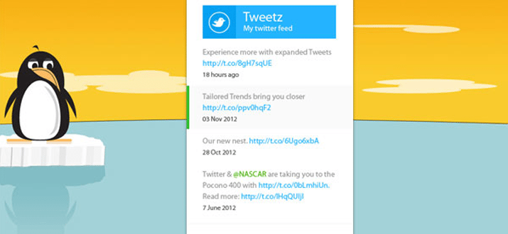
Metro Twitter Feed

Microsoft have been doing a wonderful job with their simplistic “Metro” style, and today we’re presenting a lovely Metro-style twitter feed. Containing various states for different tweets, links, and timing. A really wonderful little widget!

windows metro twitter ui interface design

Pro Admin Interface (PSD + CSS)

There’s something about this one that we really love! It’s the top part of a simple administration interface design, with various navigation options / notifications, and a content box. As well as providing you with the original PSD, we’ve also gone to the trouble of coding it all up in CSS and HTML for you. Enjoy!

freebie html css admin toolbar ui layout template

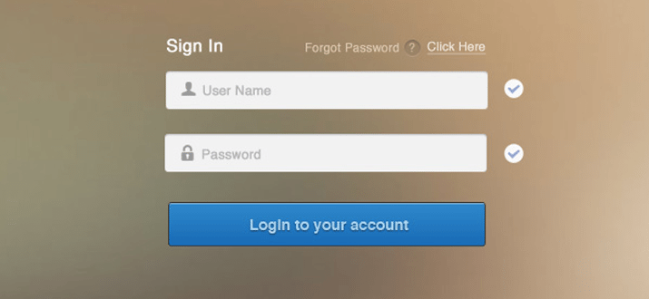
Blur Login Form (PSD)

Login forms can be tricky. They need to be simple, convey the basic information, and exude a little style. This one presses all the right buttons, with some beautiful interface styling and typography. Enjoy!

blog login psd freebie form download

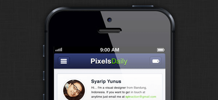
PixelsDaily iPhone App Interface (PSD + CSS)

We thought it’d be fun to create a funky app interface for PixelsDaily, then give it away free for you to use! Provided both as a fully coded HTML/CSS version, and a PSD. It has some uniquely created iOS interface elements, an author area, and a set of resource thumbnails.

custom iphone ios ui interface design freebie download

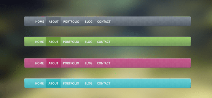
Trendy Nav Bar

A stylish navigation bar, provided as a PSD. It comes in four different colours, and might just be the perfect addition to the top of your next web design project!

trendy navigation bar interface psd freebie

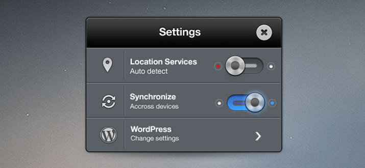
Settings Panel (PSD + CSS)

We’re really pleased with this one. It’s a settings panel with brushed metal interface elements / toggle switches. Not only is this provided in the usual PSD format, but we’ve gone ahead and coded it up as a fully functional HTML/CSS version for you!

freebie download psd website ui interface html

Tiny Note (PSD)

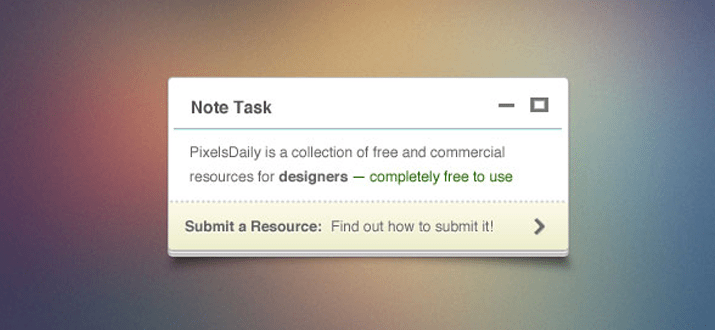
Just a quick note about this one. It’s a note. A beautiful, pixel-perfect note. On a subtle background, it’s a paper “stack” with close/minimize icons, a link to read more, and some lovely typography. Hope you find it useful!

tiny note freebie psd download pixelsdaily

vCard Minisite (PSD + CSS)

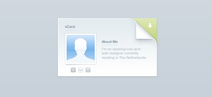
This is a beautiful minisite vCard in PSD format. It contains elements for your social media profiles, an avatar, a small bio, and a “folded corner” for someone to download a copy of your vCard. If you want to put up a vCard website, this is the perfect way to do so! We have also included a fully coded CSS and HTML version, complete with an animated corner roll-over. Enjoy!

vcard freebie website ui layout download css html psd

Design Agency Layout (PSD)

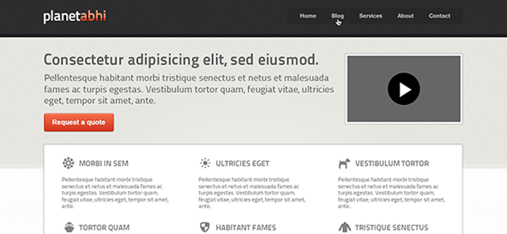
A fully-loaded PSD file, this graphic contains a sleek and professional layout for a design agency or portfolio. It has plenty of room for your logo, navigation, an introductory text area / video, and a set of different “services” that you might offer. It’s really simple to customise for your own needs!

freebie download psd pixels website agency layout

PHP Metro Generator Webapp (CSS/PHP)

Something a little different today, this is a PHP application that helps you generate unique metro-style interfaces with ease. Just drop it onto your server and experiment away! You’ll need to upload this to a web server to run the script and see how it works.

metro user interface layout webapp php testing

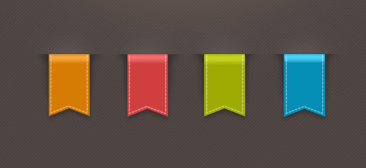
Stylish Ribbon (PSD)

Four(4) colourful ribbons with a 3D look and feel, stiched outer pattern, and a top shadow to create the effect of the ribbon dropping over its’ container. Have fun integrating it into your own design!

psd freebie download pixelsdaily website

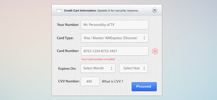
Credit Card Form (PSD + CSS)

This is an incredibly handy credit card information form, containing fields for your card number, type, expiry date, and CVV number. It’s simple enough to incorporate into any design, and is provided both as a PSD and fully coded as a CSS/HTML design. Enjoy!

credit card ui interface form website freebie download

Various Alert Boxes (PSD + CSS)

Three different alert box styles are included in this PSD — A green “success” alert, a yellow “alert” … alert, and a red “error” alert! We’ve also built one of these into CSS and HTML for you, just to save you a little time!

alert boxes website interface css freebie download

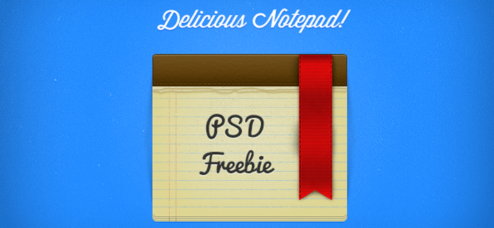
Delicious Notepad & Ribbon (PSD)

A simple notepad freebie with a classic striped/leather look-and-feel, and a red ribbon flourish of detail. Provided as a well-organized PSD file for you to incorporate into your own designs!

notepad psd freebie download website graphics

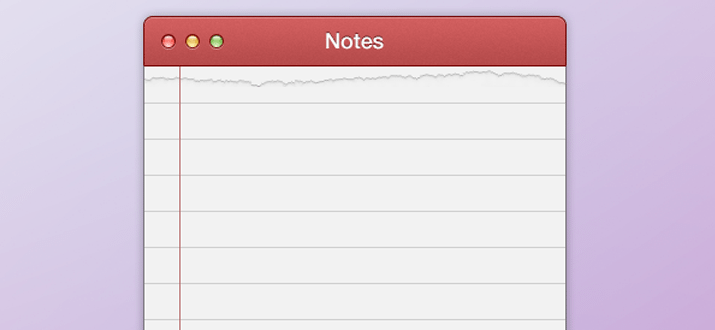
Notepad Interface (PSD)

We’ve created a pixel-perfect notepad interface, straight out of a cutting-edge Mac app! A wonderful basis on which to build your own application interface.

freebie website notepad interface psd download

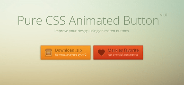
Animated Buttons (CSS)

This one is just beautiful. Two examples of a gorgeous animated button — both have subtle animations in the background, and plenty of excitement when you hover over them! The “Favorite” icon takes on the form of a beating heart, with the the download flying out, then back again. You’ll have to download the freebie to see them for yourself – don’t just take our word for it!

pure css animated buttons website freebie download

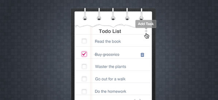
Ripped Tasks List (PSD)

A “ripped” skeumorphic to-do list with a paper effect, check-boxes for completed tasks, delete icons, and a button to add a new task. Take it, build upon it, and enjoy! Provided as a simple layered PSD file.

todo list website interface papers freebie psd download

Clock iOS App Icon (PSD)

A delightful wrist watch/clock icon, designed for an iOS app. It is provided in a range of different sizes suitable for each different iOS device, and we’d love for you to use the end result however you’d like!

freebie psd wristwatch app icon mobile retina display

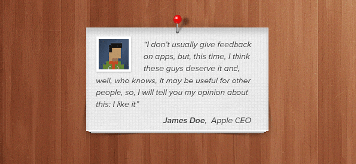
Paper Stack (PSD)

A beautiful paper stack, complete with a quotation, avatar, stylish pin, and a subtle textured background. It’s a delightful piece of interface design work, and we hope you enjoy it!

pinned paper stack pin icons design

Conclusion

Many of these elements are great for building complex layouts and applications. Mobile designers will especially enjoy some of the aesthetic pieces such as buttons and notepads. But in my opinion this set of freebies offers a powerful start to the new year. Be sure and keep updated for new releases over the course of 2013.

Photoshop to CSS Conversion: 3 Methods Compared

Converting Photoshop mockups to live web code is an extremely common practice among web designers. We’ve all done it a million times by hand, so it’s pretty exciting when we start seeing solutions pop up that will help us automate this process.


screenshot

Converting Photoshop mockups to live web code is an extremely common practice among web designers. We’ve all done it a million times by hand, so it’s pretty exciting when we start seeing solutions pop up that will help us automate this process.

The latest version of Creative Cloud Photoshop CS6 has a built-in feature for converting Photoshop styles to CSS, and if you need another solution, there are two solid extensions that you can check out. Today we’ll compare the results of all three methods: Photoshop, CSS3Ps and CSSHat to see which is best.


Our Three Candidates

This article is all about comparing the results from three different methods of achieving the same goal. We have a design in Photoshop and we want to see it built in HTML and CSS.

Our three methods include Photoshop itself (version 13.1) as well as two extensions CSS3Ps and CSSHat. I recently created a screencast for Psdtuts+ that introduces and does some comparison between Photoshop and CSS3Ps, which you can find here.

I didn’t cover layer group functionality in that tutorial though so I thought it was worth another go and decided to toss in CSSHat as well so we really cover the bases well.

Our Test Case

We’ll need something to test the different conversion methods on, so I whipped up a generic UI panel that could hold anything you want:

screenshot

This is basically comprised of three different layers: the text layer, the top bar and the background. Here I separated them out a bit so you could get an idea of how they were constructed.

screenshot

Below you can take a look at our layers palette. Note that this object is structured very intentionally. All three of the methods that we’ll look at today convert layer names to class names in CSS, so you want to be sure that you’re very careful about how you name your various pieces. Also note that the shapes are made from vector shape layers.

screenshot

Some of the methods that we’ll try out support layer groups, which means we’ll want to convert the structure here to a div structure in our HTML.

HTML

Photoshop can take care of the CSS for us, but we’re still on our own with HTML. Here’s a quick attempt at an HTML structure that will work with the code that Photoshop is going to generate. Without this in your HTML, the CSS won’t do a thing!

	
		<div class="panel"> <div class="paneltop"> <p class="type">Quick Panel</p> </div> <div class="panelback"></div> </div>

Photoshop

Let’s start off with the built in Photoshop functionality. The process here is extremely easy, all we have to do is select our layer group in the Layers panel and go to Layer>Copy CSS (you can also access this command with a right-click).

screenshot

Photoshop provides pretty much zero feedback that anything has happened at this point. There are no options to tweak, no panels to inspect, just the menu command that we clicked above, which places a big chunk of code into our clipboard. Here’s the output, straight from Photoshop.


.panel {
  position: absolute;
  left: 180px;
  top: 25px;
  width: 360px;
  height: 427px;
  z-index: 7;
}
.type {
  font-size: 19.913px;
  font-family: "Helvetica";
  color: rgb( 255, 255, 255 );
  line-height: 1.11;
  text-align: center;
  -moz-transform: matrix( 1.70449868947994, 0, 0, 1.72443193254442, 0, 0);
  -webkit-transform: matrix( 1.70449868947994, 0, 0, 1.72443193254442, 0, 0);
  position: absolute;
  left: 83px;
  top: 25.902px;
  width: 180px;
  height: 27px;
  z-index: 6;
}
.paneltop {
  background-image: -moz-linear-gradient( -90deg, rgb( 1, 98, 171 ) 0%, rgb( 0, 52, 91 ) 100%);
  background-image: -webkit-linear-gradient( -90deg, rgb( 1, 98, 171 ) 0%, rgb( 0, 52, 91 ) 100%);
  position: absolute;
  left: 2px;
  top: 1px;
  width: 351px;
  height: 81px;
  z-index: 4;
}
.panelback {
  border-radius: 20px;
  background-color: rgb( 224, 225, 226 );
  box-shadow: 1.5px 2.598px 5px 0px rgb( 0, 0, 0 );
  position: absolute;
  left: 2px;
  top: 1px;
  width: 351px;
  height: 418px;
  z-index: 3;
}

The Result

If we toss this into a code editor and take a look at the result, the results are a little disheartening. Photoshop didn’t do a great job with the conversion. For starters, the top bar doesn’t have rounded corners. Also, the shadow seems to be at full opacity (too dark) and the type placement is off. If gives us a strong start and genuinely saves us a lot of time, but it’s probably not the magic solution you were hoping for from Photoshop.

See it live: Click here

screenshot

To make things worse, if we jump back and look at the code, there’s plenty to complain about. There are some really wonky things going on here such as the unnecessary transform on the text. It seems that you can let Photoshop write CSS for you, but I’m not convinced that you should.

CSS3Ps

Our next candidate is CSS3Ps, a completely free Photoshop plugin that predated the built-in Photoshop functionality. The website shows some pretty complex examples so hopefully this will tackle our project a little better.

screenshot

With the CSS3Ps extension installed, go to Window>Extensions>CSS3Ps. Then select the layer group and click the logo that pops up inside of the CSS3Ps panel.

screenshot

Once you press that button, a web page opens up and presents you with a timer. You’re forced to wait twenty seconds and look at an ad, which sucks but given that the extension is free, it’s understandable.

screenshot

From here you’re taken to a page containing the code, which I copied and pasted below. Note that this time around, I had to add in periods before the class names. CSS3Ps takes the layer name exactly as it appears in Photoshop, so you add in the “.” or “#” symbols there.
	.type {
  font-family: Helvetica;
  font-size: 10px;
  color: #fff;
}

.paneltop {
  width: 351px;
  height: 81px;
  -webkit-border-radius: 20px 20px 0 0;
  -moz-border-radius: 20px 20px 0 0;
  border-radius: 20px 20px 0 0;
  background-color: #000;
  background-image: -webkit-linear-gradient(top, #0162ab, #00345b);
  background-image: -moz-linear-gradient(top, #0162ab, #00345b);
  background-image: -o-linear-gradient(top, #0162ab, #00345b);
  background-image: -ms-linear-gradient(top, #0162ab, #00345b);
  background-image: linear-gradient(to bottom, #0162ab, #00345b);
}

.panelback {
  width: 351px;
  height: 418px;
  -webkit-border-radius: 20px;
  -moz-border-radius: 20px;
  border-radius: 20px;
  background-color: #e0e1e2;
  -webkit-box-shadow: 2px 3px 5px rgba(0,0,0,.34);
  -moz-box-shadow: 2px 3px 5px rgba(0,0,0,.34);
  box-shadow: 2px 3px 5px rgba(0,0,0,.34);
}

The Result

There’s a lot to like about the CSS3Ps output. For starters, it treats each individual layer as its own object and doesn’t attempt to position them over each other. I actually prefer this and always immediately strip out the absolute positioning code that the built-in method uses. This keeps the focus of the conversion where it should be: on style.
See it live: Click here

screenshot

Speaking of style, the results in that area are improved as well. Notice how the top bar actually has a border-radius this time around and how the box-shadow uses an alpha value to reduce the opacity. This version might be a little prefix heavy on things that no longer require prefixes, but otherwise the code isn’t half bad.

Also, the fact that you can get the output reformatted in Sass or SCSS is a killer feature that easily makes this method better than the default Photoshop feature.

screenshot

CSSHat

The third and final method that we’re going to check out is CSSHat. Like CSS3Ps, it’s a Photoshop extension, but this one will run you about $30.

screenshot

To use CSSHat, simply select the layer that you want to convert and open the CSSHat panel (find it in the extensions menu as with CSS3Ps above). Unfortunately, CSSHat currently doesn’t support layer groups, so you’ll have to do it on each individual layer. This is a serious strike against CSSHat, but it makes up for it in versatility.

screenshot

I love that I finally have some options to tweak. The other two methods were easy, but if you don’t like something, tough! Here I can toggle four different options: comment explanations, browser prefixes, layer dimensions and whether or not the code gets wrapped in a rule named after the layer.

Also notice that you can get the output in an impressive variety of formats: CSS, SCSS, Sass, LESS, Stylus and Stylus CSS. Here’s the output for the plain CSS version:

	.type {
  color: #fff; /* text color */
  font-family: "Helvetica";
  font-size: 10px;
}

.paneltop {
  width: 351px;
  height: 81px;
  -moz-border-radius: 20px 20px 0 0;
  -webkit-border-radius: 20px 20px 0 0;
  border-radius: 20px 20px 0 0; /* border radius */
  -moz-background-clip: padding;
  -webkit-background-clip: padding-box;
  background-clip: padding-box; /* prevents bg color from leaking outside the border */
  background-color: #000; /* layer fill content */
  background-image: url(data:image/svg+xml;base64,PD94bWwgdmVyc2lvbj0iMS4wIiA/Pgo8c3ZnIHhtbG5zPSJodHRwOi8vd3d3LnczLm9yZy8yMDAwL3N2ZyIgd2lkdGg9IjEwMCUiIGhlaWdodD0iMTAwJSIgdmlld0JveD0iMCAwIDM1MSA4MSIgcHJlc2VydmVBc3BlY3RSYXRpbz0ibm9uZSI+PGxpbmVhckdyYWRpZW50IGlkPSJoYXQwIiBncmFkaWVudFVuaXRzPSJvYmplY3RCb3VuZGluZ0JveCIgeDE9IjUwJSIgeTE9Ii0xLjQyMTA4NTQ3MTUyMDJlLTE0JSIgeDI9IjUwJSIgeTI9IjEwMCUiPgo8c3RvcCBvZmZzZXQ9IjAlIiBzdG9wLWNvbG9yPSIjMDA2MWFiIiBzdG9wLW9wYWNpdHk9IjEiLz4KPHN0b3Agb2Zmc2V0PSIxMDAlIiBzdG9wLWNvbG9yPSIjMDAzMzViIiBzdG9wLW9wYWNpdHk9IjEiLz4KICAgPC9saW5lYXJHcmFkaWVudD4KCjxyZWN0IHg9IjAiIHk9IjAiIHdpZHRoPSIzNTEiIGhlaWdodD0iODEiIGZpbGw9InVybCgjaGF0MCkiIC8+Cjwvc3ZnPg==); /* gradient overlay */
  background-image: -moz-linear-gradient(top, #0061ab 0%, #00335b 100%); /* gradient overlay */
  background-image: -o-linear-gradient(top, #0061ab 0%, #00335b 100%); /* gradient overlay */
  background-image: -webkit-linear-gradient(top, #0061ab 0%, #00335b 100%); /* gradient overlay */
  background-image: linear-gradient(top, #0061ab 0%, #00335b 100%); /* gradient overlay */
}

.panelback {
  width: 351px;
  height: 418px;
  -moz-border-radius: 20px;
  -webkit-border-radius: 20px;
  border-radius: 20px; /* border radius */
  -moz-background-clip: padding;
  -webkit-background-clip: padding-box;
  background-clip: padding-box; /* prevents bg color from leaking outside the border */
  background-color: #dfe0e2; /* layer fill content */
  -moz-box-shadow: 2px 3px 5px rgba(0,0,0,.34); /* drop shadow */
  -webkit-box-shadow: 2px 3px 5px rgba(0,0,0,.34); /* drop shadow */
  box-shadow: 2px 3px 5px rgba(0,0,0,.34); /* drop shadow */
}

The Result

As you can see above, the chunk of code this time is pretty huge, mostly due to the fact that the gradient is converted to a data URL. Below is the result if we paste directly into our code editor.

See it live: Click here

screenshot

As you can see, just as with CSSPs, the elements are merely styled, not positioned, we would have to push them into place ourselves. On that front, the styles look perfect with the exception of the text, which is tiny. I expect this has to do with the fact that I built the Photoshop version on a Retina screen though so you may not experience this bug (CSS3Ps actually did the same thing).

Who Wins?

“I recommend both CSSHat and CSS3Ps over what you get inside of Photoshop 13.1.”

None of the methods for converting Photoshop styles to CSS outlined above are perfect. The Photoshop version works, but the code is pretty ugly and the results don’t utilize the advanced CSS3 techniques that you’ll need to match things like opacity and complex border-radius setups. CSS3Ps is free and performs better than Photoshop, but the method of turning you to a web page that is hidden behind a twenty second ad delay is pretty annoying.

CSSHat is the best in the bunch as far as customization, but it doesn’t support layer groups. The default Photoshop method is the only one that positions your multiple items in a way that matches your canvas, which could be a good or bad thing (I wish it were an optional feature). Ultimately, nothing is going to give you the accuracy, power and versatility of coding by hand, but these tools can get you off to a strong start and save you some serious time.

Personally, I tend to favor CSSHat in this bunch. It’s a little pricy, but the functionality is stellar. It’s frankly a lot closer to what I wanted to see from Adobe. I think they really dropped the ball on this feature and I recommend both CSSHat and CSS3Ps over what you get inside of Photoshop 13.1.

What Do You Think?

Now that you’ve seen my assessment of these three tools, it’s time for you to chime in. Which of the above methods have you tried? Which do you think is the best? Let us know in the comments below!

Responsive Design: Why You’re Doing It Wrong

Responsive design isn’t a fad that arose because of a cool CSS technique, it’s an answer to a problem. Always remember that and constantly ask yourself whether or not you’re really adequately addressing that problem. If you’re using copy and paste to insert your media query breakpoints, your solution might be flawed.

Responsive design isn’t a fad that arose because of a cool CSS technique, it’s an answer to a problem. Always remember that and constantly ask yourself whether or not you’re really adequately addressing that problem. If you’re using copy and paste to insert your media query breakpoints, your solution might be flawed.

Let’s discuss why media queries exist and how we can leverage them to truly solve the quandary of the ubiquitous web. Let’s talk about why you should let your content determine the breakpoints of a layout, not hypothetical screen sizes.

This article is part of our series on “looking beyond desktop design”, brought to you in partnership with Heart Internet VPS.

The Idea Behind Media Queries

Responsive Design PSD to Responsive Screenshot

To begin this debate correctly, it’s necessary to discuss why media queries have suddenly become so popular. The answer is of course that “Responsive Design,” a term coined by Ethan Marcotte, is a fantastic way to address an ever-growing problem for web designers.

While everyone was ranting on and on about how the “mobile web” was going to overtake the traditional one, the revolution that took place was much more drastic: the web became ubiquitous.

This “problem” is great for the world as a whole, but a real headache for us. In the past decade, the worldwide web has transformed into something new. It’s no longer bound by the walls that we had previously established. I’ve said this before but it’s worth repeating. While everyone was ranting on and on about how the “mobile web” was going to overtake the traditional one, the revolution that took place was much more drastic: the web became ubiquitous.

At this point in time, we don’t access the web from a single point. We didn’t give up our laptops in favor of smartphones as “experts” predicted. Instead, the web is everywhere we are. It’s not only in our phones and computers, it’s in our tablets, iPods, gaming systems, televisions and even cars.

This trend will only continue as time goes on. Responsive design brings us past a season of creating separate mobile sites and into an era where we develop one site that evolves and adapts to the device that it’s being viewed on. Using media queries, we can present specific CSS to any number of different viewport sizes and make sure that everyone has the best possible experience.

The Problem With Responsive Design

The section above isn’t a semi-historical rant meant to fill space, it’s an important look at the goals that responsive design is meant to achieve. The question then becomes, does it meet these goals? Does responsive design adequately address the problem of ubiquity?

The answer is complicated, at best I can say, “it depends on how you do it.” That’s a confusing statement isn’t it? Responsive design is straightforward: use media queries to serve up custom CSS to different viewport sizes. This is how everyone approaches it right? So how can there be a right and wrong way?

screenshot

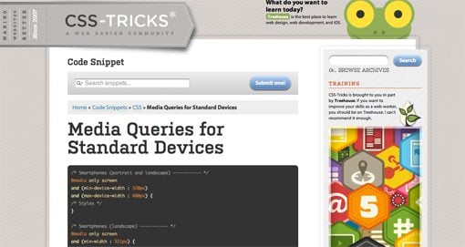
The complexity arises when we begin to discuss a crucial part of this technique: which media queries should I use? Or put a different way, which “breakpoints” should I target for custom CSS? The current popular answer predictably starts with the best “mobile” devices around: the iPhone and iPad (cue angry Android user comments). From these archetypes we establish so-called “generic” smartphone and tablet sizes. Then we move up and address laptops and small desktops and finally large screens. A standard set of media queries, like this one from CSS-Tricks, typically has nine or ten pre-established breakpoints.

What if we focused on the needs of a specific design instead of a hypothetical device use case? What if we built layouts that simply worked everywhere?

To be fair, this system does work to a certain degree. We’ve all seen lots of great responsive sites built using a set similar to Coyier’s above. However, I can’t help but think that this is somehow repeating the same mistake that we made by designing “mobile sites” a few years ago. The entire focus here is on the device viewing the site. Before we even build the site, we have these breakpoints in mind.

But devices change. We’ve already established that the web is being connected to pretty much everything with a power switch, so why are we once again placing so much emphasis on currently common screen sizes? Is there a better alternative? What if we focused on the needs of a specific design instead of a hypothetical device use case? What if we built layouts that simply worked everywhere?

Content Focused Responsive Design

The aforementioned problems with pre-established media queries occurred to me only as I dug in and really started producing responsive work on my own. In theory, the standard suggestions are great but once you apply them to a complex design you’ll discover that those breakpoints don’t always cover it. The problem, as the Boston Globe designers found quickly found out once the site went live, is that issues arise “in the in-between” (for the record, that project is fantastic and any layout issues have largely been addressed). Things get messy when the design is at a size that you didn’t account for and you have to go in and patch the holes after the fact.

I say this as an avid Apple fanboy: stop designing websites for the iPhone.


My question is, why don’t we start there? Instead of going into a project with a set of devices, and consequently media queries, in mind, why don’t we let the design decide? Every web page layout has a point where the browser size lessens its integrity. Our job as designers, in light of the problem of ubiquity, should be to find that size and account for it, then lather, rinse and repeat until all of the weak points are accounted for.

I say this as an avid Apple fanboy: stop designing websites for the iPhone. Instead, design a website that maintains its integrity as its viewport size is reduced to any feasible state. Do keep specific devices in mind as a guide for your design (example: smaller devices tend to be touch-based, so make links large), but don’t put your blinders on and fail to look at the bigger picture: that your design should look good on any screen.

A New Workflow

So what does a content focused responsive design workflow look like? It’s simpler than you think. Obviously, you need a starting point of some kind. If you want to start mobile and go up, great. If you want to start large and come down, also great. I personally find it very difficult to really dig into a design and do it right if I’m starting at the mobile level, but there are many solid arguments for doing it this way.

Something magic happens when you follow this workflow.

Hypothetically, let’s say you started with a large, 1020px wide site. Check it out on the largest screen you can get your hands on and make sure it looks great. Now drag the window and make it smaller until the design gets ugly. There’s your first breakpoint. Set a media query for that point and fix everything that you need to address. Once you’re finished, grab that window and find the next point of ugliness. Repeat these steps until you’re satisfied with the range that you’ve accounted for.

But what about the iPad? What about the Kindle Fire or Samsung’s latest attempt at being relevant? Something magic happens when you follow this workflow. You just made it so that the layout looks good at just about any size. If you did it right, then when you pull it up on your phone or tablet, it’s going to look great.

Layout Only
Keep in mind this discussion refers to layout ratios only. You absolutely don’t get out of testing functionality on different browsers and devices. Responsive design does nothing to account for the fact that different browser engines interpret HTML, CSS and JavaScript differently.

Conclusion

To sum up, media queries and responsive design provide us with an incredibly powerful tool to account for the fact that websites are being viewed by all manner of screens and viewport sizes. However, once we start pegging our designs to a handful of devices, we’re right back where we started. Your goal instead should be to build a layout that’s so versatile that it can handle almost any viewport size thrown at it.

This is all nice in theory, but where’s the example? The jumping off point of this discussion came from a recent attempt of mine to build a responsive image gallery. Check out that article for a look at how a content focused responsive design workflow might look in the wild.

Weekly Freebies: 15 Impressive CSS and PSD Navigation Menus

Today’s awesome collection of design freebies brings you a veritable utopia of navigation menu bliss. Each of the fifteen navigation menus below are both completely gorgeous 100% free to download.

screenshot

Today’s awesome collection of design freebies brings you a veritable utopia of navigation menu bliss. Each of the fifteen navigation menus below are both completely gorgeous 100% free to download.

I’ve included both CSS and PSD menus so whether you’re just looking to create a mockup or need something fully functional, we’ve got you covered. Enjoy!


Collapsing Vertical Nav (CSS)

screenshot

3-Level Navigation Menu (CSS)

screenshot

Ribbon Banner Navigation (CSS)

screenshot

CSS Menu Pack (12 Menus)

screenshot

Simple Tabbed Navigation (PSD)

screenshot

Dark Menu (PSD)

screenshot

PSD navigation menu

screenshot

Clean & Simple Navigation Menu (PSD)

screenshot

Clean Simple Navigation (PSD)

screenshot

Tab navigation (PSD)

screenshot

Glossy Dark Menu (PSD)

screenshot

Textured Navigation (PSD)

screenshot

Vertical Navigation Menu (PSD)

screenshot

Breadcrumbs navigation (PSD)

screenshot

GlossMilk Navigation (PSD)

screenshot

Love it? Share It!

If you enjoyed this week’s collection of freebies, share the love and send out a link on your favorite sites. Here’s a convenient snippet for you to copy and paste as you please!

15 Free CSS and PSD Navigation Menus: http://goo.gl/ANWrT

What Is HTML? Back to Basics

Since I have a background in print, I’m always eager to help designers from other areas get a start in web design and basic development. I know from experience that the transition is an extremely intimidating one that many people simply don’t think they can manage.

screenshot

Since I have a background in print, I’m always eager to help designers from other areas get a start in web design and basic development. I know from experience that the transition is an extremely intimidating one that many people simply don’t think they can manage.

Fortunately, I can also attest to the fact that it’s probably not as difficult as you might imagine. In the world of hardcore coding, HTML and CSS rank pretty low on the barrier to entry scale.

Today we’re going to start a series that examines the basic building blocks of web development. HTML, CSS, JavaScript; if you’re a complete and utter beginner who might not even have a basic grasp of what these technologies are much less how to wield them, then this series is for you.


What Is HTML?

There are a million ways that I could start this discussion. We could go into the drivel of how HTML stands for Hypertext Markup Language or how it was invented in 1980 by physicist Tim Berners-Lee as a system for sharing documents, but you can get all that from Wikipedia. If you’re interested in the history of the World Wide Web, I highly recommend investigating the topic further, but that doesn’t help us much in our discussion of what HTML is today and how you’ll need to use it.

What you really need to understand is the conceptual purpose of HTML. What is it for? Why do you need it? How does it compare and relate to other technologies like CSS and JavaScript?

HTML: The Most Important Piece

screenshot

Along these lines, HTML can be thought of as the fundamental building block of the web as you know it. There’s an underlying architecture of complicated technology that makes up “The Internet” but the good ol’ WWW is largely dependent on HTML.

In fact, technically, HTML is all you need to create a web page. A few extremely simple lines of HTML uploaded to a web server would constitute a web page, which is definitely not something that can be said for CSS and typically not something that can be said of JavaScript. The point here is that, while all of these technologies are closely related, HTML is the pivotal piece of the puzzle.

Now, before you get too excited, that doesn’t mean that you can get away with only learning HTML. You’d be hard pressed to find a modern web page that doesn’t utilize, at minimum, a combination of HTML and CSS.

Markup Languages

To truly understand what HTML is, you’ll need to understand what markup languages are and why they exist (I’m sneaking in that drivel after all).

Basically, the web is written in plain text. Now, by “plain text” I don’t just mean a lack of images, I mean a lack of rich formatting of any kind. Unlike in Microsoft Word where you can easily create bold italic text at any point size, writing code is more like using WriteRoom or IA Writer; all you get is plain old letters and symbols.

The Typewriter Metaphor

screenshot

Imagine composing an essay on an antique typewriter, then handing that essay to someone so that they could enter it into a computer. Your typewriter doesn’t have any formatting features, but when your associate enters your essay into the modern word processor, you want it to have headers, bold text, italic text, bulleted lists and more. How would you tell that person where to implement these features?

The answer is of course that you would “mark up” your document and insert extra indicators of how you want the text to be formatted. These wouldn’t be present on the end result but are merely meant to tell the interpreter how to make everything look the way you intend. This is exactly how a markup language works. With HTML, this markup is accomplished through tags.

Tag, You’re It

As I write this article, I’m doing so in plain text HTML. This means when I want to bold something, I can’t simply hit a button. Instead, I insert a bold tag:

1
The last word will be in <b>bold</b>.

See how I used “<b>” to indicate where the bolded text would begin? Also notice how I used “</b>” to indicate where the bolded text would end. To italicize something, I use the same technique.

1
<i>This is italicized.</i> This isn't. 

The bracketed portions are known as tags, and each set of tags has a starting and stopping point. With these, you tell the interpreter, in our case a web browser like Firefox, how you want the content to be formatted. When we place content between an opening and close tag, we typically say that we have “wrapped” it in a tag.

Example Tags

Now that you know what tags are, here are some more very basic examples of some HTML tags:

  • <p>paragraph</p>
  • <h1>header</h1> (h2, h3, h4, etc. create incrementally smaller headers)
  • <small>small text</small>

Links, Tags and Attributes

screenshot

This is where the “Hypertext” in “Hypertext Markup Language” part comes in. One of the major parts about writing HTML, and indeed about using the web in general, is linking. That’s how it all works right? If there is a web page loaded into your browser and you want to get to another page, what do you do? Click a link! This system is fantastic for connecting all of the various bits and pieces of information stored on the web.

To link something in HTML, we of course use a tag. This tag is going to look a bit more complex than most though. Let’s look at an example that links to the Design Shack home page.

1
Read <a href="http://designshack.net/">Design Shack</a> daily for awesome bits of design goodness.

Here we have not just a tag but an attribute as well. The tag (<a></a>) tells the browser that there’s a link and the attribute (href) tells the browser where the link should go. The syntax for this type of structure is as follows:

1
<tag attribute="VALUE">Text, images, etc.</tag>

In our previous example, anything between the “a” tags becomes a link. So the words “Design Shack” would’ve been an active text link that, upon clicking, directed the user to the href URL, which was the Design Shack homepage.

Placing an image via HTML works much the same way. We use the “src” attribute to point the browser to the location of the image and the “alt” attribute for text that will appear in place of the image if it can’t be displayed. Notice the closing tag structure is a bit different this time with all the “img” info placed within a single tag.

1
<img src="images/thepicture.jpg" alt="alternative text">

You Can Read HTML!

If you’ve been reading along up to this point, the following should make perfect sense.

1
2
3
4
<h1>What is HTML?</h1>
<p>You've officially learned enough that you should be able to read basic <bold>HTML</bold> fairly easily. This text is marked up with all kinds of tags, but once you know what they all mean, it becomes fairly readable doesn't it?</p>
<p>Now that you know what HTML looks like, let's move on and discuss it from a more <em>conceptual</em> point of view. What purpose does it serve in the grand scheme of web design?</p>

HTML: The Skeleton of a Web Page

screenshot

We now have a good idea of how HTML is a markup language and what that means. We know that it’s basically a way to give the browser plain text and have it output richly formatted and even active content that can be clicked on to some end. The last thing we need to understand is how it fits into the overall picture of a completed web page.

As we’ve seen in the examples above, HTML mostly relates to directly inputting content onto a page. The actual underlying structure of any web page is the kind of tagged statements we just learned about. Most text and links you see on any given page, as well as many of the images, are implemented directly with HTML.

HTML is Meant to Be Boring

As I said above, HTML is technically all you need for a web page. However, this HTML content by itself is quite plain. Notice that nowhere in the examples above have we told the page what background color we want to use, what size the text should be, which fonts to apply where, how wide certain portions should be and how they should line up, etc.

We’ve simply thrown in the content without any real thought towards what it will look like. Looking at any page on the web you can see that no one stops here. Each site has its own look and feel, its own color scheme, typography, layout, etc.

For example, imagine that your local news site picks up a story from the Associate Press. They could print the story verbatim and therefore have the same basic HTML structure for that content, yet it would likely look quite different from the version on the AP site. Why?

CSS is The Skin, Hair and Clothing

The answer is that modern HTML is not generally used to govern aesthetic style and layout. For this, we’ve adopted something called Cascading Style Sheets, or CSS.

The typical web developer workflow might be to insert all the various pure content first into an HTML document, then jump over to CSS and begin crafting that content to appear in a more visually pleasing and usable way. A year later the developer could come back and toss in a brand new CSS file that makes the website look completely different, all without touching the HTML.

JavaScript jumps into this game by taking a more active role in how the page behaves. Animations, form submissions, dynamic content, these are the domain of JavaScript. Lately CSS has been encroaching on this territory, but that’s a topic for another day.

What Is HTML5?

screenshot

Before we wrap this up, you’re probably wondering what the heck all this HTML5 talk is about. HTML5 is exactly what it sounds like: the fifth major iteration of HTML.

Web technologies aren’t set in stone, they’re constantly evolving and expanding. Just like print designers generally have to keep up with the newest bells and whistles in the latest version of Photoshop, so web designers have to keep an eye out for changes in web standards.

HTML5 brings lots of new features to the table while cutting out some unnecessary fat from its previous installment. For instance, HTML5 developers have some new tags to work with that make the basic structure of a web page more logical.

For more on HTML5, check out our complete series on the topic:

Conclusion: More to Come!

This article was meant to give you a basic conceptual overview of HTML. If you started reading without a clue as to what HTML is and how it’s used, hopefully you now have a basic grasp of these concepts.

As we look to the future I’ll be expanding this topic and walking through the basic anatomy of an HTML document and then moving on to another important question: What is CSS?

Be sure to check back soon for more on these topics!

Image sources: xlibber, Ryan Amos, Dave Parker

50 Awesome Portfolios From Female Designers and Illustrators

Think that design is a man’s world? Think again. Today we’ve got over 50 stunning portfolios from extremely talented female designers hailing from all over the planet.

screenshot

Think that design is a man’s world? Think again. Today we’ve got over 50 stunning portfolios from extremely talented female designers hailing from all over the planet.


Why All Girls?

Let’s say you’re a female designer looking to build an online portfolio and you want to get some inspiration from what other female designers have done. Where would you look? A recent survey from A List Apart of over 26,000 web designers revealed that nearly 83% were male. This becomes quite evident when you start browsing through the plethora of portfolio roundups on design blogs, they’re typically all from guys! This post is meant to serve as inspiration for all the ladies out there looking to build a name in this industry.

The portfolios below absolutely blew me away in terms of talent on display. One reoccurring theme that simply can’t be ignored is how many female designers happen to be extremely gifted illustrators. I’m not sure if girls are more inclined to be artistically talented or not but this ratio seems to be much lower among males.

It doesn’t stop there though, you’ll see a strong display of proficiency in HTML, CSS, JavaScript, design theory and every other relevant skill to web design. Man or woman, this post should inspire you to be a better designer.

The Portfolios

Winnie Ho

“Hi, I’m Winnie, and this is my site. I live in Edmonton. I was born in Hong Kong. I love online gaming and creating web apps. I’m happiest when I’m playing games, designing, or building something that didn’t exist before.”

screenshot

Tanya Merone

“I am a Graphic Designer based in New York, specializing in User Interface Design and Development. I build clean, appealing, and functional interfaces which comply with the latest web standards. But that’s just a part of it. Design is my life. It’s my five-star spa. It’s my roller-coaster. It’s something I do before going to bed, and something I can’t wait to do in the mornings. Without it, my world would be black and white.”

screenshot

Meagan Fisher

“Raised in Florida, a new New Yorker via Boston. When not making websites, I try to write and speak about making websites.”

screenshot

Veerle Pieters

“I’m a graphic/web designer living in Belgium. My personal journal reflects my journeys through design, the web, and life, and I share them here with you.”

screenshot

Jessica Hische

“Jessica Hische is a letterer, illustrator and designer working in Brooklyn. You may already be familiar with one of her side projects such as Daily Drop Cap or her Should I Work for Free? flowchart. If not, howdy and pleasure to meet you!”

screenshot

Sarah Parmenter

“Sarah lives in Leigh-on-Sea, in Essex, about 40 minutes outside London, with her husband and little dog, Alfie. Sarah was sat infront of an Atari by her Dad at the age of 3 and always knew her career would involve a computer, somehow. At the age of 14, Sarah started dabbling in web design. At 19 she decided to pursue this as her full time career and started her studio ‘You Know Who’ and hasn’t looked back since. Now 27, Sarah has been lucky enough to work with some great remote colleagues and peers over the years and even luckier to call some of them great friends.”

screenshot

Tanya Maifat

“I am a freelance designer and digital/game artist. I enjoy designing game graphics, icons, teasers and tiny beautiful & smart illustrations for your websites and other projects.”

screenshot

Tina Roth Eisenberg

“I grew up in Speicher (AR), Switzerland, influenced by renowned Swiss design and a lot of fresh mountain air. In 1999, after completing my design studies in Geneva and Munich, I crossed the Atlantic and began designing in New York. Since then, I have worked at several prominent NYC design firms, including Thinkmap, where I served as Design Director and helped design the award-winning Visual Thesaurus. I now run my own studio, swissmiss, with recent clients including the Museum of Modern Art and the Food Network. My aesthetics reveal my Swiss roots – I am a firm believer in white space and clean, elegant design.”

screenshot

Jina Bolton

“Jina is a user experience designer at Engine Yard. Previously, she worked as a visual interaction designer and front-end web developer for super rad companies including Crush + Lovely and Apple, Inc. She enjoys creating beautiful experiences, and then she likes writing and speaking about it.”

screenshot

Shyama Golden

“I’m basically a one woman shop for art and design, though I do hire a couple of brilliant interface designers and developers at times. As a child, I learned how to write code because I figured one day this internet thing would help me share my art with nice people all over the world.”

screenshot

Hillary Hopper

“I am a creative. I can never seem to stop creating anything. There is always an idea, new picture, or some business idea running through my head. I can’t help but see a picture before I see words on it. I am drawn to color and the beauty around me. I have always been drawn to art and design. Growing up I was constantly in my sketch book or having some kind of craft happening on the dining room table.”

screenshot

Allison House

“My background in user interface design is accented by a multi-disciplinary skillset that includes visual design, UX methods, content strategy and project management. The result is beautiful, well-planned websites that are intuitive, engaging, and persuasive.”

screenshot

Natalie Nash

“My name is Natalie Nash, but I also go by my pseudonym, Pinky von Pout. I am 29 years old and I am a Graphic Designer. I have been married for 5 years, and live in a small Welsh town with my Husband, Jeremy and our three terriers: Sam, Jake and Tim.”

screenshot

Janna Hagan

“My name is Janna Hagan and I am 19 year old web designer originally from the beautiful province of Alberta. I am currently in my second year of Web Design & Development at Durham College in Oshawa, Ontario. I am a hard working individual with a great attention to detail. I enjoy new and challenging projects that push me to learn more in the great field of web design. Throughout college, I have gained great time managment skills that allow me to work on multiple projects at once.”

screenshot

Allison Nold

“As a professional graphic and web designer, I bring a range of art and design disciplines to every project I work on. From brand strategy and user interface design to creative writing and front-end development, my work exemplifies an appreciation for complete brand experiences.”

screenshot

Iris Sousa

“I provide UI design & products for web, desktop & mobile applications.”

screenshot

Dana Tanamachi

“Dana Tanamachi is a graphic designer and custom chalk letterer living in Brooklyn, New York.
She currently works at Louise Fili Ltd.”

screenshot

Naomi Atkinson

“An English Designer and Illustrator, passionate about the web.”

screenshot

Claire Coullon

“A freelance graphic designer specialising in typography, I work primarily with logo design, custom & hand drawn lettering and expressive typography. I also love print related work, especially book design & writing. Originally from France and currently living in Prague, Czech Republic, I co-run Op45 Creative Design Agency.”

screenshot

Adelle Charles

“A designer and entrepreneur at heart, Adelle Charles currently acts as Chief Creative Officer at Fuel Brand Inc. where she oversees all creative and strategic direction for the company. She is a known twitter addict with a geeky love for typography and Starbucks. Charles has a Bachelor of Fine Arts degree in Graphic Design from RIT and has won various awards for her past work in television.”

screenshot

Erica Schoonmaker

“I’m a graphic designer and native New Yorker currently living in San Francisco, CA. I love paper and books just as much as I love the internet and enjoy designing all types of projects across both web and print mediums.”

screenshot

Samantha Warren

“I love fusing smart concepts with creative, standards-based, accessible web design. I know that listening, understanding business and user experience goals, and adhering to standards are keys to well-executed design online.”

screenshot

Lindsay Burtner

“I’m a Rochester Institute of Technology New Media Design & Imaging 2009 Alumni. I worked at MODE in Charlotte, NC as an Interactive Designer/Developer.”

screenshot

Heath Waller

“I discovered my passion for web design quite by accident. The experience of teaching myself about this field has been both challenging and extremely rewarding. I wake up excited about continuing to grow in this rapidly-evolving industry.”

screenshot

Larissa Meek

“I have over 9 years of experience designing for the web and consider myself a standards enthusiast with a passion for visual design. I am well versed in design trends and usability with a strong handle on CSS and HTML. As an ACD at AgencyNet, I’ve had the pleasure to work on a multitude of diverse brands such as Fuse, Oxygen Networks, Bacardi, Ruby Tuesday, iN Demand, Howard Stern, Warner Brothers and many more.”

screenshot

Sara White

“Sara is a twenty-four year old living in the rainy yet beautiful city of Victoria, Canada. She has a degree in business but chose to ignore the corporate world and pursue her passion, design, instead. She’s currently the Creative Director at MetaLab and likes to spend her free time in the kitchen, dabbling in interior design, and occasionally taking pictures.”

screenshot

Geri Coady

“I’m Geri Coady — a Designer, Illustrator and Photographer working in St. John’s, Newfoundland — the oldest and most Easterly city in North America. Art, illustration, web design, graphic design, photography, typography, printing, advertising — how can I choose just one? My wide interest means I’m never bored — just the way I like it. I’m currently working as a Senior Designer at a local advertising agency where every day brings a new challenge.”

screenshot

Denise Chandler

“Hi, my name is Denise and I specialize in designing and building websites for small businesses and personal use.”

screenshot

Meg Hunt

“Hi! My name is Meg. I’m a self-professed jack of all trades, but currently work as an illustrator. My goal is to fill the world with my creations, and make people happy in the process. I want to explore and try new things; it’s my goal to branch out beyond editorial and into the living breathing world we inhabit. One day I would like to illustrate gift cards and childrens’ books and stationery and textiles and packaging and oh, all sorts of things. What do you say?”

screenshot

Laura Kalbag

“I’m Laura Kalbag and I design web sites. Sometimes I do design for other digital media and print, but I find web design inspiring, exciting, and I’ll go on about it for hours.”

screenshot

Inayaili de León

“Hi! My name is Inayaili de León and I’m a web designer. That means I make websites both beautiful and easy to use—I can make a lot of amorphous content look clean and easy to understand. I also take a lot of pleasure in coding mine and other people’s designs to make them work online.”

screenshot

Beth Dean

“I’m a user experience designer specializing in billing and payments for transactional sites, and mobile design.”

screenshot

Sneh Roy

“I am Sneh. I Design. I am the co-founder of LBOI, a design studio in Sydney, Australia. I love creating logos and wacky characters the most. I also design and develop websites, create original content for the web, blog about design here on LBOI and about food on Gel’s Kitchen. I also write design related articles for other websites and blogs.”

screenshot

Kelli Anderson

“Hi. I’m an artist/designer and tinkerer who is always experimenting with new means of making images and experiences. I draw, photograph, cut, print, code, and create a variety of designed things for myself and others. ”

screenshot

Andrea Garza

screenshot

Sarah Kaiser

“Currently I am a fourth year New Media Design student with Rochester Institute of Technology. I’m passionate about design, illustration, 3d and motion and possess some skills in development, print and web as well.”

screenshot

Amber Weinberg

“Specializing in the development of HTML5, CSS3 and WordPress using valid and semantic coding practices.
I also make apps for fun and write a blog.”

screenshot

Valerie Jar

“I’m a 24-year-old designer/illustrator located in Salt Lake City. Currently, I’m working at StruckAxiom. I’m inspired by art deco, vintage signs, hand-lettering, tattoo art and people. Art and bikes are two of my favorite things. I love the hidden symbolism and meanings behind common objects and everyday things, and oftentimes, that fascination will play a role in my design and illustration.”

screenshot

Megan Kirby

“Art director and graphic designer specializing in luxury brand development with multidisciplinary experience refining the brand story with illustration, print and interactive design.”

screenshot

Erika Van Der Bent

“Erika van der Bent, Freelance Designer for online / digital media , age 27.
Born and raised in The Netherlands. Started to discover the world of webdesign when I was 12 and I felt in love. Over the years I have worked for and with several different web-design companies.
A beautiful interface makes me happy!”

screenshot

Susan Murphy

“Once upon there was a freckly Irish girl name Sue. She studied Visual Communications in Dublin, is currently studying for a Masters in the USA and will soon be moving to work in the Netherlands. Never defined by a place or a thing, she always aims to try and be a master of all trades, a jack of none. ”

screenshot

Dever Thomas

“Dever Thomas is an aspiring graphic designer, illustrator, creative person, and soon-to-be graduate of Indiana University.”

screenshot

Melissa Pohl

“Like many designers, I grew up with a passion for drawing and artistic pursuits of all kinds. After high school, this love of creating lead me in various directions which included becoming a tattoo artist, hair-stylist, and painter. As soon as I was introduced to the world of digital graphics however, I fell in love.”

screenshot

Laura Javier

“I’ve got one foot in the world of print, one foot in the world of pixels, and a love for both. I’m graduating this spring with a degree in Communication Design, a sense of humor, and a mission to find some amazing people to work with.”

screenshot

Emma Taylor

“A creative freelance web and graphic designer based on the sunny island of Cyprus. With an ultimate passion for website design and development, branding and advertising material. Focusing on designing simple, clean attractive websites that fully comply with today’s web standards for wonderful clients across the globe.”

screenshot

Christina Fowler

“Who is she? She’s the descendant of generations of magic designers (since 2008). And she’s no ordinary woman. She’s girly. Full of personality. A good communicator. And – more.”

screenshot

Abigail (Ruby Too)

“I work full-time in ‘Ye Olde Web Towne’ at Harmonix. I do some visual design but I spend most of my days knee-deep in CSS & HTML (and learning JavaScript). I get to work with some of the most talented and entertaining people I’ve ever come across. I love my job.”

screenshot

Ciara panacchia

“My name is Ciara (pronounced Kee-rah). I come from a small town in Ireland called Carlow, but found a place to call home in U.S. when I moved to Illinois in 2005. Although my love of the Arts started at a very early age (since I could hold a pencil), I have been a dedicated student of design since 1998, I don’t think it is something you ever stop learning.”

screenshot

Heather Grossman

“I’ve been a web designer for more than a decade. I’ve learned many things about web design since starting out in this industry, and the things I’ve learned have helped me develop processes that benefit everyone involved in the projects I work on.”

screenshot

Susie Ghahremani

“Susie Ghahremani is a 2002 graduate of the Rhode Island School of Design (RISD) with a BFA in Illustration. Her artwork combines her love of nature, animals, music and patterns. Born and raised in Chicago, Susie now happily spends her time painting, drawing, crafting and tending to her pet finches and cat in San Diego, CA. ”

screenshot

Melissa Washin

“I am a designer and developer who builds websites and creates print materials for small businesses and agencies.”

screenshot

Aubrey Klein

“Hi, I’m Aubrey, a graphic designer living in Dallas, TX. I specialize in web, illustration, tweeting and thing-making.”

screenshot

Bianca Mangels

“My name is Bianca and I’m a Screen and Web Designer from Frankfurt (Germany). I love design in every form and I can’t get enough inspiration.”

screenshot

Courtney Joy

“I currently work full-time for a creative firm in Dallas called Vintage 56. We offer services in graphic design, audio engineering, video production and web development. My role, as the graphic designer, includes branding/logo marks, business cards, stationeries, brochures, occasional web UI, product packaging and keynote presentations.”

screenshot

Show Us Yours!

This post doesn’t even scratch the surface of extremely talented females in the design industry. If you’re one of them, leave a comment below with a link to your portfolio so we can check it out!