Choosing the Right Partner for Design to Code Conversions
The transition from design to functional code is a critical step in modern web development. Whether you’re handing off a Photoshop (PSD), Figma, Sketch, or Adobe XD file, the quality of your front-end markup or WordPress integration can make or break the project. At TheSiteSlinger.com, we’ve spent years in the trenches converting designs to pixel-perfect, responsive, production-ready code. That’s why we took the time to research and evaluate the top companies offering PSD to HTML, PSD to WordPress, and general design to code conversion services.
But this isn’t just another generic list. Below, we explain the methodology we used to vet each provider—and what you should look for when choosing a development partner for your next project.
What We Looked for in the Best PSD to HTML Companies
Not all code conversion services are created equal. Here’s what separated the top-tier providers from the rest:
| Evaluation Criteria | Why It Matters |
|---|---|
| Code Quality & Semantics | Clean, W3C-valid, accessible HTML/CSS is non-negotiable. |
| Responsiveness | Mobile-first development is the standard, not an add-on. |
| CMS Integration | Many designs go straight into WordPress—accuracy is key. |
| Turnaround Time | Fast delivery with consistent quality control. |
| Communication | Clear project intake and post-delivery support are essential. |
| Technology Stack | Support for SCSS, Bootstrap, React, Tailwind, etc. |
| Real Client Work | We prioritized teams with a track record of visible, verifiable work. |
| NDA & White Labeling | Crucial for agencies and freelancers working with third parties. |
Why These Services Still Matter in 2025
Despite the rise of page builders and no-code tools, PSD to HTML and PSD to WordPress services remain highly relevant. Agencies and brands still rely on custom-coded frontends for performance, SEO, and design accuracy. Automated tools simply can’t replicate handcrafted markup—especially when accessibility, Core Web Vitals, or complex integrations are at stake.
When you need design to code conversion that’s reliable, scalable, and doesn’t fall apart under pressure, these companies deliver.
How We Compiled This List
We evaluated dozens of companies using a mix of public data, client feedback, test projects, and our own professional experience. We paid close attention to:
- Public code samples and live site case studies
- Depth of services: from raw HTML to complex WordPress theming
- Transparency around pricing, communication, and project process
- Years in business and stability of the team
- UX polish and responsiveness of their own websites (you’d be surprised…)
Only those that consistently performed across all areas made it into our list.
Use This List as a Starting Point
This is not a sponsored list, and we don’t rank companies based on payment. Consider it a curated set of options for agencies, startups, designers, and developers who want to delegate PSD to HTML or design to WordPress work without sacrificing quality or control.
Whether you’re outsourcing a one-off project or looking for a long-term partner, the companies we feature below have the skills and structure to deliver.
TheSiteSlinger
Specialists in PSD to HTML and Custom Design Implementation
TheSiteSlinger has carved a niche in the design-to-code market by offering streamlined, US-managed services with offshore execution. They focus on delivering hand-coded, cross-browser compatible HTML/CSS from PSDs and other design files, making them ideal for clients who need precision and reliability without compromising communication standards.
Key Strengths:
- File Types Supported: PSD, Sketch, XD, Figma, InVision.
- Tech Stack: HTML5, CSS3, Bootstrap, JavaScript, jQuery, WordPress.
- Client Base: Agencies, startups, and product teams in the US and Europe.
- Turnaround Time: 1–3 business days for basic HTML pages.
- Quality Assurance: Multi-device and cross-browser testing.
Advantages:
- Dedicated project managers based in the US.
- Simple pricing structure and clear quoting process.
- Excellent customer support for ongoing and repeat projects.
Their collaborative process and focus on quality assurance make TheSiteSlinger a great choice for clients seeking a trusted PSD to HTML partner with an emphasis on professionalism and responsive communication.
GetDevDone
Reliable White-Label Development with a Design-to-Code Legacy
P2H Inc, known for its specialized GetDevDone brand, is a longstanding authority in design-to-code services. Founded in 2005 and operating globally, the company has served as a technical backbone for thousands of creative and digital agencies. With over 250 developers on staff and a reputation for consistent delivery, P2H excels at transforming static designs into robust, responsive front-end code.
Services Focused on Code Precision
- Design-to-Code: PSD, Figma, XD, Sketch, and AI files converted into clean, W3C-compliant HTML5/CSS3 code.
- Tech Stack Expertise: HTML, CSS, JavaScript, React, Vue, Angular, WordPress, Drupal, and Shopify.
- Service Focus: 60% Web Development, 20% E-Commerce, 10% Web Design.
- Industries Served: eCommerce, advertising, business services, medical, education, non-profit, and government.
Client-Focused Development
The company’s workflow is structured, secure, and NDA-backed. P2H delivers pixel-perfect front-end code, optimized for performance and SEO. Their team is particularly well-suited for white-label partnerships, allowing agencies to scale client projects without adding overhead.
“They quickly understood our plan and took action immediately.” – Client testimonial
With a 5.0 Clutch rating and 76 reviews, P2H Inc is a trusted partner for agencies and enterprises that prioritize consistency, agility, and clean code.
HTML Pro
Design to Code for Complex Web Projects and CMS Integration
HTML Pro is a US-based web development agency that blends creativity with code integrity. With a focus on PSD to HTML and full-cycle design-to-code services, the team is known for supporting complex front-end builds and CMS implementations. Their wide service offering includes eCommerce and web application interfaces, with a strong base in HTML/CSS and mobile responsiveness.
Expertise in Multi-Platform Front-End Work
- Primary Services: PSD to HTML, custom web development, WordPress theming, eCommerce integration.
- Technical Range: HTML5/CSS3, Bootstrap, Shopify, Magento, and responsive frameworks.
- Service Focus: 50% Web Dev, 30% E-Commerce, 20% Web Design.
- Project Size: Minimum $10,000 engagements.
- Hourly Rate: $50–$99/hr
Versatility with Business-Centric Delivery
HTML Pro stands out for their communication and proactive approach to quality control. They support agencies, brands, and startups looking for pixel-accurate conversions and full front-end delivery with CMS integration.
“Their commitment to doing their best and positive energy impressed us.” – Client testimonial
Backed by 26 Clutch reviews and a 4.9-star rating, HTML Pro is an excellent fit for larger design-to-code initiatives where technical polish and proactive service are essential.
Webenix Technologies Private Limited
Scalable Design-to-Code and Software Outsourcing
Webenix Technologies is an India-based provider of web development and IT services with a growing reputation for responsive, scalable front-end coding. While their profile reflects broader outsourcing capabilities, their design-to-code conversions are delivered with attention to visual integrity and responsiveness.
Design Conversion and Full-Cycle Dev
- Core Services: Web design and development, PSD to HTML, mobile-friendly interfaces.
- Development Strength: HTML/CSS, responsive design frameworks, CMS customization.
- Hourly Rate: $25–$49/hr
- Minimum Engagement: $5,000
- Team Size: 1000+ employees
Reliability and Client Communication
Despite having a newer Clutch presence, their internal teams bring experience across sectors including IT, business services, and eCommerce.
“We’re impressed with their depth of knowledge and their commitment.” – Client testimonial
Rated 4.7 on Clutch, Webenix offers a practical solution for agencies looking for offshore PSD to HTML support with strong scaling potential.
he, highly tailored support for PSD to HTML conversions in commerce-heavy environments.
CSSChopper
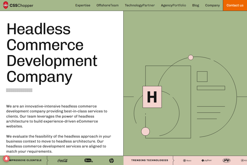
Established PSD to HTML Experts with Enterprise-Ready Code
CSSChopper is a long-established name in front-end development, widely known for their PSD to HTML conversions. They bring advanced technical maturity to every project — ensuring semantic markup, mobile responsiveness, and seamless integration into larger systems.
Why CSSChopper?
- Services: PSD to HTML, Bootstrap integration, JavaScript development, custom CMS themes.
- Development Standards: W3C-compliant code, retina-ready, cross-browser tested.
- Industries: 75% eCommerce, 25% retail.
- Engagements: $10,000+ minimum; $25–$49/hr rate.
- Clutch Rating: 5.0 from 61 reviews
“I was impressed with their dedication to challenges and their technical accuracy.” – Client testimonial
Ideal for clients seeking refined markup and future-ready HTML conversions, CSSChopper remains one of the strongest players in this niche.
XHTMLCHOP
Pixel-Perfect Design to Code with a Global Reach
XHTMLCHOP is a seasoned design-to-code vendor offering white-label front-end development services to agencies and brands worldwide. With a reputation built on precision, they provide hand-coded HTML/CSS from a wide range of design formats including PSD, Sketch, and Figma.
Key Offerings:
- Primary Services: PSD to HTML, responsive HTML, email templates, CMS theming.
- Supported Platforms: WordPress, Joomla, Magento, Shopify, WooCommerce.
- Development Focus: Clean, W3C-validated code; SEO-ready structure; device-agnostic testing.
- Pricing: Undisclosed hourly rates; starting at $1,000+ project minimum.
- Team Size: 250–999 employees globally.
While the company does not publicly list pricing or detailed client testimonials, XHTMLCHOP is known in the industry for their long-standing reliability and NDA-compliant service delivery.
This vendor is particularly suitable for agencies seeking a dependable white-label HTML slicing partner for high-throughput or recurring work.
PSDtoHTMLNinja
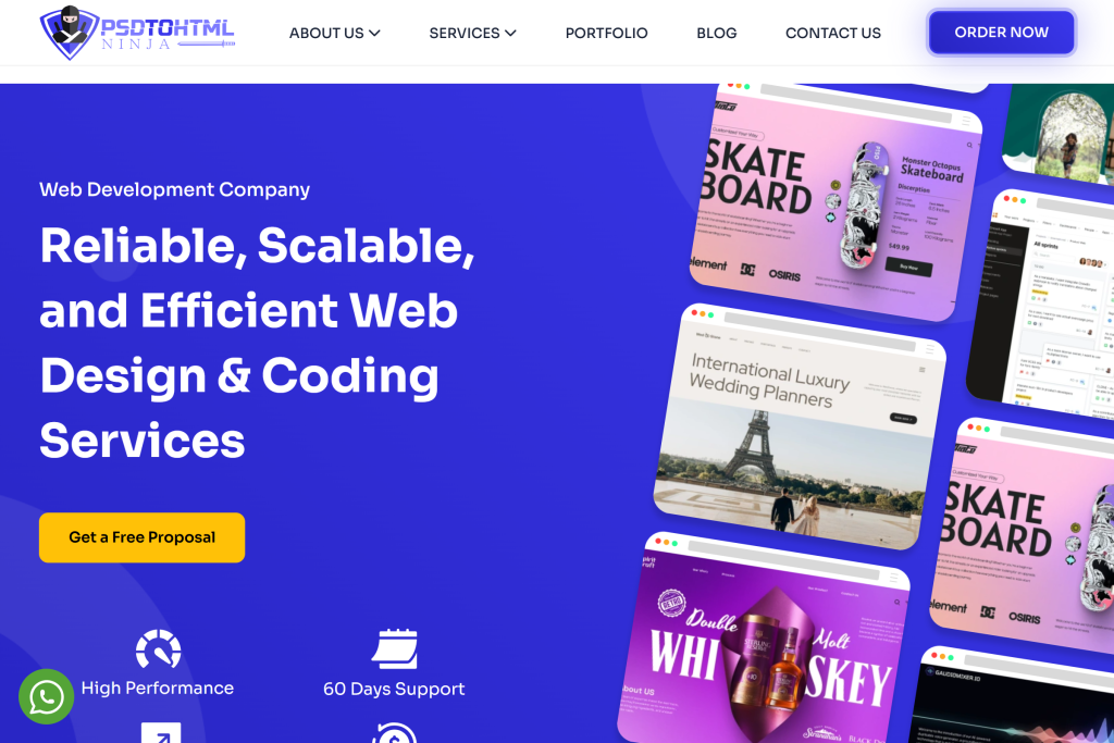
Budget-Friendly Design to Code Solutions from a Nimble Team
PSDtoHTMLNinja offers lean, cost-effective PSD to HTML and Figma to HTML conversion services with fast turnaround times. Catering primarily to startups and SMBs, the company emphasizes affordability without compromising responsiveness or design accuracy.
Highlights:
- Service Areas: PSD/Figma to HTML5/CSS3, landing pages, email templates.
- Pricing Structure: <$25/hr with a $1,000 minimum project size.
- Development Approach: Mobile-first coding, semantic markup, performance-focused delivery.
- Clutch Rating: 4.7 with a growing reputation.
- Testimonial Insight: “They were reactive and appeared to understand our needs well.”
Though smaller in team size and market visibility, PSDtoHTMLNinja serves as an agile choice for businesses needing fast and affordable design-to-code execution.
Flatworld Solutions
End-to-End Outsourcing Partner with Front-End Development Capability
Flatworld Solutions is a global outsourcing giant providing a spectrum of IT and business services, including front-end web development. While not solely focused on design-to-code, they offer PSD to HTML conversions as part of larger custom web projects and enterprise integrations.
What They Offer:
- Core Capabilities: HTML slicing, UI development, software engineering, call center services.
- Pricing: <$25/hr; flexible engagement based on project scope.
- Industry Focus: Information technology, healthcare, eCommerce.
- Team Size: 50–249
- Headquarters: Edison, NJ
- Established: 2002
Though lacking dedicated PSD to HTML branding, Flatworld is a viable choice for businesses seeking comprehensive digital execution — including design conversion, development, and support under one roof.
Final Thoughts: Choosing the Right Development Partner
Design-to-code conversion isn’t just a technical step—it’s the bridge between creativity and functionality. When done right, it preserves your vision, optimizes performance, and sets the foundation for future scalability. The companies we’ve featured here prove that high-quality PSD to HTML and PSD to WordPress services still play a critical role in professional web development workflows.
If you’re a designer, agency, or product owner looking to reliably convert your design files into fast, responsive, and clean front-end code, TheSiteSlinger.com is built for that exact need. We’ve worked with teams of all sizes, handling everything from static HTML builds to fully responsive WordPress themes, all with a focus on accuracy and communication.
For projects that go beyond conversion—custom functionality, integrations, web apps, complex CMS setups—we recommend our partners at GetDevDone.com. Their team specializes in high-level engineering, including eCommerce, React, headless builds, and tailored enterprise development.
Not Sure Where to Start?
- Already have a Figma, Sketch, or PSD file? Send it our way and we’ll take care of the code.
- Need a broader solution involving backend development or eCommerce? Talk to GetDevDone.
- Still exploring options? Use this list to test out a small project and compare outcomes—it’s the best way to find your fit.
Your design deserves better than a rushed or automated conversion. Whether you need a fast, pixel-perfect HTML handoff or a custom development team that can scale with you, now you know where to start.