10 Reasons NOT to code your own HTML

At The Site Slinger, we see LOTS of different kinds of web designs from our customers, and we hear lots of different reasons why they choose us to turn their designs into code. I wanted to share 10 of these reasons with you to show you the ways The Site Slinger helps you bring your designs to life, whether you are building a simple landing page, a complex web application, a WordPress theme, or even a great looking HTML email.

10 great reasons not to code your own HTML for your next project.

10. You can’t code.
Design to code services are for people just like you, no technical experience required. Don’t worry, developers don’t bite.

9. You are on a deadline (or multiple deadlines)
Rapidly approaching deadlines are not good for your stress level. If you don’t know how you will get the job done in time we have RUSH PSD to HTML options available.

8. You need jQuery or JavaScript animations
Most design to code services charge extra for JavaScript animations, we include it in the per page price.

7. Your client doesn’t want to pay for you to code by the hour
Using a design to code service for your website will be a fraction of what it would cost to code by the hour. We’ll even give you a PDF estimate to take to your client!

6. You don’t know any reliable web developers
Finding any good developer is hard, finding reliable outsourced development is even harder. You need someone you can count on who knows how to make you happy.

5. You have a LOT of pages to develop
If you build large, complex applications with extensive views, design to code services save you time so you aren’t wasting developer time coding HTML.

4. Your development team is backlogged
Your team is great, but they are busy building out your application. Don’t slow them down!

3. You are building a WordPress theme
WordPress sites are overtaking the web — everybody wants one and now you don’t have to be an expert to give it to them.

2. You build lots of web applications
We work with Bootstrap, 1140gridCSS, 960gsZurb and many other responsive web application frameworks. Get your prototype up in 5 days or less.

1. You are the smartest person on the planet and realize The Site Slinger should code your designs, not you.
We are happy to help!

Want to Learn More? See Examples!

Web Design and Development with Mobile SEO in Mind

We’ve broken down the key features of responsive web design and discussed the benefits that make it the go-to choice of web designers today. But how do search engines feel about all of this?

SEO is at the forefront of every web publisher’s mind.

So whether you’re an internet business pining for maximum clicks, or a new blogger luring readers to your corner of the web, it’s a topic that deserves priority consideration when deciding how you’ll approach ‘going mobile.’

Let’s look briefly at the top search engines.  These are Google, Bing, Yahoo!, and Ask.com (source). These four are far more popular than other search engines out there so it makes sense to focus your SEO efforts on these major players as they’ll be driving most of your indirect traffic.

The search engines primarily use a three-pronged approach comprised of: a web crawler to follow links and ping millions of sites efficiently; an indexer that, well, indexes their findings in a database; and a query processor to interpret your search terms and provide the best matches from the database.

Mobile SEO

Beyond traditional mobile web development.

While the SEO world still focuses its efforts on desktop design, the world of mobile design and development has boomed – inevitable considering our smartphone-driven lives. Traditional web development often calls for duplication of web content for desktop and mobile sites. This dual-mode presence calls for time-consuming URL redirects, separation of content, and splitting site traffic, which isn’t good for user experience or that all-important mobile SEO.

Again, we find ourselves landing on responsive web design as the solution (SEO mobile web development is the key!). Keeping your site and content singular is inherent in this web development technique  – no URL redirects, no multiple web crawls needed from the search engines, no split traffic hurting your rankings. All this is possible just by choosing a better web design strategy!

There are numerous ways to make your site responsive, including using a responsive framework like Twitter Bootstrap or coding a responsive page template with @mediaqueries.  Learn more about responsive design.

For an expanded look at mobile SEO and mobile design/development, reference: http://www.webdesignerdepot.com/2012/11/seo-for-the-mobile-web/

*Photo courtesy of Fotopedia, used under Creative Commons License.

HTML5: The Language of the New Web

No longer a novelty, HTML5 has already changed the way web developers code and the way users interact with websites. Contributing to the decline of Flash, HTML5 is an undeniable force utilized by countless modern websites.

HTML5 Logo

The New Standard.

HTML5 is setting the bar for the ever changing web landscape. In addition to being integral to the single-site, multi-device experience, HTML5 serves as a standard for video, Flash-like interactivity, and is even creeping into the ad space. With HTML working hand in hand with CSS3 and JavaScript, HTML5 brings us to the next level of web development.

HTML5 is paving the path of the future for the Web:

It will be the go-to language for cross-platform development. According to Web Developer Juice, “Almost every platform – mobile or web – is now making the shift to HTML5 (this includes Blackberry OS, Palm WebOS, and Windows 8).” And Strategy Analytics predicted that HTML5 phones are a hyper-growth market, and global sales will increase 365% by 2016, from 2011. Developing for the desktop now includes developing for mobile. Which means faster and more cost-effective reach.

Ads will continue to shift from Flash. Apple adamantly denounced Flash, so, unsurprisingly, their iOS devices lack compatibility with those traditional Flash ads you otherwise see blinking at you across the web. With so much of mobile web traffic coming from iPhone and iPad users, advertisers can’t ignore that fact. Even on desktops, HTML5 aims for faster loading and better integration. Google Mobile Ads now offers a feature to easily convert Flash ads to HTML5 in Adwords and offers HTML5 banners. Pointroll goes as far as calling HTML5 “the future ‘Secret Sauce’ in online advertising.” HTML5 proves, once again, it is the solution for more effective and efficient reach.

It’s a robust and clean coding standard aimed at streamlining coding, publishing and browsing. HTML5 has been designed to do away with the need for add-on browser plugins. Many features are intended to improve site discovery and overall SEO, translating into more traffic. HTML5 includes the use of Canvas, which provides the potential for more graphic interactivity and an alternative to loading images the ‘old’ way – even on the fly! With better support for feedback forms, drag-and-drop tools, chat, and other popular interactive elements HTML5 aims to make developing and using the new Web much easier.
You can reference a useful infographic about HTML5 features and the benefits for future web development here.

To make the most of the new Web, the HTML5 experts at The Site Slinger code with the future in mind, utilizing the latest tools to provide robust user experiences, beautiful and clean websites. We’re happy to turn your vision into a pixel-perfect site via our best-in-the-world PSD to HTML coding, so contact us or submit your design and let’s get it done!

*Image courtesy of W3C, used under Creative Commons licensing.

30 Brand New PixelsDaily PSD & CSS Design Freebies

Loads of new freebies and open source codes are placed online every day. Web & mobile designers can learn a lot by studying newer interface trends and design layouts.


featured-pixelsdaily-screenshot-image-freebies

Loads of new freebies and open source codes are placed online every day. Web & mobile designers can learn a lot by studying newer interface trends and design layouts. PixelsDaily is one such website which publishes freebies and premium content. This is an excellent resource for designers who want to dig a bit deeper into constructing usable layouts for the web.

In this roundup I have put together 30 of the latest freebies from PixelsDaily. You will find both PSDs and HTML/CSS codes mixed in with each other. Some freebies actually offer both graphics and the code together! But no matter what items you’re looking for, this showcase is bound to have something cool.


Google Maps Markers (PSD)

These varied Google Map Makers are a fantastic set of resources to have in your design collection. They represent different things — a restaurant, telephone, gas, airport, rail station, and mechanic. It’s simple to implement these into an embedded Google Map!

photoshop freebie psd download googlemaps

Custom Slideshow (PSD + CSS)

This custom slideshow is provided both as a PSD, or fully coded in CSS and HTML. It’s wrapped up in a delightfully simple design, with subtle shadows, borders, and textures. It’s simple to make a few tweaks to add your own images, captions, and information. Enjoy!

freebie jquery slideshow html css webdesign download

Info Widget (PSD)

This is a tidy little information widget for a blog post, containing the title, author information, comments, and likes. Presented as a well organised PSD file to integrate into your own designs!

psd freebie information widget website

Sticky Note Paper (PSD)

A “Sticky Notepaper” — a piece of paper with lined paper, a download button, and some sticky tape that wraps it all together! Really simple, but a useful starting point for your own note-style interface.

sticky notepad paper designs psd freebie

Windows 8 Metro Buttons (CSS)

A selection of Metro style, Windows 8 buttons and icons. All coded using HTML and CSS, so they’re incredibly easy to drop into your own design, customise colours, and so on. Add a little simplistic metro style to your next interface!

css3 html windows win8 buttons

Notification Centre UI (PSD + CSS)

A versatile PSD of a notification style interface. It includes a drop-down list of recent notifications/messages, a login/connect window, and pop-out messages with more information as well. Packed with potential functionality for your next app, and we’ve also added a fully coded CSS/HTML version. Enjoy!

notification center user interface webdesign psd freebie

Timer Interface (PSD)

A stylish countdown/stopwatch/timer interface, with play/stop/restart buttons, countdown digits, the current time, and some simple OS X chrome.

stopwatch timer psd freebie ui interface

Yellow Subscribe Box (PSD)

A stylish subscription box, giving your readers the information they need to subscribe to your site. It contains two options — one for an email newsletter subscription, and another for RSS. The base colour is yellow, but it’s easy to tweak to fit in with your own design.

yellow email subscription box freebie download

Spotify Mini Player (PSD)

A stylish mini-player interface for Spotify. It contains a track listing, simple play/volume controls, and a full-screen graphic. The perfect way to get started with a media player, whether for Spotify, or any other third party service!

green user interface mini music player freebie

Confirmation Dialog (PSD)

A beautiful confirmation dialog box with a subtle set of gradients and textures, a header, close button, two different button styles, and some explanatory text. A really gorgeous interface on which to build upon!

freebie windows modal box popup psd freebie website

Newsletter Signup Form (PSD)

A detailed newsletter sign-up form PSD, including a description of the mailing list, fields for name and email address, an anti-spam message, and a prominent “Join” button. Enjoy!

signup popover window modal design freebie download

Metro Twitter Feed

Microsoft have been doing a wonderful job with their simplistic “Metro” style, and today we’re presenting a lovely Metro-style twitter feed. Containing various states for different tweets, links, and timing. A really wonderful little widget!

windows metro twitter ui interface design

Pro Admin Interface (PSD + CSS)

There’s something about this one that we really love! It’s the top part of a simple administration interface design, with various navigation options / notifications, and a content box. As well as providing you with the original PSD, we’ve also gone to the trouble of coding it all up in CSS and HTML for you. Enjoy!

freebie html css admin toolbar ui layout template

Blur Login Form (PSD)

Login forms can be tricky. They need to be simple, convey the basic information, and exude a little style. This one presses all the right buttons, with some beautiful interface styling and typography. Enjoy!

blog login psd freebie form download

PixelsDaily iPhone App Interface (PSD + CSS)

We thought it’d be fun to create a funky app interface for PixelsDaily, then give it away free for you to use! Provided both as a fully coded HTML/CSS version, and a PSD. It has some uniquely created iOS interface elements, an author area, and a set of resource thumbnails.

custom iphone ios ui interface design freebie download

Trendy Nav Bar

A stylish navigation bar, provided as a PSD. It comes in four different colours, and might just be the perfect addition to the top of your next web design project!

trendy navigation bar interface psd freebie

Settings Panel (PSD + CSS)

We’re really pleased with this one. It’s a settings panel with brushed metal interface elements / toggle switches. Not only is this provided in the usual PSD format, but we’ve gone ahead and coded it up as a fully functional HTML/CSS version for you!

freebie download psd website ui interface html

Tiny Note (PSD)

Just a quick note about this one. It’s a note. A beautiful, pixel-perfect note. On a subtle background, it’s a paper “stack” with close/minimize icons, a link to read more, and some lovely typography. Hope you find it useful!

tiny note freebie psd download pixelsdaily

vCard Minisite (PSD + CSS)

This is a beautiful minisite vCard in PSD format. It contains elements for your social media profiles, an avatar, a small bio, and a “folded corner” for someone to download a copy of your vCard. If you want to put up a vCard website, this is the perfect way to do so! We have also included a fully coded CSS and HTML version, complete with an animated corner roll-over. Enjoy!

vcard freebie website ui layout download css html psd

Design Agency Layout (PSD)

A fully-loaded PSD file, this graphic contains a sleek and professional layout for a design agency or portfolio. It has plenty of room for your logo, navigation, an introductory text area / video, and a set of different “services” that you might offer. It’s really simple to customise for your own needs!

freebie download psd pixels website agency layout

PHP Metro Generator Webapp (CSS/PHP)

Something a little different today, this is a PHP application that helps you generate unique metro-style interfaces with ease. Just drop it onto your server and experiment away! You’ll need to upload this to a web server to run the script and see how it works.

metro user interface layout webapp php testing

Stylish Ribbon (PSD)

Four(4) colourful ribbons with a 3D look and feel, stiched outer pattern, and a top shadow to create the effect of the ribbon dropping over its’ container. Have fun integrating it into your own design!

psd freebie download pixelsdaily website

Credit Card Form (PSD + CSS)

This is an incredibly handy credit card information form, containing fields for your card number, type, expiry date, and CVV number. It’s simple enough to incorporate into any design, and is provided both as a PSD and fully coded as a CSS/HTML design. Enjoy!

credit card ui interface form website freebie download

Various Alert Boxes (PSD + CSS)

Three different alert box styles are included in this PSD — A green “success” alert, a yellow “alert” … alert, and a red “error” alert! We’ve also built one of these into CSS and HTML for you, just to save you a little time!

alert boxes website interface css freebie download

Delicious Notepad & Ribbon (PSD)

A simple notepad freebie with a classic striped/leather look-and-feel, and a red ribbon flourish of detail. Provided as a well-organized PSD file for you to incorporate into your own designs!

notepad psd freebie download website graphics

Notepad Interface (PSD)

We’ve created a pixel-perfect notepad interface, straight out of a cutting-edge Mac app! A wonderful basis on which to build your own application interface.

freebie website notepad interface psd download

Animated Buttons (CSS)

This one is just beautiful. Two examples of a gorgeous animated button — both have subtle animations in the background, and plenty of excitement when you hover over them! The “Favorite” icon takes on the form of a beating heart, with the the download flying out, then back again. You’ll have to download the freebie to see them for yourself – don’t just take our word for it!

pure css animated buttons website freebie download

Ripped Tasks List (PSD)

A “ripped” skeumorphic to-do list with a paper effect, check-boxes for completed tasks, delete icons, and a button to add a new task. Take it, build upon it, and enjoy! Provided as a simple layered PSD file.

todo list website interface papers freebie psd download

Clock iOS App Icon (PSD)

A delightful wrist watch/clock icon, designed for an iOS app. It is provided in a range of different sizes suitable for each different iOS device, and we’d love for you to use the end result however you’d like!

freebie psd wristwatch app icon mobile retina display

Paper Stack (PSD)

A beautiful paper stack, complete with a quotation, avatar, stylish pin, and a subtle textured background. It’s a delightful piece of interface design work, and we hope you enjoy it!

pinned paper stack pin icons design

Conclusion

Many of these elements are great for building complex layouts and applications. Mobile designers will especially enjoy some of the aesthetic pieces such as buttons and notepads. But in my opinion this set of freebies offers a powerful start to the new year. Be sure and keep updated for new releases over the course of 2013.

So what IS responsive web design, anyway?

With the world going mobile there’s no way around it: your site has to adapt to any and every device that’s out there. Think about it… How many devices have you used today? I can count checking my email on three already!

Don’t get lost in buzzwords, understand why/how responsive web design works.

With the world going mobile there’s no way around it: your site has to adapt to any and every device that’s out there. Think about it… How many devices have you used today? I can count checking my email on three already!

In the past, the solution to differing device screens was to build an alternate version of your site, or even multiple apps optimized for the various mobile OS’s. However, these options often prove to be too costly in development and cumbersome to perform maintenance and updates. So what is today’s solution? Responsive web design!

Well, you ask… what IS responsive design? It’s one of those buzz words being thrown around a lot right now.

Responsive design allows for a single site to be designed and developed, yet performs effectively and beautifully across devices of varying screen sizes and orientations.

There are a few key features that allow this to work:

A flexible framework for content – the ‘grid’

The foundation of the responsive design, the grid provides easy content management across varying screen sizes through the repositioning of content areas or boxes.

Check out some great info on how to use the grid in design and download some basic templates here.

Responsive web design
Content moves based on screen size, but should still relay the same message in an aesthetically pleasing way. (Image courtesy of DezignMatterz)

Adaptable visual content

From images to backgrounds and graphical motifs, a solidly designed responsive site must be able to communicate your vision consistently, regardless of device and screen size. These elements of the page must be able to move around and make sense from a user perspective and still effectively tell the user what you’re saying/selling.

Check out some great examples of sites that do this here.

The ability to respond to devices

Generally done via ‘media queries,’ a responsive site must determine the best display configuration and adapt in an instant to changes in screen orientation and size. This should be done in such a way that the user doesn’t notice the site changing.

Check out some great examples of this here.

The Site Slinger understands the need to develop websites in a cost-effective, multi-platform manner. We love coding PSD to responsive design! You shouldn’t spend all of your resources managing updates or site variations across a seemingly infinite sea of different mobile devices. That’s why we build effective, high-value, responsive sites, giving you the ability to deliver content consistently and reliably to all visitors, whether they’re on a desktop, tablet, or smartphone.

If you’d like to discuss the options for translating your web design into a fully responsive site, please contact us, or submit a quote. We’re happy to turn your vision into a pixel-perfect site via our best-in-the-world PSD to HTML coding.

*For further reference on responsive elements see, “Understanding the Elements of Responsive Web Design

The Site Slinger Makes Design to Code Easy.

The Site Slinger makes design to code easy. Headquartered in Austin, our quality, reliability, and speed makes us different than other PSD to HTML companies. We are the only company to offer easy online ordering and a fully transparent development process.

The Easiest Way to Order PSD to HTML

We’ve just recreated The Site Slinger from the ground up focused on offering you the easiest PSD to HTML option, and we want to know what you think! Create an account, upload designs and we will get you a quote in 24 hours or less. Our easy to use online ordering system makes it simple to check the status of your current projects, submit new projects, see order history, and connect with the developers.

We love to code and we know how bad outsourced development can be. Try us for your next PSD to HTML project and get $100 off your first order. Please reach out if you have questions or comments, we would love to hear your feedback!

Follow us on Twitter and Facebook for the latest updates.

Photoshop to CSS Conversion: 3 Methods Compared

Converting Photoshop mockups to live web code is an extremely common practice among web designers. We’ve all done it a million times by hand, so it’s pretty exciting when we start seeing solutions pop up that will help us automate this process.


screenshot

Converting Photoshop mockups to live web code is an extremely common practice among web designers. We’ve all done it a million times by hand, so it’s pretty exciting when we start seeing solutions pop up that will help us automate this process.

The latest version of Creative Cloud Photoshop CS6 has a built-in feature for converting Photoshop styles to CSS, and if you need another solution, there are two solid extensions that you can check out. Today we’ll compare the results of all three methods: Photoshop, CSS3Ps and CSSHat to see which is best.


Our Three Candidates

This article is all about comparing the results from three different methods of achieving the same goal. We have a design in Photoshop and we want to see it built in HTML and CSS.

Our three methods include Photoshop itself (version 13.1) as well as two extensions CSS3Ps and CSSHat. I recently created a screencast for Psdtuts+ that introduces and does some comparison between Photoshop and CSS3Ps, which you can find here.

I didn’t cover layer group functionality in that tutorial though so I thought it was worth another go and decided to toss in CSSHat as well so we really cover the bases well.

Our Test Case

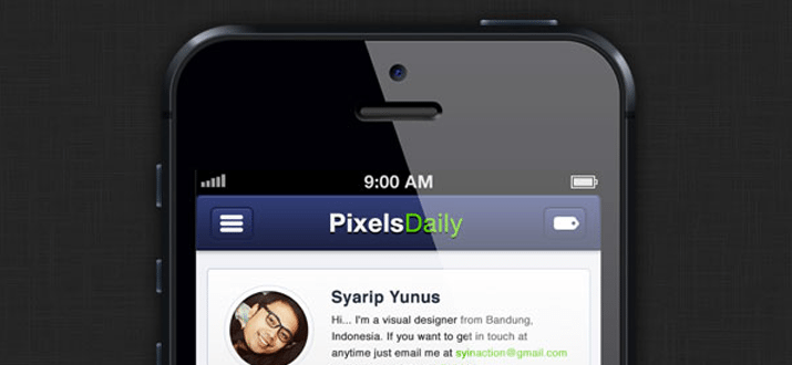
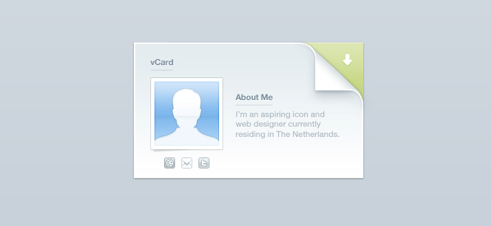
We’ll need something to test the different conversion methods on, so I whipped up a generic UI panel that could hold anything you want:

screenshot

This is basically comprised of three different layers: the text layer, the top bar and the background. Here I separated them out a bit so you could get an idea of how they were constructed.

screenshot

Below you can take a look at our layers palette. Note that this object is structured very intentionally. All three of the methods that we’ll look at today convert layer names to class names in CSS, so you want to be sure that you’re very careful about how you name your various pieces. Also note that the shapes are made from vector shape layers.

screenshot

Some of the methods that we’ll try out support layer groups, which means we’ll want to convert the structure here to a div structure in our HTML.

HTML

Photoshop can take care of the CSS for us, but we’re still on our own with HTML. Here’s a quick attempt at an HTML structure that will work with the code that Photoshop is going to generate. Without this in your HTML, the CSS won’t do a thing!

	
		<div class="panel"> <div class="paneltop"> <p class="type">Quick Panel</p> </div> <div class="panelback"></div> </div>

Photoshop

Let’s start off with the built in Photoshop functionality. The process here is extremely easy, all we have to do is select our layer group in the Layers panel and go to Layer>Copy CSS (you can also access this command with a right-click).

screenshot

Photoshop provides pretty much zero feedback that anything has happened at this point. There are no options to tweak, no panels to inspect, just the menu command that we clicked above, which places a big chunk of code into our clipboard. Here’s the output, straight from Photoshop.


.panel {
  position: absolute;
  left: 180px;
  top: 25px;
  width: 360px;
  height: 427px;
  z-index: 7;
}
.type {
  font-size: 19.913px;
  font-family: "Helvetica";
  color: rgb( 255, 255, 255 );
  line-height: 1.11;
  text-align: center;
  -moz-transform: matrix( 1.70449868947994, 0, 0, 1.72443193254442, 0, 0);
  -webkit-transform: matrix( 1.70449868947994, 0, 0, 1.72443193254442, 0, 0);
  position: absolute;
  left: 83px;
  top: 25.902px;
  width: 180px;
  height: 27px;
  z-index: 6;
}
.paneltop {
  background-image: -moz-linear-gradient( -90deg, rgb( 1, 98, 171 ) 0%, rgb( 0, 52, 91 ) 100%);
  background-image: -webkit-linear-gradient( -90deg, rgb( 1, 98, 171 ) 0%, rgb( 0, 52, 91 ) 100%);
  position: absolute;
  left: 2px;
  top: 1px;
  width: 351px;
  height: 81px;
  z-index: 4;
}
.panelback {
  border-radius: 20px;
  background-color: rgb( 224, 225, 226 );
  box-shadow: 1.5px 2.598px 5px 0px rgb( 0, 0, 0 );
  position: absolute;
  left: 2px;
  top: 1px;
  width: 351px;
  height: 418px;
  z-index: 3;
}

The Result

If we toss this into a code editor and take a look at the result, the results are a little disheartening. Photoshop didn’t do a great job with the conversion. For starters, the top bar doesn’t have rounded corners. Also, the shadow seems to be at full opacity (too dark) and the type placement is off. If gives us a strong start and genuinely saves us a lot of time, but it’s probably not the magic solution you were hoping for from Photoshop.

See it live: Click here

screenshot

To make things worse, if we jump back and look at the code, there’s plenty to complain about. There are some really wonky things going on here such as the unnecessary transform on the text. It seems that you can let Photoshop write CSS for you, but I’m not convinced that you should.

CSS3Ps

Our next candidate is CSS3Ps, a completely free Photoshop plugin that predated the built-in Photoshop functionality. The website shows some pretty complex examples so hopefully this will tackle our project a little better.

screenshot

With the CSS3Ps extension installed, go to Window>Extensions>CSS3Ps. Then select the layer group and click the logo that pops up inside of the CSS3Ps panel.

screenshot

Once you press that button, a web page opens up and presents you with a timer. You’re forced to wait twenty seconds and look at an ad, which sucks but given that the extension is free, it’s understandable.

screenshot

From here you’re taken to a page containing the code, which I copied and pasted below. Note that this time around, I had to add in periods before the class names. CSS3Ps takes the layer name exactly as it appears in Photoshop, so you add in the “.” or “#” symbols there.

	.type {
  font-family: Helvetica;
  font-size: 10px;
  color: #fff;
}

.paneltop {
  width: 351px;
  height: 81px;
  -webkit-border-radius: 20px 20px 0 0;
  -moz-border-radius: 20px 20px 0 0;
  border-radius: 20px 20px 0 0;
  background-color: #000;
  background-image: -webkit-linear-gradient(top, #0162ab, #00345b);
  background-image: -moz-linear-gradient(top, #0162ab, #00345b);
  background-image: -o-linear-gradient(top, #0162ab, #00345b);
  background-image: -ms-linear-gradient(top, #0162ab, #00345b);
  background-image: linear-gradient(to bottom, #0162ab, #00345b);
}

.panelback {
  width: 351px;
  height: 418px;
  -webkit-border-radius: 20px;
  -moz-border-radius: 20px;
  border-radius: 20px;
  background-color: #e0e1e2;
  -webkit-box-shadow: 2px 3px 5px rgba(0,0,0,.34);
  -moz-box-shadow: 2px 3px 5px rgba(0,0,0,.34);
  box-shadow: 2px 3px 5px rgba(0,0,0,.34);
}

The Result

There’s a lot to like about the CSS3Ps output. For starters, it treats each individual layer as its own object and doesn’t attempt to position them over each other. I actually prefer this and always immediately strip out the absolute positioning code that the built-in method uses. This keeps the focus of the conversion where it should be: on style.

See it live: Click here

screenshot

Speaking of style, the results in that area are improved as well. Notice how the top bar actually has a border-radius this time around and how the box-shadow uses an alpha value to reduce the opacity. This version might be a little prefix heavy on things that no longer require prefixes, but otherwise the code isn’t half bad.

Also, the fact that you can get the output reformatted in Sass or SCSS is a killer feature that easily makes this method better than the default Photoshop feature.

screenshot

CSSHat

The third and final method that we’re going to check out is CSSHat. Like CSS3Ps, it’s a Photoshop extension, but this one will run you about $30.

screenshot

To use CSSHat, simply select the layer that you want to convert and open the CSSHat panel (find it in the extensions menu as with CSS3Ps above). Unfortunately, CSSHat currently doesn’t support layer groups, so you’ll have to do it on each individual layer. This is a serious strike against CSSHat, but it makes up for it in versatility.

screenshot

I love that I finally have some options to tweak. The other two methods were easy, but if you don’t like something, tough! Here I can toggle four different options: comment explanations, browser prefixes, layer dimensions and whether or not the code gets wrapped in a rule named after the layer.

Also notice that you can get the output in an impressive variety of formats: CSS, SCSS, Sass, LESS, Stylus and Stylus CSS. Here’s the output for the plain CSS version:

	.type {
  color: #fff; /* text color */
  font-family: "Helvetica";
  font-size: 10px;
}

.paneltop {
  width: 351px;
  height: 81px;
  -moz-border-radius: 20px 20px 0 0;
  -webkit-border-radius: 20px 20px 0 0;
  border-radius: 20px 20px 0 0; /* border radius */
  -moz-background-clip: padding;
  -webkit-background-clip: padding-box;
  background-clip: padding-box; /* prevents bg color from leaking outside the border */
  background-color: #000; /* layer fill content */
  background-image: url(data:image/svg+xml;base64,PD94bWwgdmVyc2lvbj0iMS4wIiA/Pgo8c3ZnIHhtbG5zPSJodHRwOi8vd3d3LnczLm9yZy8yMDAwL3N2ZyIgd2lkdGg9IjEwMCUiIGhlaWdodD0iMTAwJSIgdmlld0JveD0iMCAwIDM1MSA4MSIgcHJlc2VydmVBc3BlY3RSYXRpbz0ibm9uZSI+PGxpbmVhckdyYWRpZW50IGlkPSJoYXQwIiBncmFkaWVudFVuaXRzPSJvYmplY3RCb3VuZGluZ0JveCIgeDE9IjUwJSIgeTE9Ii0xLjQyMTA4NTQ3MTUyMDJlLTE0JSIgeDI9IjUwJSIgeTI9IjEwMCUiPgo8c3RvcCBvZmZzZXQ9IjAlIiBzdG9wLWNvbG9yPSIjMDA2MWFiIiBzdG9wLW9wYWNpdHk9IjEiLz4KPHN0b3Agb2Zmc2V0PSIxMDAlIiBzdG9wLWNvbG9yPSIjMDAzMzViIiBzdG9wLW9wYWNpdHk9IjEiLz4KICAgPC9saW5lYXJHcmFkaWVudD4KCjxyZWN0IHg9IjAiIHk9IjAiIHdpZHRoPSIzNTEiIGhlaWdodD0iODEiIGZpbGw9InVybCgjaGF0MCkiIC8+Cjwvc3ZnPg==); /* gradient overlay */
  background-image: -moz-linear-gradient(top, #0061ab 0%, #00335b 100%); /* gradient overlay */
  background-image: -o-linear-gradient(top, #0061ab 0%, #00335b 100%); /* gradient overlay */
  background-image: -webkit-linear-gradient(top, #0061ab 0%, #00335b 100%); /* gradient overlay */
  background-image: linear-gradient(top, #0061ab 0%, #00335b 100%); /* gradient overlay */
}

.panelback {
  width: 351px;
  height: 418px;
  -moz-border-radius: 20px;
  -webkit-border-radius: 20px;
  border-radius: 20px; /* border radius */
  -moz-background-clip: padding;
  -webkit-background-clip: padding-box;
  background-clip: padding-box; /* prevents bg color from leaking outside the border */
  background-color: #dfe0e2; /* layer fill content */
  -moz-box-shadow: 2px 3px 5px rgba(0,0,0,.34); /* drop shadow */
  -webkit-box-shadow: 2px 3px 5px rgba(0,0,0,.34); /* drop shadow */
  box-shadow: 2px 3px 5px rgba(0,0,0,.34); /* drop shadow */
}

The Result

As you can see above, the chunk of code this time is pretty huge, mostly due to the fact that the gradient is converted to a data URL. Below is the result if we paste directly into our code editor.

See it live: Click here

screenshot

As you can see, just as with CSSPs, the elements are merely styled, not positioned, we would have to push them into place ourselves. On that front, the styles look perfect with the exception of the text, which is tiny. I expect this has to do with the fact that I built the Photoshop version on a Retina screen though so you may not experience this bug (CSS3Ps actually did the same thing).

Who Wins?

“I recommend both CSSHat and CSS3Ps over what you get inside of Photoshop 13.1.”

None of the methods for converting Photoshop styles to CSS outlined above are perfect. The Photoshop version works, but the code is pretty ugly and the results don’t utilize the advanced CSS3 techniques that you’ll need to match things like opacity and complex border-radius setups. CSS3Ps is free and performs better than Photoshop, but the method of turning you to a web page that is hidden behind a twenty second ad delay is pretty annoying.

CSSHat is the best in the bunch as far as customization, but it doesn’t support layer groups. The default Photoshop method is the only one that positions your multiple items in a way that matches your canvas, which could be a good or bad thing (I wish it were an optional feature). Ultimately, nothing is going to give you the accuracy, power and versatility of coding by hand, but these tools can get you off to a strong start and save you some serious time.

Personally, I tend to favor CSSHat in this bunch. It’s a little pricy, but the functionality is stellar. It’s frankly a lot closer to what I wanted to see from Adobe. I think they really dropped the ball on this feature and I recommend both CSSHat and CSS3Ps over what you get inside of Photoshop 13.1.

What Do You Think?

Now that you’ve seen my assessment of these three tools, it’s time for you to chime in. Which of the above methods have you tried? Which do you think is the best? Let us know in the comments below!

50 Amazing Resources for Dribbble Lovers

Here at The Site Slinger, we’re huge Dribbble fans. Sort of a Twitter for design, this awesome site is home to beautiful bite-sized work samples from the web’s best designers.

screenshot

Here at The Site Slinger, we’re huge Dribbble fans. Sort of a Twitter for design, this awesome site is home to beautiful bite-sized work samples from the web’s best designers.

To showcase our love for Dribbble, we’ve put together a collection of fifty fantastic resources for anyone and everyone who uses Dribbble. From open source developer projects and quirky web projects to desktop and mobile applications, we’ve got enough Dribbble goodness to keep you occupied for months.


Developer

Dribbble API

The official Dribbble API documentation. If you’re a developer and you want to build anything related to Dribbble, start here!

screenshot

Jribbble

Jribble is a jQuery plugin that opens up various aspects of the Dribbble API. Grab shots, users, comments, rebounds and more.

screenshot

Rebbbounds

If you want to keep an eye on what developers are doing with the Dribbble API, hit up Rebbbounds, a Tumblr blog that’s chock full of great examples.

screenshot

GitHub Goodies

There are a ton of Dribbble related projects on GitHub, here’s a quick list of some that you should check out.

  • dribbble-php – PHP wrapper for the Dribbble API.
  • swish – Ruby wrapper for the Dribbble API.
  • Dribbble.js – Dribbble.js is a one file, library agnostic javascript file that will add your most recent dribbble shots to your website.
  • dribbble_desktop – A ruby script that scrapes rss feed of “shots” from dribbble.com, puts the images in a folder, generates an html file that you can load using WebDesktop. Poof – dribbble shots tiled nicely on your desktop.
  • Objective-Dribbble – A wrapper for the Dribbble API, written in Objective-C.
  • dribbble-codeigniter – Dribbble API Library for CodeIgniter.
  • Dribbble-node – Client API for Dribbble web site in node.
  • dribbbleCFC – ColdFusion wrapper for the Dribbble interface showcase API.
  • dribbble-dotnet – A Mono and .NET library for the Dribbble API, built using C#.
  • Dribbble-Sync – Drupal 7 module that syncs shots from Dribbble.
  • Dribbble-Retinizer – Chrome and Safari extensions that add a few nifty retina features to Dribbble.
  • dribbble-sass – Sass demo for Dribbble Show & Tell.
  • dribbble-dimmer – Chrome extension that enables the viewing of shots over a dimmed background.
  • Dribbble_Wrapper – Dribbble Wrapper takes the mobile Dribble website and put it inside phone gap to create a native android application.
  • dribbble-screen-saver – Pulls down popular shots for easy use in a Mac OS X “picture show” screensaver.

WordPress Plugins

WP Dribbble Shots

Adds a template function that grabs the most recent shots from the Dribbble user of your choosing.

screenshot

RainyShots

Similar to the one above, this plugin returns an array of 15 recent shots from any player.

screenshot

Web Apps

Liiikes: Top Players

Liiikes is like a Dribbble scoreboard. It shows you the statistics for all of the major players and scouts (recruiters).

screenshot

Jump Ball

A simple and fun memory matching game built with the Dribbble API.

screenshot

Nibbble

Nibbble is a web app, but it’s specifically built to allow a better Dribbble viewing experience for the iPad.

screenshot

Who Drafted Who?

Type in a Dribbble username, see who drafted that person.

screenshot

Box Seat

Box Seat is a no distractions, one-at-a-time shot viewer with keyboard controls.

screenshot

Full Court Shots

An infinitely scrolling grid of recent Dribbble shots. Great if you need a quick shot of design inspiration.

screenshot

Alley Oop

Search Dribbble by color. Really helpful if you have one color that you like and want to find some others to complement it.

screenshot

bbbrowser

Another simple grid full of Dribbble shots. This one doesn’t require scrolling though, just load up the page and watch.

screenshot

Mac Clients

Play by Play

Play by Play is the Dribbble client that I personally use the most. It has the feel of a desktop Twitter client, only it’s full of Dribbble shots. What could be better?

screenshot

Dribbbler

Dribbbler isn’t meant for viewing shots but for making them. Drag it over the area you want to shoot, click the button and upload.

screenshot

Nibbble — A Dribbble screensaver for OS X

Love Dribbble? Why not make it your screensaver? Mac users can do just that with this free software.

screenshot

iPhone Clients

iOS developers have definitely embraced Dribbble and its API. There are quite a few really sharp iPhone clients. Here are the ones that I found.

As far as I can tell, they pretty much all share most of the basic Dribbble browsing and interaction features. It really comes down to which interface you like the best. I personally think that PlayBook is pretty slick. It’s also free so it’s a good place to start.

Asssist for Dribbble

screenshot

Shotz – A Dribbble Client

screenshot

Swish

screenshot

Balllin ~ a Dribbble client

screenshot

PlayBoook

screenshot

Backboard

screenshot

Travveling for Dribbble

screenshot

Air Ball App

screenshot

Dunk

screenshot

Drishots

screenshot

Alley Ooop – A stream of inspiration shots from dribbble

screenshot

scoreboard! (coming soon)

screenshot

iPad Clients

Dribbble on the iPad is an entirely enjoyable experience. The large screen and touch interaction makes for an unrivaled browsing experience. It’s definitely one of my favorite ways to keep up on recent activity.

If you’re looking for a suggestion, the first two are my favorites. Dribbblr is from Tapmates so you know it’s awesome and Pick’n’Roll is just gorgeous.

Dribbblr for iPad

screenshot

Pick’n’Roll for iPad

screenshot

Courtside for iPad

screenshot

Dribbbits for iPad for iPad

screenshot

Dribbble Flow for iPad

screenshot

Android

Not an iOS user? Fear not, there are a couple of good Android Dribbble apps as well. Check them out below.

Pixle for Dribbble – Android

screenshot

Asssist | The Dribbble client for Android powered devices

screenshot

What Did We Miss?

This collection includes the absolute best Dribbble resources that I was able to find, but I’m sure that I missed a ton of great stuff. Leave me a comment with a link to your favorite Dribbble app, service or code project. Also be sure to let me know what you think of the resources above.

Responsive Design: Why You’re Doing It Wrong

Responsive design isn’t a fad that arose because of a cool CSS technique, it’s an answer to a problem. Always remember that and constantly ask yourself whether or not you’re really adequately addressing that problem. If you’re using copy and paste to insert your media query breakpoints, your solution might be flawed.

Responsive design isn’t a fad that arose because of a cool CSS technique, it’s an answer to a problem. Always remember that and constantly ask yourself whether or not you’re really adequately addressing that problem. If you’re using copy and paste to insert your media query breakpoints, your solution might be flawed.

Let’s discuss why media queries exist and how we can leverage them to truly solve the quandary of the ubiquitous web. Let’s talk about why you should let your content determine the breakpoints of a layout, not hypothetical screen sizes.

This article is part of our series on “looking beyond desktop design”, brought to you in partnership with Heart Internet VPS.

The Idea Behind Media Queries

Responsive Design PSD to Responsive Screenshot

To begin this debate correctly, it’s necessary to discuss why media queries have suddenly become so popular. The answer is of course that “Responsive Design,” a term coined by Ethan Marcotte, is a fantastic way to address an ever-growing problem for web designers.

While everyone was ranting on and on about how the “mobile web” was going to overtake the traditional one, the revolution that took place was much more drastic: the web became ubiquitous.

This “problem” is great for the world as a whole, but a real headache for us. In the past decade, the worldwide web has transformed into something new. It’s no longer bound by the walls that we had previously established. I’ve said this before but it’s worth repeating. While everyone was ranting on and on about how the “mobile web” was going to overtake the traditional one, the revolution that took place was much more drastic: the web became ubiquitous.

At this point in time, we don’t access the web from a single point. We didn’t give up our laptops in favor of smartphones as “experts” predicted. Instead, the web is everywhere we are. It’s not only in our phones and computers, it’s in our tablets, iPods, gaming systems, televisions and even cars.

This trend will only continue as time goes on. Responsive design brings us past a season of creating separate mobile sites and into an era where we develop one site that evolves and adapts to the device that it’s being viewed on. Using media queries, we can present specific CSS to any number of different viewport sizes and make sure that everyone has the best possible experience.

The Problem With Responsive Design

The section above isn’t a semi-historical rant meant to fill space, it’s an important look at the goals that responsive design is meant to achieve. The question then becomes, does it meet these goals? Does responsive design adequately address the problem of ubiquity?

The answer is complicated, at best I can say, “it depends on how you do it.” That’s a confusing statement isn’t it? Responsive design is straightforward: use media queries to serve up custom CSS to different viewport sizes. This is how everyone approaches it right? So how can there be a right and wrong way?

screenshot

The complexity arises when we begin to discuss a crucial part of this technique: which media queries should I use? Or put a different way, which “breakpoints” should I target for custom CSS? The current popular answer predictably starts with the best “mobile” devices around: the iPhone and iPad (cue angry Android user comments). From these archetypes we establish so-called “generic” smartphone and tablet sizes. Then we move up and address laptops and small desktops and finally large screens. A standard set of media queries, like this one from CSS-Tricks, typically has nine or ten pre-established breakpoints.

What if we focused on the needs of a specific design instead of a hypothetical device use case? What if we built layouts that simply worked everywhere?

To be fair, this system does work to a certain degree. We’ve all seen lots of great responsive sites built using a set similar to Coyier’s above. However, I can’t help but think that this is somehow repeating the same mistake that we made by designing “mobile sites” a few years ago. The entire focus here is on the device viewing the site. Before we even build the site, we have these breakpoints in mind.

But devices change. We’ve already established that the web is being connected to pretty much everything with a power switch, so why are we once again placing so much emphasis on currently common screen sizes? Is there a better alternative? What if we focused on the needs of a specific design instead of a hypothetical device use case? What if we built layouts that simply worked everywhere?

Content Focused Responsive Design

The aforementioned problems with pre-established media queries occurred to me only as I dug in and really started producing responsive work on my own. In theory, the standard suggestions are great but once you apply them to a complex design you’ll discover that those breakpoints don’t always cover it. The problem, as the Boston Globe designers found quickly found out once the site went live, is that issues arise “in the in-between” (for the record, that project is fantastic and any layout issues have largely been addressed). Things get messy when the design is at a size that you didn’t account for and you have to go in and patch the holes after the fact.

I say this as an avid Apple fanboy: stop designing websites for the iPhone.


My question is, why don’t we start there? Instead of going into a project with a set of devices, and consequently media queries, in mind, why don’t we let the design decide? Every web page layout has a point where the browser size lessens its integrity. Our job as designers, in light of the problem of ubiquity, should be to find that size and account for it, then lather, rinse and repeat until all of the weak points are accounted for.

I say this as an avid Apple fanboy: stop designing websites for the iPhone. Instead, design a website that maintains its integrity as its viewport size is reduced to any feasible state. Do keep specific devices in mind as a guide for your design (example: smaller devices tend to be touch-based, so make links large), but don’t put your blinders on and fail to look at the bigger picture: that your design should look good on any screen.

A New Workflow

So what does a content focused responsive design workflow look like? It’s simpler than you think. Obviously, you need a starting point of some kind. If you want to start mobile and go up, great. If you want to start large and come down, also great. I personally find it very difficult to really dig into a design and do it right if I’m starting at the mobile level, but there are many solid arguments for doing it this way.

Something magic happens when you follow this workflow.

Hypothetically, let’s say you started with a large, 1020px wide site. Check it out on the largest screen you can get your hands on and make sure it looks great. Now drag the window and make it smaller until the design gets ugly. There’s your first breakpoint. Set a media query for that point and fix everything that you need to address. Once you’re finished, grab that window and find the next point of ugliness. Repeat these steps until you’re satisfied with the range that you’ve accounted for.

But what about the iPad? What about the Kindle Fire or Samsung’s latest attempt at being relevant? Something magic happens when you follow this workflow. You just made it so that the layout looks good at just about any size. If you did it right, then when you pull it up on your phone or tablet, it’s going to look great.

Layout Only
Keep in mind this discussion refers to layout ratios only. You absolutely don’t get out of testing functionality on different browsers and devices. Responsive design does nothing to account for the fact that different browser engines interpret HTML, CSS and JavaScript differently.

Conclusion

To sum up, media queries and responsive design provide us with an incredibly powerful tool to account for the fact that websites are being viewed by all manner of screens and viewport sizes. However, once we start pegging our designs to a handful of devices, we’re right back where we started. Your goal instead should be to build a layout that’s so versatile that it can handle almost any viewport size thrown at it.

This is all nice in theory, but where’s the example? The jumping off point of this discussion came from a recent attempt of mine to build a responsive image gallery. Check out that article for a look at how a content focused responsive design workflow might look in the wild.

Weekly Freebies: 15 Impressive CSS and PSD Navigation Menus

Today’s awesome collection of design freebies brings you a veritable utopia of navigation menu bliss. Each of the fifteen navigation menus below are both completely gorgeous 100% free to download.

screenshot

Today’s awesome collection of design freebies brings you a veritable utopia of navigation menu bliss. Each of the fifteen navigation menus below are both completely gorgeous 100% free to download.

I’ve included both CSS and PSD menus so whether you’re just looking to create a mockup or need something fully functional, we’ve got you covered. Enjoy!


Collapsing Vertical Nav (CSS)

screenshot

3-Level Navigation Menu (CSS)

screenshot

Ribbon Banner Navigation (CSS)

screenshot

CSS Menu Pack (12 Menus)

screenshot

Simple Tabbed Navigation (PSD)

screenshot

Dark Menu (PSD)

screenshot

PSD navigation menu

screenshot

Clean & Simple Navigation Menu (PSD)

screenshot

Clean Simple Navigation (PSD)

screenshot

Tab navigation (PSD)

screenshot

Glossy Dark Menu (PSD)

screenshot

Textured Navigation (PSD)

screenshot

Vertical Navigation Menu (PSD)

screenshot

Breadcrumbs navigation (PSD)

screenshot

GlossMilk Navigation (PSD)

screenshot

Love it? Share It!

If you enjoyed this week’s collection of freebies, share the love and send out a link on your favorite sites. Here’s a convenient snippet for you to copy and paste as you please!

15 Free CSS and PSD Navigation Menus: http://goo.gl/ANWrT