Bootstrap 3 Released!

The long awaited update to the premier responsive framework has arrived! On August 19th, the folks behind Twitter Bootstrap took the latest version out of beta and announced the release of Bootstrap 3, coinciding with the two-year anniversary of the original release. Here’s a few things about the release worth calling out.

Twitter-Bootstrap-Logo

The long awaited update to the premier responsive framework has arrived! On August 19th, the folks behind Twitter Bootstrap took the latest version out of beta and announced the release of Bootstrap 3, coinciding with the two-year anniversary of the original release.

Here at The Site Slinger, we’ve received many inquiries about Bootstrap 3 and have been waiting to get our hands on the latest, stable version. We’re excited to code up more responsive websites using the new Bootstrap, with all of its great improvements! Submit your PSD to Bootstrap 3 project today!

Here’s a few updates in the release worth calling out

  • Mobile first and always responsive! Nearly everything has been redesigned and rebuilt to start from your handheld devices and scale up. With Bootstrap 3 we’ve gone deep on responsive and mobile first—it’s built in and no longer requires a separate stylesheet. That’s great for most folks, but not everyone needs or wants an adaptive web site or application. To help, we’ve added some documentation and an example that disables the adaptive or responsive features with some extra CSS. Check out the Disabling responsiveness section or head right to the non-responsive example to learn more.
  • Better box model by default. Everything in Bootstrap gets box-sizing: border-box, making for easier sizing options and an enhanced grid system.
  • Super-powered grid system. With four tiers of grid classes—phones, tablets, desktops, and large desktops—you can do some super crazy awesome layouts.
  • New Glyphicons icon font! While they were gone for a while, we’ve since restored the Glyphicons to the main repo. In 2.x, they were images, but now they’re in font format and include 40 new glyphs.
  • Overhauled navbar. It’s now always responsive and comes with some super handy and re-arrangable subcomponents.
  • Modals are way more responsive. We’ve overhauled the modal code to make it way more responsive on mobile devices
  • Dropped Internet Explorer 7 and Firefox 3.6 support. For Internet Explorer 8, you’ll need to include Respond.js for all the media queries to work correctly. You can read more about browser support in the docs.
Source: Official Bootstrap Blog 

You can read the official Bootstrap blog post about the release, complete with a celebratory Montell Jordan – “This is How We Do It” music video — AWESOME!

In case you’re wondering what the heck Bootstrap even is…

Twitter Bootstrap was created by a couple of guys at Twitter to maintain consistency across many internal tools. In public form, it’s a free, yet powerful framework for front-end development of websites and web applications. It uses HTML and CSS-based layout templates for typography, and interface components like forms, buttons and navigation elements. The key is that it’s a highly flexible framework built for the new era of responsive web design. Learn more about our PSD to Bootstrap conversion process here.

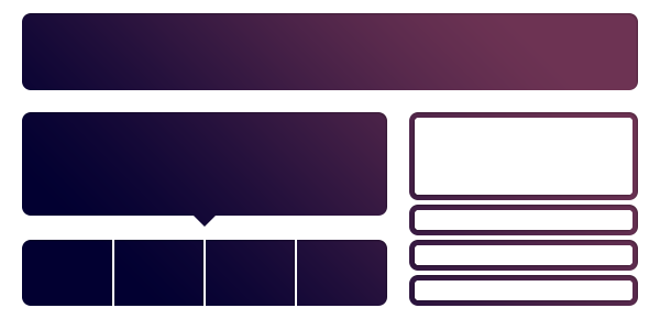
bs-docs-bootstrap-features

Have questions or a design ready for us to review? Submit your Bootstrap 3 projects today!

Photoshop to CSS Conversion: 3 Methods Compared

Converting Photoshop mockups to live web code is an extremely common practice among web designers. We’ve all done it a million times by hand, so it’s pretty exciting when we start seeing solutions pop up that will help us automate this process.


screenshot

Converting Photoshop mockups to live web code is an extremely common practice among web designers. We’ve all done it a million times by hand, so it’s pretty exciting when we start seeing solutions pop up that will help us automate this process.

The latest version of Creative Cloud Photoshop CS6 has a built-in feature for converting Photoshop styles to CSS, and if you need another solution, there are two solid extensions that you can check out. Today we’ll compare the results of all three methods: Photoshop, CSS3Ps and CSSHat to see which is best.


Our Three Candidates

This article is all about comparing the results from three different methods of achieving the same goal. We have a design in Photoshop and we want to see it built in HTML and CSS.

Our three methods include Photoshop itself (version 13.1) as well as two extensions CSS3Ps and CSSHat. I recently created a screencast for Psdtuts+ that introduces and does some comparison between Photoshop and CSS3Ps, which you can find here.

I didn’t cover layer group functionality in that tutorial though so I thought it was worth another go and decided to toss in CSSHat as well so we really cover the bases well.

Our Test Case

We’ll need something to test the different conversion methods on, so I whipped up a generic UI panel that could hold anything you want:

screenshot

This is basically comprised of three different layers: the text layer, the top bar and the background. Here I separated them out a bit so you could get an idea of how they were constructed.

screenshot

Below you can take a look at our layers palette. Note that this object is structured very intentionally. All three of the methods that we’ll look at today convert layer names to class names in CSS, so you want to be sure that you’re very careful about how you name your various pieces. Also note that the shapes are made from vector shape layers.

screenshot

Some of the methods that we’ll try out support layer groups, which means we’ll want to convert the structure here to a div structure in our HTML.

HTML

Photoshop can take care of the CSS for us, but we’re still on our own with HTML. Here’s a quick attempt at an HTML structure that will work with the code that Photoshop is going to generate. Without this in your HTML, the CSS won’t do a thing!

	
		<div class="panel"> <div class="paneltop"> <p class="type">Quick Panel</p> </div> <div class="panelback"></div> </div>

Photoshop

Let’s start off with the built in Photoshop functionality. The process here is extremely easy, all we have to do is select our layer group in the Layers panel and go to Layer>Copy CSS (you can also access this command with a right-click).

screenshot

Photoshop provides pretty much zero feedback that anything has happened at this point. There are no options to tweak, no panels to inspect, just the menu command that we clicked above, which places a big chunk of code into our clipboard. Here’s the output, straight from Photoshop.


.panel {
  position: absolute;
  left: 180px;
  top: 25px;
  width: 360px;
  height: 427px;
  z-index: 7;
}
.type {
  font-size: 19.913px;
  font-family: "Helvetica";
  color: rgb( 255, 255, 255 );
  line-height: 1.11;
  text-align: center;
  -moz-transform: matrix( 1.70449868947994, 0, 0, 1.72443193254442, 0, 0);
  -webkit-transform: matrix( 1.70449868947994, 0, 0, 1.72443193254442, 0, 0);
  position: absolute;
  left: 83px;
  top: 25.902px;
  width: 180px;
  height: 27px;
  z-index: 6;
}
.paneltop {
  background-image: -moz-linear-gradient( -90deg, rgb( 1, 98, 171 ) 0%, rgb( 0, 52, 91 ) 100%);
  background-image: -webkit-linear-gradient( -90deg, rgb( 1, 98, 171 ) 0%, rgb( 0, 52, 91 ) 100%);
  position: absolute;
  left: 2px;
  top: 1px;
  width: 351px;
  height: 81px;
  z-index: 4;
}
.panelback {
  border-radius: 20px;
  background-color: rgb( 224, 225, 226 );
  box-shadow: 1.5px 2.598px 5px 0px rgb( 0, 0, 0 );
  position: absolute;
  left: 2px;
  top: 1px;
  width: 351px;
  height: 418px;
  z-index: 3;
}

The Result

If we toss this into a code editor and take a look at the result, the results are a little disheartening. Photoshop didn’t do a great job with the conversion. For starters, the top bar doesn’t have rounded corners. Also, the shadow seems to be at full opacity (too dark) and the type placement is off. If gives us a strong start and genuinely saves us a lot of time, but it’s probably not the magic solution you were hoping for from Photoshop.

See it live: Click here

screenshot

To make things worse, if we jump back and look at the code, there’s plenty to complain about. There are some really wonky things going on here such as the unnecessary transform on the text. It seems that you can let Photoshop write CSS for you, but I’m not convinced that you should.

CSS3Ps

Our next candidate is CSS3Ps, a completely free Photoshop plugin that predated the built-in Photoshop functionality. The website shows some pretty complex examples so hopefully this will tackle our project a little better.

screenshot

With the CSS3Ps extension installed, go to Window>Extensions>CSS3Ps. Then select the layer group and click the logo that pops up inside of the CSS3Ps panel.

screenshot

Once you press that button, a web page opens up and presents you with a timer. You’re forced to wait twenty seconds and look at an ad, which sucks but given that the extension is free, it’s understandable.

screenshot

From here you’re taken to a page containing the code, which I copied and pasted below. Note that this time around, I had to add in periods before the class names. CSS3Ps takes the layer name exactly as it appears in Photoshop, so you add in the “.” or “#” symbols there.

	.type {
  font-family: Helvetica;
  font-size: 10px;
  color: #fff;
}

.paneltop {
  width: 351px;
  height: 81px;
  -webkit-border-radius: 20px 20px 0 0;
  -moz-border-radius: 20px 20px 0 0;
  border-radius: 20px 20px 0 0;
  background-color: #000;
  background-image: -webkit-linear-gradient(top, #0162ab, #00345b);
  background-image: -moz-linear-gradient(top, #0162ab, #00345b);
  background-image: -o-linear-gradient(top, #0162ab, #00345b);
  background-image: -ms-linear-gradient(top, #0162ab, #00345b);
  background-image: linear-gradient(to bottom, #0162ab, #00345b);
}

.panelback {
  width: 351px;
  height: 418px;
  -webkit-border-radius: 20px;
  -moz-border-radius: 20px;
  border-radius: 20px;
  background-color: #e0e1e2;
  -webkit-box-shadow: 2px 3px 5px rgba(0,0,0,.34);
  -moz-box-shadow: 2px 3px 5px rgba(0,0,0,.34);
  box-shadow: 2px 3px 5px rgba(0,0,0,.34);
}

The Result

There’s a lot to like about the CSS3Ps output. For starters, it treats each individual layer as its own object and doesn’t attempt to position them over each other. I actually prefer this and always immediately strip out the absolute positioning code that the built-in method uses. This keeps the focus of the conversion where it should be: on style.

See it live: Click here

screenshot

Speaking of style, the results in that area are improved as well. Notice how the top bar actually has a border-radius this time around and how the box-shadow uses an alpha value to reduce the opacity. This version might be a little prefix heavy on things that no longer require prefixes, but otherwise the code isn’t half bad.

Also, the fact that you can get the output reformatted in Sass or SCSS is a killer feature that easily makes this method better than the default Photoshop feature.

screenshot

CSSHat

The third and final method that we’re going to check out is CSSHat. Like CSS3Ps, it’s a Photoshop extension, but this one will run you about $30.

screenshot

To use CSSHat, simply select the layer that you want to convert and open the CSSHat panel (find it in the extensions menu as with CSS3Ps above). Unfortunately, CSSHat currently doesn’t support layer groups, so you’ll have to do it on each individual layer. This is a serious strike against CSSHat, but it makes up for it in versatility.

screenshot

I love that I finally have some options to tweak. The other two methods were easy, but if you don’t like something, tough! Here I can toggle four different options: comment explanations, browser prefixes, layer dimensions and whether or not the code gets wrapped in a rule named after the layer.

Also notice that you can get the output in an impressive variety of formats: CSS, SCSS, Sass, LESS, Stylus and Stylus CSS. Here’s the output for the plain CSS version:

	.type {
  color: #fff; /* text color */
  font-family: "Helvetica";
  font-size: 10px;
}

.paneltop {
  width: 351px;
  height: 81px;
  -moz-border-radius: 20px 20px 0 0;
  -webkit-border-radius: 20px 20px 0 0;
  border-radius: 20px 20px 0 0; /* border radius */
  -moz-background-clip: padding;
  -webkit-background-clip: padding-box;
  background-clip: padding-box; /* prevents bg color from leaking outside the border */
  background-color: #000; /* layer fill content */
  background-image: url(data:image/svg+xml;base64,PD94bWwgdmVyc2lvbj0iMS4wIiA/Pgo8c3ZnIHhtbG5zPSJodHRwOi8vd3d3LnczLm9yZy8yMDAwL3N2ZyIgd2lkdGg9IjEwMCUiIGhlaWdodD0iMTAwJSIgdmlld0JveD0iMCAwIDM1MSA4MSIgcHJlc2VydmVBc3BlY3RSYXRpbz0ibm9uZSI+PGxpbmVhckdyYWRpZW50IGlkPSJoYXQwIiBncmFkaWVudFVuaXRzPSJvYmplY3RCb3VuZGluZ0JveCIgeDE9IjUwJSIgeTE9Ii0xLjQyMTA4NTQ3MTUyMDJlLTE0JSIgeDI9IjUwJSIgeTI9IjEwMCUiPgo8c3RvcCBvZmZzZXQ9IjAlIiBzdG9wLWNvbG9yPSIjMDA2MWFiIiBzdG9wLW9wYWNpdHk9IjEiLz4KPHN0b3Agb2Zmc2V0PSIxMDAlIiBzdG9wLWNvbG9yPSIjMDAzMzViIiBzdG9wLW9wYWNpdHk9IjEiLz4KICAgPC9saW5lYXJHcmFkaWVudD4KCjxyZWN0IHg9IjAiIHk9IjAiIHdpZHRoPSIzNTEiIGhlaWdodD0iODEiIGZpbGw9InVybCgjaGF0MCkiIC8+Cjwvc3ZnPg==); /* gradient overlay */
  background-image: -moz-linear-gradient(top, #0061ab 0%, #00335b 100%); /* gradient overlay */
  background-image: -o-linear-gradient(top, #0061ab 0%, #00335b 100%); /* gradient overlay */
  background-image: -webkit-linear-gradient(top, #0061ab 0%, #00335b 100%); /* gradient overlay */
  background-image: linear-gradient(top, #0061ab 0%, #00335b 100%); /* gradient overlay */
}

.panelback {
  width: 351px;
  height: 418px;
  -moz-border-radius: 20px;
  -webkit-border-radius: 20px;
  border-radius: 20px; /* border radius */
  -moz-background-clip: padding;
  -webkit-background-clip: padding-box;
  background-clip: padding-box; /* prevents bg color from leaking outside the border */
  background-color: #dfe0e2; /* layer fill content */
  -moz-box-shadow: 2px 3px 5px rgba(0,0,0,.34); /* drop shadow */
  -webkit-box-shadow: 2px 3px 5px rgba(0,0,0,.34); /* drop shadow */
  box-shadow: 2px 3px 5px rgba(0,0,0,.34); /* drop shadow */
}

The Result

As you can see above, the chunk of code this time is pretty huge, mostly due to the fact that the gradient is converted to a data URL. Below is the result if we paste directly into our code editor.

See it live: Click here

screenshot

As you can see, just as with CSSPs, the elements are merely styled, not positioned, we would have to push them into place ourselves. On that front, the styles look perfect with the exception of the text, which is tiny. I expect this has to do with the fact that I built the Photoshop version on a Retina screen though so you may not experience this bug (CSS3Ps actually did the same thing).

Who Wins?

“I recommend both CSSHat and CSS3Ps over what you get inside of Photoshop 13.1.”

None of the methods for converting Photoshop styles to CSS outlined above are perfect. The Photoshop version works, but the code is pretty ugly and the results don’t utilize the advanced CSS3 techniques that you’ll need to match things like opacity and complex border-radius setups. CSS3Ps is free and performs better than Photoshop, but the method of turning you to a web page that is hidden behind a twenty second ad delay is pretty annoying.

CSSHat is the best in the bunch as far as customization, but it doesn’t support layer groups. The default Photoshop method is the only one that positions your multiple items in a way that matches your canvas, which could be a good or bad thing (I wish it were an optional feature). Ultimately, nothing is going to give you the accuracy, power and versatility of coding by hand, but these tools can get you off to a strong start and save you some serious time.

Personally, I tend to favor CSSHat in this bunch. It’s a little pricy, but the functionality is stellar. It’s frankly a lot closer to what I wanted to see from Adobe. I think they really dropped the ball on this feature and I recommend both CSSHat and CSS3Ps over what you get inside of Photoshop 13.1.

What Do You Think?

Now that you’ve seen my assessment of these three tools, it’s time for you to chime in. Which of the above methods have you tried? Which do you think is the best? Let us know in the comments below!

Responsive Design: Why You’re Doing It Wrong

Responsive design isn’t a fad that arose because of a cool CSS technique, it’s an answer to a problem. Always remember that and constantly ask yourself whether or not you’re really adequately addressing that problem. If you’re using copy and paste to insert your media query breakpoints, your solution might be flawed.

Responsive design isn’t a fad that arose because of a cool CSS technique, it’s an answer to a problem. Always remember that and constantly ask yourself whether or not you’re really adequately addressing that problem. If you’re using copy and paste to insert your media query breakpoints, your solution might be flawed.

Let’s discuss why media queries exist and how we can leverage them to truly solve the quandary of the ubiquitous web. Let’s talk about why you should let your content determine the breakpoints of a layout, not hypothetical screen sizes.

This article is part of our series on “looking beyond desktop design”, brought to you in partnership with Heart Internet VPS.

The Idea Behind Media Queries

Responsive Design PSD to Responsive Screenshot

To begin this debate correctly, it’s necessary to discuss why media queries have suddenly become so popular. The answer is of course that “Responsive Design,” a term coined by Ethan Marcotte, is a fantastic way to address an ever-growing problem for web designers.

While everyone was ranting on and on about how the “mobile web” was going to overtake the traditional one, the revolution that took place was much more drastic: the web became ubiquitous.

This “problem” is great for the world as a whole, but a real headache for us. In the past decade, the worldwide web has transformed into something new. It’s no longer bound by the walls that we had previously established. I’ve said this before but it’s worth repeating. While everyone was ranting on and on about how the “mobile web” was going to overtake the traditional one, the revolution that took place was much more drastic: the web became ubiquitous.

At this point in time, we don’t access the web from a single point. We didn’t give up our laptops in favor of smartphones as “experts” predicted. Instead, the web is everywhere we are. It’s not only in our phones and computers, it’s in our tablets, iPods, gaming systems, televisions and even cars.

This trend will only continue as time goes on. Responsive design brings us past a season of creating separate mobile sites and into an era where we develop one site that evolves and adapts to the device that it’s being viewed on. Using media queries, we can present specific CSS to any number of different viewport sizes and make sure that everyone has the best possible experience.

The Problem With Responsive Design

The section above isn’t a semi-historical rant meant to fill space, it’s an important look at the goals that responsive design is meant to achieve. The question then becomes, does it meet these goals? Does responsive design adequately address the problem of ubiquity?

The answer is complicated, at best I can say, “it depends on how you do it.” That’s a confusing statement isn’t it? Responsive design is straightforward: use media queries to serve up custom CSS to different viewport sizes. This is how everyone approaches it right? So how can there be a right and wrong way?

screenshot

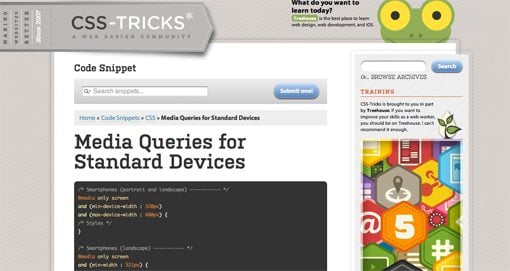
The complexity arises when we begin to discuss a crucial part of this technique: which media queries should I use? Or put a different way, which “breakpoints” should I target for custom CSS? The current popular answer predictably starts with the best “mobile” devices around: the iPhone and iPad (cue angry Android user comments). From these archetypes we establish so-called “generic” smartphone and tablet sizes. Then we move up and address laptops and small desktops and finally large screens. A standard set of media queries, like this one from CSS-Tricks, typically has nine or ten pre-established breakpoints.

What if we focused on the needs of a specific design instead of a hypothetical device use case? What if we built layouts that simply worked everywhere?

To be fair, this system does work to a certain degree. We’ve all seen lots of great responsive sites built using a set similar to Coyier’s above. However, I can’t help but think that this is somehow repeating the same mistake that we made by designing “mobile sites” a few years ago. The entire focus here is on the device viewing the site. Before we even build the site, we have these breakpoints in mind.

But devices change. We’ve already established that the web is being connected to pretty much everything with a power switch, so why are we once again placing so much emphasis on currently common screen sizes? Is there a better alternative? What if we focused on the needs of a specific design instead of a hypothetical device use case? What if we built layouts that simply worked everywhere?

Content Focused Responsive Design

The aforementioned problems with pre-established media queries occurred to me only as I dug in and really started producing responsive work on my own. In theory, the standard suggestions are great but once you apply them to a complex design you’ll discover that those breakpoints don’t always cover it. The problem, as the Boston Globe designers found quickly found out once the site went live, is that issues arise “in the in-between” (for the record, that project is fantastic and any layout issues have largely been addressed). Things get messy when the design is at a size that you didn’t account for and you have to go in and patch the holes after the fact.

I say this as an avid Apple fanboy: stop designing websites for the iPhone.


My question is, why don’t we start there? Instead of going into a project with a set of devices, and consequently media queries, in mind, why don’t we let the design decide? Every web page layout has a point where the browser size lessens its integrity. Our job as designers, in light of the problem of ubiquity, should be to find that size and account for it, then lather, rinse and repeat until all of the weak points are accounted for.

I say this as an avid Apple fanboy: stop designing websites for the iPhone. Instead, design a website that maintains its integrity as its viewport size is reduced to any feasible state. Do keep specific devices in mind as a guide for your design (example: smaller devices tend to be touch-based, so make links large), but don’t put your blinders on and fail to look at the bigger picture: that your design should look good on any screen.

A New Workflow

So what does a content focused responsive design workflow look like? It’s simpler than you think. Obviously, you need a starting point of some kind. If you want to start mobile and go up, great. If you want to start large and come down, also great. I personally find it very difficult to really dig into a design and do it right if I’m starting at the mobile level, but there are many solid arguments for doing it this way.

Something magic happens when you follow this workflow.

Hypothetically, let’s say you started with a large, 1020px wide site. Check it out on the largest screen you can get your hands on and make sure it looks great. Now drag the window and make it smaller until the design gets ugly. There’s your first breakpoint. Set a media query for that point and fix everything that you need to address. Once you’re finished, grab that window and find the next point of ugliness. Repeat these steps until you’re satisfied with the range that you’ve accounted for.

But what about the iPad? What about the Kindle Fire or Samsung’s latest attempt at being relevant? Something magic happens when you follow this workflow. You just made it so that the layout looks good at just about any size. If you did it right, then when you pull it up on your phone or tablet, it’s going to look great.

Layout Only
Keep in mind this discussion refers to layout ratios only. You absolutely don’t get out of testing functionality on different browsers and devices. Responsive design does nothing to account for the fact that different browser engines interpret HTML, CSS and JavaScript differently.

Conclusion

To sum up, media queries and responsive design provide us with an incredibly powerful tool to account for the fact that websites are being viewed by all manner of screens and viewport sizes. However, once we start pegging our designs to a handful of devices, we’re right back where we started. Your goal instead should be to build a layout that’s so versatile that it can handle almost any viewport size thrown at it.

This is all nice in theory, but where’s the example? The jumping off point of this discussion came from a recent attempt of mine to build a responsive image gallery. Check out that article for a look at how a content focused responsive design workflow might look in the wild.

Twitter Bootstrap 2: Bootstrap Goes Responsive

Twitter just released Bootstrap 2.0, an update so large it equates to a near full rewrite. There are quite a few new features and toys to play with, but the real headliner is that the framework is now fully responsive. Join us as we dig in to see how the new grid works and what other cool new features have been added. You’ll learn how to implement Bootstrap in your projects and will also pick up some extremely handy CSS techniques that you can use anywhere.

Recently, we published a piece titled 5 Incredibly Useful Tools Built Into Twitter Bootstrap, which took a look at the basic structure of Twitter’s Bootstrap framework and walked you through implementing some of the major components.

Twitter just released Bootstrap 2.0, an update so large it equates to a near full rewrite. There are quite a few new features and toys to play with, but the real headliner is that the framework is now fully responsive. Join us as we dig in to see how the new grid works and what other cool new features have been added. You’ll learn how to implement Bootstrap in your projects and will also pick up some extremely handy CSS techniques that you can use anywhere.

Demo

We’ll be talking about several new Bootstrap features today. If you want to see them in action, stop by the live demo below.

Demo: Click here to launch.

screenshot

Implementing the Responsive Grid

The most major aspect of Twitter Bootstrap is of course that it is now fully responsive. If you’re still labeling the whole responsive movement as a silly fad in hopes that you can ultimately skip learning the requisite techniques, you’re out of luck. Responsive design is well on its way to being a standard practice instead of a “nice to have” add on. It’s really not as complicated as you might think and tools like Bootstrap make it even easier.

The new responsive grid is twelve columns wide and works much like the sixteen column grid from Bootstrap 1. If you’ve ever used any grid system before, then you’ll feel right at home as there’s nothing too Earth shattering here.

screenshot

To implement the grid, you pretty much follow the same steps as you always did. Start with a container div, then create a row and fill that row with span(x) divs. Given that it’s a twelve column grid, just make sure the numbers in a row add up to twelve. Try four “span3″ divs, a “span9″ with a “span3″ or even just a straight up “span12″ to go all the way across. Here’s a quick example:

1
2
3
4
5
6
7
<div class="container">
  <div class="row">
    <div class="span4"><p>Lorem ipsum dolor sit amet</p></div>
    <div class="span4"><p>Lorem ipsum dolor sit amet</p></div>
    <div class="span4"><p>Lorem ipsum dolor sit amet</p></div>
  </div>
</div>

The above represents a static grid. It will still be responsive, it just won’t respond to every minute browser window size change, only those set by media queries. If you want a fluid grid, use the fluid classes:

1
2
3
4
5
6
7
<div class="container-fluid">
  <div class="row-fluid">
    <div class="span4"><p>Lorem ipsum dolor sit amet</p></div>
    <div class="span4"><p>Lorem ipsum dolor sit amet</p></div>
    <div class="span4"><p>Lorem ipsum dolor sit amet</p></div>
  </div>
</div>

The Media Queries

The included media queries are listed below, starting at mobile and working their way up. Basically, each one goes in and changes the size of the columns to reflow the layout to something more appropriate for the viewport.

  • @media (max-width: 480px)
  • @media (max-width: 768px)
  • @media (min-width: 768px) and (max-width: 980px)
  • @media (max-width: 980px)
  • @media (min-width: 980px)
  • @media (min-width: 1200px)

The first media query (480px and below) targets smartphones and pretty much breaks everything down to a single, 100% width column. This may be a bit oversimplified for your tastes, but the beauty of frameworks like this is that they’re only suggestions, you’re encouraged to customize to your heart’s content.

The next media query targets portrait tablets with a range of 480px to 768px, then up to 980px for landscape tablets and on up to standard desktops and large displays.

For the static grid, individual columns start at 70px wide, then jump down to 60px and finally down to 42px before going 100% width for mobile.

screenshot

Tip: Grab the Right Download
Interestingly enough, the media queries aren’t included in the default download from the Bootstrap homepage. If you want them, you’ll have to grab the GitHub Download.

Nice Attribute Value Selector Usage

If you check out the code for the media queries, you might learn a neat trick or two. For instance, the devs have implemented a solid example of the “Arbitrary Substring Attribute Value Selector”, which I wrote about in CSS Selectors: Just the Tricky Bits.

screenshot

Bootstrap has many classes that use the word “span” (span1, span2, etc.), and rather than typing out each individually, the ASAVS grabs them all in one go with this fancy bit of code: [class*=”span”]. This selector actually digs through the HTML and finds anything with “span” in the class name, regardless of what follows it. Even a class of “spansomethingtotallycrazy” would be targeted.

Content Transformation

Though the heart of the media queries is to reflow the columns, there’s a lot more going on here as well. The developers have actually taken the time to restructure many of the elements so that they transform as the viewport size changes.

For instance, the navigation menus change pretty drastically when you’re viewing on a tablet or smartphone. To see an example, test out the Bootstrap Homepage. At full size, the navigation menu is a simple horizontal list of text links.

screenshot

On a tablet or smartphone though, the text is cleared out and replaced with a button up in the top right of the screen.

screenshot

Tapping on the button will expand the new menu area. Here we have a vertical list of links, which allows for larger tappable areas.

screenshot

Responsive Images

screenshot

The navigation menu isn’t the only thing that changes size with the viewports, lots of other objects do as well, from simple buttons up to more complicated objects like image carousels. To pull off the automatically resizing images, Twitter has taken the “max-width: 100%;” route. Here’s the full snippet:

1
2
3
4
5
6
img {
  max-width: 100%;
  height: auto;
  border: 0;
  -ms-interpolation-mode: bicubic;
}

This makes it so that, as those columns and rows resize themselves, the image width will max out at the width of the parent column. Also notice the “-ms-interpolation-mode: bicubic;” line. This is a fairly obscure property that essentially makes image re-sizing smoother in IE.

More New Stuff

The responsive functionality is definitely the coolest new feature of Bootstrap, but there’s a lot more here to get excited about. Here are three of my favorite items:

Progress Bars

screenshot

Bootstrap now has cross-browser-compatible progress bars that are super easy to implement. Just insert a snippet like the one below:

1
2
3
<div class="progress">
  <div class="bar" style="width: 30%;"></div>
</div>

The “width: 30%” here resembles how far along the progress bar will be. If you want to change that to half full, just type in 50%.

Button Groups

screenshot

Button groups are a bit like breadcrumb navigation in that they’re individual buttons that are all smushed together. Normally, this takes a good chunk of code to pull off. Not only do you have to style the general button theme, you also have to make the first and last button different.

With Bootstrap, all you need are some links with the “btn” class inside of a “btn-group” div.

1
2
3
4
5
<div class="btn-group">
  <a class="btn" href="#">One</a>
  <a class="btn" href="#">Two</a>
  <a class="btn" href="#">Three</a>
</div>

Carousels

screenshot

The old Bootstrap JavaScript plugins have been revamped and some completely new ones have been added. My favorite here is the new jQuery carousel. The example code below may seem hefty, but if you break it down it’s pretty simple. The slide contents gets thrown in the “.item” div and an optional caption can be added. Navigation is tossed in at the end.

01
02
03
04
05
06
07
08
09
10
11
12
13
14
15
16
17
18
19
20
21
22
23
24
25
<div id="myCarousel" class="carousel slide">
    <div class="carousel-inner">
         
        <div class="item active">
            <img src="assets/img/bootstrap-mdo-sfmoma-01.jpg" alt="">
            <div class="carousel-caption">
                <h4>Third Thumbnail label</h4>
                <p>Lorem ipsum...</p>
            </div><!--end caption-->
        </div><!--end item-->
         
         <div class="item">
            <img src="assets/img/bootstrap-mdo-sfmoma-02.jpg" alt="">
            <div class="carousel-caption">
                <h4>Third Thumbnail label</h4>
                <p>Lorem ipsum...</p>
            </div><!--end caption-->
        </div><!--end item-->
         
    </div><!--end inner-->
     
    <!--nav-->
    <a class="left carousel-control" href="#myCarousel" data-slide="prev">‹</a>
    <a class="right carousel-control" href="#myCarousel" data-slide="next">›</a>
</div>

Conclusion

When a large company like Twitter puts out a free resource, it’s a gamble to actually build your workflow around it. One major issue is that you can’t know for sure how well it will be kept up in the long run. Fortunately, it seems like Bootstrap is, for now at least, a fairly high priority at Twitter. The new version represents a massive amount of time and effort and it really shows. This is turning into one extremely extensive boilerplate.

I’m personally stoked that Twitter deemed it necessary to take Bootstrap responsive. This will definitely help further the cause of responsive design that works well across not only all major browsers, but all major devices as well.

Leave a comment below and let us know what you think of Bootstrap 2.0. Did you try the first version? What are your favorite improvements?