
Custom Web Development Isn’t Just About Code—It’s About Fit
When people talk about building a website, they often think of templates, drag-and-drop builders, or plug-and-play platforms. And those tools do serve a purpose—for personal blogs, side projects, or even early-stage startups on a tight timeline. But once a business starts growing, or an agency takes on more complex digital needs, those off-the-shelf solutions quickly hit their limits.
That’s where custom web development companies come in.
Unlike cookie-cutter builds, custom web development is about crafting digital solutions from the ground up—based on the actual requirements of the business. It means designing not only for aesthetics but for performance, security, backend workflows, and user experience tailored to a specific audience or industry.
What Does “Custom” Really Cover?
It’s not just a buzzword. Custom web development services span a wide range of disciplines and deliverables:
- Frontend and backend development built to spec
- CMS implementations that don’t break under pressure
- Fully bespoke website development with tailored user journeys
- Web applications that go beyond static pages
- Database-driven platforms and internal tools
- Third-party API integrations
- Custom dashboards and admin panels for better control
These services are typically handled by web application development agencies that combine technical depth with creative thinking—going far beyond what WordPress plugins or Squarespace templates can offer.
Why Do Businesses Opt for Custom Solutions?
There’s a reason more mature brands and scaling agencies turn to bespoke web solutions rather than patching together plugins and pre-made themes.
They want:
- Flexibility, to evolve the platform with the business
- Speed and performance, tailored for their audience and content
- Scalability, to handle growing traffic and functionality
- Security, especially in regulated industries
- Compliance, such as GDPR or ADA accessibility
- Design freedom, for unique branding and user experiences
And maybe most important: they want ownership and control—not to be locked into someone else’s ecosystem.
What Makes a Great Development Partner?
Hiring a team to build something from scratch isn’t just about code. It’s about collaboration. When companies set out to hire web developers, they’re not just looking at hourly rates—they’re evaluating:
- Proven experience across industries
- Clear communication and project workflows
- Strong quality assurance practices
- Mastery of relevant tech stacks
- Ability to work in agile sprints
- Transparent post-launch support
Some clients want a long-term partner. Others need a team that can drop in, deliver fast, and move on. Either way, picking the right agency is not a minor decision—it shapes the product, the timeline, and ultimately the business outcome.
How We Picked These Custom Web Development Companies
At TheSiteSlinger.com, we’ve worked alongside dozens of development agencies—and we’ve also seen how hard it can be to choose the right one.
For this list, we evaluated each company based on:
- The technical breadth of their work
- Their service offerings, from frontend builds to complex integrations
- Real project examples and public case studies
- Team structure and engineering talent
- Honest feedback from clients—not just 5-star reviews, but how they worked together
Each agency here brings something unique to the table. Some focus on speed, others on innovation. Some serve startups, others specialize in enterprise-level platforms. What they all share: a commitment to doing things right, not just fast.
The Site Slinger
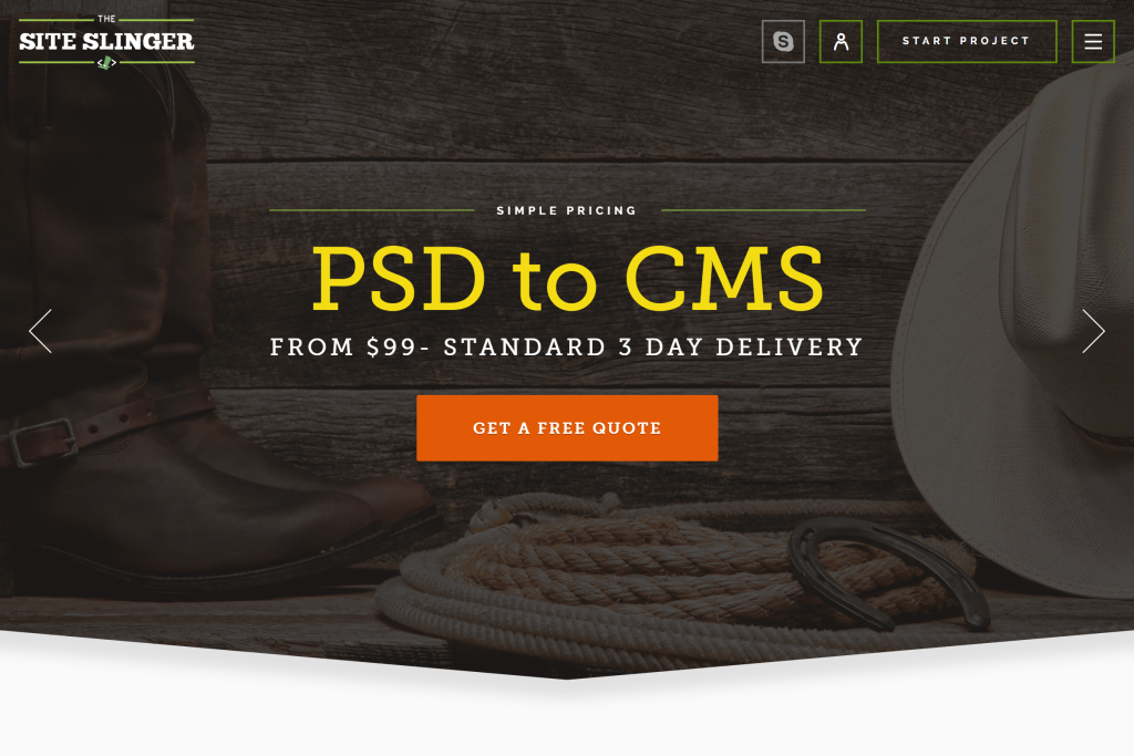
Overview
The Site Slinger is a U.S.-based development agency specializing in transforming design files into high-quality, responsive websites. They offer services like PSD to HTML, PSD to Bootstrap, and CMS integrations, catering to clients seeking precise and efficient front-end development.
Custom Development Services
Their offerings include:
- PSD to HTML5: Converting design files into cross-browser compatible, SEO-friendly HTML5 code.
- PSD to Bootstrap: Building responsive Bootstrap templates with flat per-page pricing.
- CMS Integrations: Developing feature-rich websites on popular CMS platforms like WordPress, Drupal, Shopify, Magento, and Joomla.
- Sketch to HTML: Hand-coding Sketch designs into structured HTML5/CSS3 code.
- HTML5 Banners: Creating animated, customizable HTML5 banners.
Why Choose The Site Slinger?
- Pixel-Perfect Development: Known for turning static designs into flawless, functional websites.
- Agency-Friendly Model: Offers white-label services, supporting creative firms in outsourcing execution without compromising quality.
- Fast Turnaround: Delivers projects promptly, crucial for time-sensitive web development needs.
- Client Testimonials: Clients praise their professionalism and quality of work, highlighting their ability to meet tight deadlines and deliver responsive front-end solutions.
GetDevDone

Overview
GetDevDone, a division of P2H Inc., is a global web development company offering comprehensive services ranging from PSD to HTML conversions to complex web application development. With over 19 years in the industry, they cater to digital agencies, startups, and enterprises seeking reliable and scalable web solutions.
Custom Development Services
Their extensive service offerings include:
- Custom Website Development: Building websites from scratch or revamping existing ones, tailored to client needs.
- Web Application Development: Creating scalable web applications using technologies like React, Angular, Vue.js, and more.
- eCommerce Solutions: Developing online stores on platforms like Shopify, WooCommerce, and Magento, including custom theme development and third-party integrations.
- CMS Development: Crafting custom themes and plugins for CMS platforms such as WordPress, Drupal, and HubSpot.
- Front-End Development: Delivering responsive, cross-platform websites with a focus on user experience.
- White-Label Services: Providing white-label development services for agencies, including dedicated account managers and flexible payment schedules.
Why Choose GetDevDone?
- Experienced Team: Access to over 500 top-tier front-end and back-end developers.
- Transparent Pricing: Offers instant AI-calculated quotes with no hidden charges.
- Flexible Engagement Models: Provides various engagement options, including on-demand, dedicated developers, retainers, and time & materials.
- Client Testimonials: Clients commend their streamlined communication, timely delivery, and high-quality work, making them a preferred partner for long-term projects.
Ajroni Enterprises Inc.

Overview
Ajroni Enterprises Inc. is a Florida-based digital agency that blends creative design with technical precision to deliver scalable, custom web solutions. With a growing reputation in the industry and a focus on small to mid-sized businesses, Ajroni stands out for its agile approach, collaborative culture, and rapid delivery.
Custom Web Development Services
Ajroni offers end-to-end web development tailored to unique client needs—whether it’s a branded corporate website, a customer portal, or a full-featured eCommerce platform. Their developers are well-versed in front-end and back-end stacks, often working with frameworks like React, Vue, Laravel, and Node.js to build responsive, SEO-optimized, and secure digital products.
Why Choose Ajroni?
- Industry Focus: Strong track record in business services, education, and IT sectors.
- Team Size: 10–49 specialists providing personalized attention and quick turnaround.
- Pricing: $100–$149/hour with a low minimum project size of $1,000.
- Client Review: “Lirim is a great person to work with, and his team made the process seamless.”
Clutch Highlights
- ⭐ 5.0 rating from 7 reviews
- Praised for: ease of collaboration, on-time delivery, and strong communication
- Services also include SEO and web design to support full-cycle projects
By the Pixel
Overview
Denver-based By the Pixel specializes in high-end custom web development and digital strategy. With a clear focus on mid-sized to enterprise-level clients, they craft solutions that blend robust back-end logic with clean, scalable front-end frameworks.
Custom Development Expertise
By the Pixel handles everything from complex integrations to headless CMS implementations and custom dashboards. Their work typically involves Laravel, WordPress, React, and Vue, paired with advanced infrastructure setups to ensure high performance and scalability.
What Makes Them Stand Out
- Primary Service Line: 75%+ of their services are custom web development.
- Preferred Clients: Automotive, nonprofit, and retail sectors.
- Team & Budget: 10–49 people; $150–$199/hour; $25,000+ project minimum.
- Client Quote: “Their professionalism, expertise, and commitment to our project were unmatched.”
Clutch Reputation
- ⭐ 5.0 average rating from 5 reviews
- Commended for: effective collaboration, adaptability, and proactive communication
- Known for building long-term partnerships with clients focused on growth
Coalition Technologies

Overview
With over 140 Clutch reviews, Los Angeles-based Coalition Technologies is one of the most established agencies on this list. Although they’re widely known for SEO, their web development team delivers complex, custom-built platforms aligned with modern performance, accessibility, and UX standards.
Web Development Capabilities
The Coalition team handles full-stack development projects that range from custom WordPress builds to custom-coded solutions for eCommerce and SaaS platforms. Their work frequently supports SEO from the ground up, ensuring clean code and optimized structures.
Key Attributes
- Scale: 50–249 team members, able to manage large-scale, multi-phase projects.
- Budget Flexibility: Projects starting at $1,000; hourly rate between $50–$99.
- Client Verticals: Strong presence in eCommerce, retail, and financial services.
- Client Testimonial: “We really appreciate the time that the Coalition team invested in our success.”
Review and Recognition
- ⭐ 4.8 rating from 147 verified reviews
- Clients highlight: timeliness, communication, and a results-driven mindset
- Also offers branding, SEO, and CRO services—ideal for businesses seeking a full-service digital partner
COAX

Overview
COAX is a full-cycle product development company that builds custom digital solutions for startups and established brands. With offices in Ukraine and the UK, they bring European software craftsmanship to a global clientele, emphasizing scalability, usability, and business impact.
Specialization in Custom Web Development
COAX’s development approach is structured around modern, maintainable architecture. They build bespoke websites, dashboards, and web apps using frameworks like Django, Ruby on Rails, and React, and often integrate complex APIs and third-party services to support user-focused products. Their services cater especially well to data-driven platforms and multi-user systems.
Highlights
- Client Focus: Especially strong in hospitality, retail, and eCommerce.
- Team Size: 50–249 developers, designers, and strategists.
- Engagement Models: Offers both fixed-price and dedicated team setups.
- Pricing: $50–$99/hour with a project minimum of $10,000.
- Client Quote: “The COAX team worked seamlessly together from start to finish.”
Reputation on Clutch
- ⭐ 4.9 rating from 17 reviews
- Known for: high-quality output, communication, and proactive problem-solving
- Flexible in methodology—working with Agile, Scrum, or waterfall depending on client needs
CodeIT

Overview
Based in Sofia, Bulgaria, CodeIT is a veteran software development agency with strong capabilities in web development, AI, and product design. Their tech-first culture and commitment to R&D make them a strong partner for companies looking for more than just code—they deliver solutions rooted in deep understanding and strategic execution.
Custom Web Solutions
CodeIT crafts tailored digital products for businesses in finance, healthcare, and manufacturing. Their expertise includes progressive web apps (PWAs), multi-tenant systems, and CMS-based platforms built from the ground up. The team also emphasizes user experience and scalable backend logic, with tech stacks often including Laravel, Angular, Vue.js, and custom PHP frameworks.
Key Features
- AI & Emerging Tech: Also operates CodeIT AI Lab to apply machine learning in web platforms.
- Budget & Pricing: $25–$49/hour; typical projects start from $50,000.
- Team Strength: 50–249 people, structured for enterprise-level project management.
- Client Review: “They stood out for their understanding of the project and technical depth.”
Clutch Performance
- ⭐ 4.9 rating across 26 reviews
- Praised for: communication, quality of engineering, and attention to long-term goals
- Offers full-cycle services—from discovery workshops to post-launch support
Dinarys GmbH

Overview
Headquartered in Mainz, Germany, Dinarys GmbH delivers sophisticated digital solutions for retail and enterprise. They specialize in eCommerce and custom web development, helping businesses upgrade outdated infrastructure, build new platforms, and seamlessly integrate third-party systems. With a presence across Europe, they support clients in both DACH and international markets.
Custom Development Services
Dinarys is especially known for blending eCommerce know-how with robust custom development. They build tailored solutions using Symfony, Laravel, Magento, and Shopware, often extending functionality with custom APIs and middleware. Their development process includes thorough business analysis and UX optimization, ideal for companies looking to align digital tools with strategic goals.
What Sets Them Apart
- Hybrid Skillset: Combines strong back-end engineering with conversion-focused UI/UX design.
- Industries Served: eCommerce-heavy, with clients in retail, B2B logistics, and fashion.
- Team Size & Engagement: 50–249 professionals; flexible team extension or project-based contracts.
- Rates & Projects: $50–$99/hour with project budgets starting at $10,000.
- Client Feedback: “Their developers truly understand not only code but also the user’s perspective.”
Recognition on Clutch
- ⭐ 4.9 rating based on 21 client reviews
- Known for: rapid onboarding, attention to detail, and real-world business logic integration
- A solid choice for custom eCommerce platforms that go beyond plug-and-play solutions
FuturByte

Overview
FuturByte is a fast-growing development partner for startups and enterprises seeking agility, technical depth, and a product-minded approach. With operations spanning Dubai and London, the company emphasizes modern tech stacks and rapid prototyping in its web development process.
Focus on Custom Web Development
FuturByte builds performance-focused web applications tailored to business workflows. Whether it’s a custom CMS, a SaaS platform, or an internal automation tool, they prioritize modular, future-proof codebases using tools like React, Next.js, and Node.js. They also offer DevOps support and continuous integration pipelines to maintain speed and scalability post-launch.
Highlights
- Tech Proficiency: Deep experience in full-stack JavaScript and cloud-based architecture.
- Industries: Strong presence in fintech, logistics, and professional services.
- Pricing & Scope: $50–$99/hour; minimum engagement from $10,000.
- Client Endorsement: “We were impressed by how quickly they turned our vision into a working product.”
Clutch Reputation
- ⭐ 5.0 rating with growing visibility
- Clients note: fast delivery, high responsiveness, and modern UI standards
- Ideal for businesses seeking both MVP launches and scalable long-term platforms
How to Choose the Right Fit for Your Project
By now, you’ve seen that there’s no single “best” web development company—only the one best suited for your goals, budget, and timeline. A company that builds internal tools for SaaS startups might not be the best pick for an eCommerce brand looking to scale globally. And vice versa.
As you review the options, try to think beyond the portfolio:
- Do they understand your business model?
- Are they flexible enough to scale with you—or small enough to stay agile?
- Can they speak your language—both technically and in terms of collaboration?
A beautiful site means nothing if it’s built in a silo. The best outcomes usually come from teams that ask sharp questions, challenge assumptions, and aren’t afraid to push back if they see a better solution.
It’s Okay to Start Small—But Think Long-Term
Not every project needs to begin with a six-month roadmap. In fact, some of the most successful platforms start with a single, well-scoped MVP and grow from there. If you’re just testing a new idea or need a reliable dev partner to bring designs to life, you can always start small and build trust over time.
At TheSiteSlinger, we work with designers, marketers, and founders who need reliable, well-built websites fast—without taking shortcuts. Whether you’re launching a landing page, a CMS site, or a custom frontend, we keep things lean and developer-friendly from day one.
For Bigger Builds, Go Bespoke
If you’re planning a large-scale digital product, a multi-role platform, or something that breaks the usual mold—you’ll want a team that lives and breathes custom web architecture.
Our partners at GetDevDone specialize in high-level custom web development. We’ve worked closely with them on projects that required deep backend engineering, API integrations, performance tuning, and scalable infrastructure. If your idea doesn’t fit inside a template, they’re a solid team to talk to.
One Last Tip: Vet for Chemistry, Not Just Skill
Technical skill is essential—but it’s not the whole story. The right partner will feel like an extension of your team. They’ll listen, adapt, and make decisions with your end-users in mind. That’s hard to spot in a portfolio—but easy to sense in the first call.
So take your time. Ask about process. Share your concerns. And when the right team clicks into place, you’ll know.
Need help bringing your designs to life or scoping out a bigger build?
Start with a quote from TheSiteSlinger or explore GetDevDone for full-scale custom web development.
Either way, you’re not just building a website. You’re building the backbone of your digital presence. Make it count.


