Top 5 Web Design Mistakes of Modern Websites

These days, when we stumble upon a website that doesn’t grab our attention or immediately meet our needs, we surf away faster then you can say “HTML.” So how do new sites grab and keep a user’s attention? One of the first steps in creating a compelling and useful website is by avoiding the 5 remarkably common web design mistakes detailed in this post.

In 2013 U.S. internet users spent nearly 70 hours online per month, and U.K.  users spent 43 hours online per month. We are so tied to the internet that many of us would rather lose a toe then our modem. Consequently, to some extent, we have all become web experts — or at least, very good at knowing how to find what we want.

These days, when we stumble upon a website that doesn’t grab our attention or immediately meet our needs, we surf away faster then you can say “HTML.” So how do new sites grab and keep a user’s attention? One of the first steps in creating a compelling and useful website is by avoiding the 5 remarkably common web design mistakes detailed below.

Web design mistakes

1. The site is outdated

While webpages don’t need to be trendy, they do need to be current, both in terms of aesthetics and information. A webpage is the public face of your company. If it looks outdated, consumers may assume that you no longer offer the services you claim to offer, or worse, that you are no longer in business. Unless you’re going intentionally retro, you don’t want images of flip phones or clunky computers. Use bright, contemporary images and design.  And be sure, of course, to keep your information up-to-date.

2. The site has no clear call-to-action

The call-to-action accomplishes two things:

  • It encourages users to further engage with your business.
  • It allows you to capture leads.

Place the call-to-action on your landing page. Often, the call-to-action is a form where users can leave email and request further information. But if a form is too complicated, at least be sure to encourage users to contact you. And be sure to make your contact information very accessible.

3. The site has no social media component

Facebook now has over 1 billion active monthly users. Twitter and Instagram are undeniable forces, along with Pinterest and LinkedIn. With the rise of social media, traditional disruptive marketing has been further replaced with the concept of content marketing: attracting customers by creating and curating useful and relevant content. You may do this by creating a deep library of texts and tools in your field for your customer; this, however,  is not an immediate requirement. What is essential is that you begin to create a community around your field­ — a community in which you are the experts. Social media is the best tool available for this project.

Responsive Web Design

4. Your site has a non-responsive web design

See our earlier post, “Why Responsive Web Design? Here’s 3 Reasons.” Non-responsive web design limits SEO, discourages on-the-go users, and can cost unnecessary time and money. Moreover, non-responsive web design is outmoded — users have come to expect, and need, responsive websites!

5. Bad UX: Your site is cluttered, incoherent and/or inconsistent

It amazes me how many websites still throw up incomprehensible walls of text. Or they use difficult-to-read fonts. Or they ignore the value of empty space. You want your information to pop, and usually, it will do so with the help of good graphic design. But unfortunately, good graphics don’t solve all of your design problems. Sites may look gorgeous, but because they are inconsistent in their use of font, color and general tone, they become unreadable. Moreover, if they lack good web-sense — that is, interactivity and smart layout — they can become just another pretty picture to surf past.

Remember that by the time you have collated all of your website’s content, organized it in a useful manner, and thrown in some nice graphics, your eyes have become tired. Ask for help. New eyes will see typos and inconsistencies. Moreover, outside experts can bring in new ideas that just may solve intractable communication issues you didn’t even know you had. There are several services you can use to test your site, such as Amazon’s Mechanical Turk, UserTesting, and TaskRabbit. We here at The Site Slinger also help out designers all the time with courtesy design or development feedback for a project you’re prepping. Want us to review something? Just let us know.

PSD to HTML

The Benefits of Flat Design

Flat design, which is often touted as the future of web design, is a trendy, minimalistic design aesthetic that eschews more complicated design techniques for a more simplified, classic appearance.

If you are planning to design a new website and are trying to decide what type of design is right for you, check out this post. It contains many of the benefits you will reap if you choose to design with flat design.

If you’ve paid attention to what is happening online, you’ve probably heard the term “flat design” – but what is flat design, exactly? Flat design, which is often touted as the future of web design, is a trendy, minimalistic design aesthetic that eschews more complicated design techniques for a more simplified, classic appearance.

Flat design is easy to identify when you spot it; it is often described as clean, and it incorporates straight, crisp edges, bright colors, and 2D illustrations (hence, the name “flat”). Not only is flat design appealing to the eye and easy to read, it also is known for its emphasis on usability and user-friendliness, and it is a great choice for anyone who wants their website to be easy to use for all of its visitors.

If you are planning to design a new website and are trying to decide what type of design is right for you, check out the list below. It contains many of the benefits you will reap if you choose to design with flat design.

Flat Design Example

1. Great for usability.

It’s just a fact that messages communicated simply and clearly are more easily digested by a viewer. Thus, flat design trumps in terms of usability, since it shuns complicated design elements and excess decoration for the bare essentials – just what the user needs to grasp or see to make the site function. Sites with flat design choose functionality while espousing modern style.

2. Better for Small Screens.

In today’s digital age, people are accessing the Internet via a huge range of devices – from desktops to laptops to tablets to mobile phones. Flat design is helpful because it tends to be both aesthetically pleasing and functional when adapted for a smaller screen. The reason flat design adapts well is because it incorporates a lot of white space and often uses large, clear buttons — which tends to “work,” and appear clear, even when viewed on a smaller screen or device. The latest developments with iPhone have even incorporated flat design, finally.

Flat Design Example

 3. Alleviate Technical Issues.

Flat design can alleviate common technical website issues.  Websites designed with flat design require fewer images to design, and they also need far less complicated coding, which often results in faster loading times and a site with less risk for glitches.

 4. Better SEO.

A site’s SEO ranking determines how high it appears in search engine results – which in turn increases the likelihood of new customers finding it. There are countless variables that go into calculating a site’s ranking, but one important one is a website’s speed (Basically, faster websites have higher rankings). When a site uses fewer images and smaller images, it takes a lot shorter time to load – which means, in general, that a site designed with flat design will have a shorter loading time and a higher SEO ranking.

5. Focus on content.

One of the best benefits of flat design is that it puts the website’s focus on content or function and not merely its design. You don’t want people visiting your site only because it looks cool or because they want to play with all of its bells and whistles – only to leave after appreciating its style and design. A flat-designed website’s simplicity makes clear its sole purpose, ensuring that people who visit, use its functions or complete a business transaction  – ultimately making your site a tool that serves solely to help you increase your business or cause.

Flat Design Icons

Image(s) source: All images in this post were obtained via Creative Commons license from Pixels Daily.

How to Create Awesome Landing Pages

The landing page is perhaps the second most important page on any website (besides the Checkout page, of course!). This is where casual lurkers turn into prospects and actionable leads. Building landing pages is part science, part art. In this blog post, we’ll tell you everything you needed to know about making landing pages that soak up leads like a sponge.

The landing page is perhaps the second most important page on any website (besides the Checkout page, of course!). This is where casual lurkers turn into prospects and actionable leads. Think of it as the wide mouth of a sales funnel, the part where you get to introduce your products and services to a hungry audience.

Building landing pages is part science, part art. In this blog post, we’ll tell you everything you needed to know about making landing pages that soak up leads like a sponge.

What is a Landing Page?

A landing page is just that – a page where a visitor lands.

That’s not very helpful, is it?

To be more precise, any page built specifically to capture visitor information and communicate a specific message is called a landing page, and is used by just about every online marketer. This leaves out your blog posts, home page and product listings, which are basically content pages. A product page with a big shiny ‘Buy Now’ button? That’s not necessarily a landing page, either.

Almost every landing page will have a form of some sorts. This can be a simple “Hey, we’re launching soon. Let us know your email and we’ll drop you a line when we’re live” form, or an in-depth form with over a dozen fields.

But enough talk. Let’s see what a landing page actually looks like:

As you can see, both these pages have a form. In fact, that’s the primary focus of the two pages – to get the visitor to give up some contact information.

This is exactly what a landing page is: a tight, controlled environment designed to capture leads.

Where Can You Use Landing Pages?

Landing pages can be used anyplace where you want to turn general user interest into something more concrete – an email or a telephone number. Mostly, they are used for:

  • Under Construction Pages: Your website may be under construction, but that doesn’t mean you won’t have stray visitors stopping by for a minute or two. Stick an email capture form and you can turn those stray visitors into prospects and customers.
  • Coming Soon Pages: Launching a new product or service? Why not add a lead capture form to turn casual interest into actionable leads?
  • Targeting an Audience: This is where you’re most likely to see landing pages in the wild. Suppose you’re starting a new ad campaign. Since you are a very savvy marketer, you want to make sure that every visitor who lands on your site leaves behind something – preferably an email address/phone number – so you can pitch him your products later. To do this, you can ad a lead capture form to the page, turning your marketing pitch into a landing page.

You can check out some landing pages yourself. Just type in a lucrative keyword like “online MBA”, “credit check”, or “online car loan” into Google, click on the sponsored results at the top, and note the kind of pages you see. More than likely, they’ll be sales pitches with a lead capture form built-in – that is, landing pages.

Or you can do the easy part and check out the inspiration gallery below.

Inspiring Examples

How to Build a Killer Landing Page

Creating landing pages can be hard – not rocket-science-brain-surgery hard, but fairly difficult. This is because every landing page must accommodate two very divergent schools of web design:

  • Conversion Centric Design: The objective here is to maximize conversion rate. Brand colors, overall site design, etc. can all take a walk. If it doesn’t help get more leads, it gets tossed out the window.
  • User Centric Design: This is the type of design you’re likely familiar with where users come first. You design to keep users happy and make your brand as appealing as possible. Conversion rates will be the last thing on your mind.

This doesn’t have to be an either-or situation. It’s perfectly possible to create high conversion landing pages that don’t look like one of those scammy “make $1M in 2 hours” sales letters, as we will learn below.

UI and UX for Landing Pages

People don’t read online. That’s a fact backed by solid research. Most of us scan a webpage from left to right, stop when we see something interesting, and move on. This is something you can use to your advantage when designing landing pages.

  • Grab the visitors with a BIG BOLD HEADLINE.
  • Your website visitors will scan the page from left to right. Make sure that you organize your information in the same way: all benefits and features of whatever you’re offering go on the left, the sign-up form goes on the right.
  • Don’t overcomplicate the page with too many bold shapes. Keep it simple – the visitor’s attention should be focused on the offer, not the graphics. Follow the guidelines in our list of pro tips for web design.
  • Keep as much information as possible ‘above the fold’.
  • Take out the top navigation menu, perhaps. Don’t give click-happy visitors a reason to leave the landing page.
  • On that note, remove all external links from the page. Now is not the time to go on a Wikipedia quoting spree.
  • Stick the necessary pages – About, Contact, Prices, etc. – at the very bottom. Again, these provide visitors a way to leave the site. You may have to include them because of ad network guidelines, but that doesn’t mean you have to make them prominent.
  • The lead capture form should dominate the right side of the screen.
  • Include a big sign up/submit button below the lead capture form.
  • Everything should “flow” naturally towards the lead capture form. It isn’t cheating if you stick a giant arrow pointing to the submit button.

Based on this, let’s take a look at the world’s ugliest sign up form:

Granted, it won’t win any web designing awards, but it should give you an idea of the barebones structure of any landing page.

Choosing Colors for Your Landing Page

Believe it or not, colors can actually affect your conversion rate. Some colors make you doze off, others literally scream “CLICK ME!”

Follow these guidelines when choosing colors for your landing page:

  • Use contrasting colors; it makes your copy easier to read. If in doubt, remember that you can never go wrong with black text on white background.
  • Pick up the basics of color theory. As per this theory, some colors trigger specific psychological reactions. Red, for instance, makes you pumped up (hence the idiom, “seeing red”), while black stands for luxury and sophistication. Yellow makes you perky because you associate it with the sun, while blue is a soothing color because it reminds you of lapping ocean waves and a clear sky.
  • Use a bold, contrasting color for the sign-up/submit button (arguably the most important element of a landing page). Orange seems to work exceptionally well in this role.
For more ideas and inspiration on using color, check out our list of 35 best web design resources.

Writing Copy for Landing Pages

A stunning landing page with poor copy is like a machine gun that shoots only blanks. Writing copy, of course, is an art (just ask Donald Draper), but there are a few guidelines you must follow in all your landing pages:

  • Write, then rewrite. The first time, you’re writing to put your own thoughts to paper. The second time, you’re refining it for the actual audience. Or, as Stephen King puts it: “Write with the door closed, rewrite with the door open.”
  • Keep it Short: Chop off any words that aren’t absolutely necessary.
  • Keep it Simple: This isn’t the place to bring out the thesaurus. Keep your copy simple and easy to understand.
  • Spend a lot of time refining the call to action (CTA). This is the first thing visitors will see on the landing page; make sure that it keeps them glued to their seats.
  • Create several alternative CTAs for testing purposes (see testing section below).
  • CTAs should be short – anything over 15 words goes straight into the trash can.
  • Use active voice. “Do it!” is far more effective than “This should be done!”
  • Humor is always good. Just make sure not to overdo it.
  • Headlines that begin with “How to…” can be very persuasive.
  • “Free”, “Secret”, “Quick”, “Discover”, “Fast”, “Proven”, “Results”, “Guarantee” are among the most persuasive words in your arsenal; use them judiciously.
  • Headlines that are also questions work great. This also gives you a chance to provide the answer in the benefits section.
  • Appeal to the readers emotions.
  • Magazine covers are a great way to learn how to write short, crisp copy. Us, People, and Cosmopolitan have this practically down to a science.
  • Follow the copywriting conventions and voice of your industry; landing page copy for enterprise CRM customers shouldn’t read like copy for a video game manufacturer.

Best Practices for Landing Page Design

Now that you know how to work the UI/UX, copy and colors, let’s consider some more best practices for landing pages:

  • People are hesitant to give away their private data for free. Give away stuff – an eBook, a phone consultation, a whitepaper, a discount code – to make them feel that they’re getting something in return.
  • Minimize “page leaks” – that is, links leading to other parts of the site, or worse, an external page.
  • Your call to action (CTA) should grab all eyeballs. Make sure that it is big, bold, and occupies major screen real estate above the fold.
  • Directional cues can be used to control how visitors read through the page. Arrows work great in this role, though you can also be more subtle by including a figure looking or pointing towards your target element (usually the lead capture form).
  • The submit button should tell the visitor what he stands to gain by clicking that button. Make sure it says something like “Get Free eBook” or “Get Free Phone Consultation” instead of a generic “Submit”.
  • Videos work great. Just make sure not to host them publicly on YouTube – your visitors will most likely leak away as soon as the cat videos load up.
  • Don’t do too many things on the landing page. Focus entirely on getting the visitor to submit user data.
  • List out major benefits of your offer. If you’re giving away a free eBook, for instance, include the top three things the visitor stands to gain from the book.
  • Testimonials from customers work great as social proof.
  • If you’ve got some major press, add an “As seen in” or “Featured in” section along with publication logos below the benefits.
  • Three words: ‘Always Be Testing’ (see below).
  • Use bullet points whenever possible.
  • Add a phone number along with working hours.
  • Include a link to your privacy policy or a disclaimer directly above or below the ‘Submit’ button (which you’ve hopefully changed to something more attractive). This reassures users that you aren’t just going to use their private data for nefarious purposes.
  • Responsive landing page designs can be efficient, but difficult to pull off perfectly. Small screens demand a unique approach to landing page design. If resources permit, skip responsive design and create separate pages for different screen sizes. If you’re unsure what responsive design is, check out this post.

Testing Your Landing Page

You can follow all the above landing page design guidelines and still struggle with poor conversions. This is why you need to keep testing landing pages until you arrive at something satisfactory.

Testing refers to split or A/B testing. In split testing, two different versions of a web page are shown to different users. The page that converts better is used for the final design (or further testing). It’s a lot like taste-testing; different combinations of ‘flavors’ are combined and a roomful of judges (i.e. your users) is asked the flavor that works the best.

There are many variations in testing which are beyond the scope of this tutorial. For the purpose of designing landing pages, you only need to know the following:

  • Create multiple versions of the same landing page, each with minor variations.
  • Create landing page ‘recipes’ with different ‘ingredients’. Say, one ‘recipe’ includes a long CTA with short copy, another with short CTA and long copy, and yet another with a video and sign-up form.
  • Keep on making changes until you come to see an agreeable conversion rate.
  • Small changes can often lead to big rewards. Changing something as simple as submit button color can increase conversions dramatically. Check out how 37Signals improved its conversions dramatically by making little changes.
  • Before you launch, make sure that your landing page is working perfectly. Use Amazon Mechanical Turk (MTurk) for user testing, for example, or UserTesting.com.

The Site Slinger code example

Coding Your Landing Page Design

You now know the secrets to creating a great looking, high converting landing page. It’s now time to go live with your very own custom coded landing page. This isn’t something everyone is looking to take on by themselves (see our 10 reasons for not coding your own HTML). So, let The Site Slinger help turn that amazing landing page design to code! With our PSD to HTML, PSD to Responsive, and PSD to Bootstrap services, you can create pixel perfect pages in no time. Be sure to try us out for that awesome landing page you just learned to create!

If you have an idea for an app but are unsure where to start, try our tutorial on how to create a web app.

Wireframing Tools, Design Inspiration, and Resources

Wireframing is often the first step in any web design process, where elusive ideas take starting taking a concrete shape. Long before the Photoshop mockups and the actual website, the designer will sit down with her favorite wireframing tool and sketch out different layouts and design ideas. Wireframing can also be a wonderful source of inspiration. Most professional designers swear by wireframing, which means this is one skill you wouldn’t want to go without. Read on for all things wireframe, plus tools and other design resources.

Wireframing is often the first step in any web design process, where elusive ideas take starting taking a concrete shape. Think of a wireframe as a very rough first draft of a novel, or a hastily drawn outline of a new sketch. Long before the Photoshop mockups and the actual website, the designer will sit down with her favorite wireframing tools and sketch out different layouts and design ideas. These will then serve as a ‘map’ guiding the designer throughout the website creation process.

Wireframing can also be a wonderful source of inspiration. Learning from wireframes made by others can help improve your design skills while also giving you new ideas on layouts, UI and UX. Most professional designers swear by wireframing, which means this is one skill you wouldn’t want to go without.

What is Wireframing?

Imagine you have to make a skyscraper. You have all the raw materials you’ll ever need and a construction crew that will work non-stop, without pay. You start off with a lot of enthusiasm but quickly learn that building a skyscraper is a lot more difficult than it sounds. You place blocks in the wrong place, struggle with interior design and misplace the elevator shaft. As you sit on the crumbling rubble of your failed skyscraper, you wonder, “if only I had a blueprint to guide me”.

This is exactly what wireframing is: it is a blueprint that helps you build your own skyscraper website. Just like you need a blueprint to construct any building more complex than four walls and a roof, you also need a wireframe to build larger, more complicated websites.

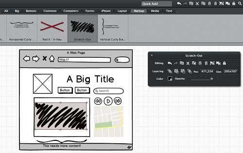
Website wireframes don’t include any real copy or graphical elements – just like a blueprint. Instead, wireframes are usually made up of placeholder elements that describe the basic structure and layout of a website.

how-to-wireframe

How to Create Wireframes

Wireframing is like sketching; there is no prescribed method for doing it. Some like to create freehand drawings, some like to use professional wireframing software, while some others are happy to cobble things together in Photoshop. Some of the most popular methods of creating wireframes are:

  • Freehand Sketching: Despite the ubiquity of software tools, drawing wireframes by hand still remains one of the most popular methods. It’s easy to see why: it’s fast, quick, cheap, and creating a new ‘canvas’ is as easy as turning over a page. One disadvantage, however, is that hand drawn wireframes can’t be shared easily. This is why most designers like to start off drawing wireframes by hand before moving onto digital wireframes that are easier to edit and share.
  • Dedicated Wireframing Software: Designers have a number of options to choose from when it comes to wireframing software (which we will cover below). These may be free or paid, cloud or desktop based. The wireframes thus created are easy to share, edit, and annotate – must have features when working with large teams and demanding clients.
  • Image Editing Tools: Some designers eschew professional wireframing tools in favor of image editing tools like GIMP, Photoshop, or even MS Paint. The only perceptible advantage to using such tools is that they cost nothing extra (i.e. if you’ve purchased the software already), whereas dedicated wireframing tools can cost several dollars a month.

The Four Step Wireframing Process

For professional web designers, creating wireframes is usually a four step process:

  1. The Brief: Before you can put the (metaphorical) pen to paper, you must first understand what your client really wants. The first step, therefore, is a client interview where you try and learn the client’s requirements. Ask direct, pertinent questions – “Do you want an image slider on the homepage? What navigation elements will you need?, etc.” – but also consider conceptual questions such as the client’s expectations from the website (drive traffic, inform audience) and its purpose (showcasing products, selling, generating leads). This will help you immensely during wireframing and the actual website building process.
  2. The Rough Sketch: In step two, you’ll create rough sketches, usually by hand, of the website. Grab a notebook and a pen and start cranking out prospective website layouts. Use popular websites as an inspiration and the client brief as the roadmap. Ideally, you should have several different website layouts up and ready for the next stage. Don’t be afraid to use different colors in your sketches to denote different sections.
  3. The Final Wireframe: Step three is where you turn your rough sketches into something more concrete. Use your dedicated wireframing tools to create the final version of the website layout and structure. Make sure that it can be easily shared and annotated.
  4. Feedback and Reiteration: In the final step, you’ll share your wireframe with your client and gather feedback. You may have to alter the wireframe, depending on the client’s feedback. This is where a professional wireframing tool comes real handy as it can not only capture notes and comments, but can only be edited to easily accommodate the client’s requests.

The process is slightly different for creating web apps, as there is much heavier focus on UX and UI. Refer to our previous post on launching a web app for more information.

Once the wireframing process is complete, you can start creating the first mockup in Photoshop. After the client’s approval, you can turn the mockup into an actual, live website using HTML and CSS. Some wireframing tools also have the capability to create dynamic, interactive HTML webpages from simple wireframes.

wireframe-inspiration

Getting Inspired

With wireframing, as with much of web design, you must stand on the shoulders of giants to create something new and extraordinary. Gathering wireframing ideas from top web designers is an essential part of the learning process and can help you to:

  • Kickstart the Visualization Process: Creating functional, yet attractive wireframes is essentially an exercise in visualization – to imagine how the eventual website might look from its flimsy, monochromatic, wireframe origins. And the best way to kickstart this process is to observe and learn from fellow web designers. Take a peak at our resources list below to get inspired now!
  • Understand UI and UX: UI (User Interface) and UX (User Experience) are the two most misunderstood concepts in web design. What might be pleasing to the eye might not necessarily be functional, and vice versa. Great designers seem to strike a balance between designs that are aesthetically pleasing but still navigable – a fact reflected in their wireframes.
  • Understand Conversion Flow: Websites aren’t merely beautiful placeholders for contact information; they are also meant to generate leads and make sales. By picking apart others wireframes, you can understand the conversion process and incorporate it into your designs – a must have skill for any modern web designer.
  • Keep Up With Trends: Web design trends change almost as often as winter fashion. Sure, there are a few layouts that’ll always remain popular – like a 2-column, justified webpage – but new trends emerge almost on a monthly basis. Parallax scrolling and jQuery sliders, for instance, are the two most popular trends currently. Another new buzzword is ‘responsive design’ (learn about it here). By observing others’ wireframes, you can stay abreast of the latest trends and incorporate them into your designs. Our previous post on 7 pro-tips for web design should serve as a good reference.
  • Learn Best Practices: There’s a reason a few layouts tend to dominate the web design marketplace – they simply work. Understanding best web design practices will go a long way in helping you create functional, beautiful websites. After all, as the Dalai Lama said, “Know the rules well, so you can break them effectively”.

“But”, you ask, “how do I find and learn from other designers?”

The answer, as we’ll learn below, is rather simple:

  • Break it Down: When you find a new, interesting website (online inspiration/CSS galleries are full of them – check out our ‘resources’ section for more information), try to understand how every element works structurally. Where is the navigation bar located? How far is it from the main website logo? Are there any sing-up forms in the navigation bar? Does the website include a static header or a dynamic image slider on the home page? How “busy” is the primary content section? How does the footer design differ from the overall layout?
    Asking questions like these will be help you build a stronger understanding of the web design concepts outlined above.
  • Sketch it Out: The best way to learn anything is by actually doing it. When you see a great website design, sketch the layout on a piece of paper. See how all the elements stack up. You can also port this design to wireframing software to play around with it further.
  • Make it Live: To truly understand how great designs work, take your wireframe and turn it into a mockup. Feel free to copy actual design elements – logo, images, graphics, etc. – from the original design since you’ll be using this only for learning purposes. Try to understand how the wireframe turns into a full-fledged, functional website with the addition of various design elements. This will help you a great deal in turning your wireframes into actual websites. You can even try coding it to HTML, though that isn’t generally a good idea (learn why in this blog post).

These tips apply to not just websites, but web/mobile apps and email newsletters as well. In fact, designing email newsletters poses an altogether new design challenge, as our previous post on 10 tips for designing HTML emails notes.

Balsamiq Mockups Wireframe

Tools

Designers are spoiled for choice when it comes to picking wireframing tools. There are dozens of tools in the market, some online, some desktop-based, some free, and some paid. We’ll take a look at some of the most popular tools below:

1. Balsamiq Mockups: Long held as the gold-standard in wireframing, Balsamiq is immensely popular with web designers and comes in both desktop and web-based avatars. Although it is packed with features, including many plugins, it does cost a pretty penny – $79 for the desktop version, and web-based plans starting at $12/month.

2. Pidoco: Pidoco is a web-based wireframing tool that’s quickly rising up the popularity charts. It boasts an extensive library of drag-and-drop web elements. Finished wireframes can be easily shared with clients, who can also leave notes and comments on the designs. Prices start at $9/month for a basic package.

3. Visio: Visio, a part of the Microsoft Office family, is more than just a wireframing tool – it is a complete diagramming software that allows anyone to create powerful, data-linked diagrams and flowcharts. Of course, it can be used for wireframing as well, though the interface does get a bit clunky, especially for large, more complicated websites. Prices start at $599, making it a poor choice for most web designers.

4. Axure: More than a simple wireframing tool, Axure is a powerful mockup software that helps you turn your wireframes into interactive, HTML websites. It is available for both Mac and Windows with prices starting at $289.

5. Adobe InDesign: InDesign, as you might be familiar, is Adobe’s flagship desktop publishing software. While the software is primarily used for creating magazine/book layouts, it can also be used for creating wireframes. But with limited functionality, you’re better off using a dedicated wireframing tool, especially considering the price.

6. iPlotz: iPlotz is a simple, web-based mockup tool with drag-and-drop functionality. Although somewhat limited in features, it’s a great tool for creating wireframes on the fly. You can also leave notes and discuss design elements with other team members. iPlotz offers a free version, though you might want to at least get the single-user license ($15/month).

7. PencilProject: For a free, open-source alternative, look no further than PencilProject. Available for both Mac and Windows, PeincilProject is feature rich, powerful, and most importantly, completely free!

8. OmniGraffle: OmniGraffle started out as a Mac favorite before making the transition to the iPad. It’s a great looking, feature-rich wireframing tool priced at $49.99 that’ll help you create website prototypes, conversion flow charts, sign-up process charts, etc.  The only downside is that it’s not available for Windows.

9. MockFlow: MockFlow is a web-based wireframing tool you can try for free online. Besides the familiar drag-and-drop model, it also supports extensive collaborating capabilities, making it a great choice for larger teams.

10. Adobe Photoshop: Last, but not the least, is Adobe Photoshop. Every designer worth his salt is already familiar with the software. Which is why it works quite well as a wireframing tool (although larger websites can get a bit cumbersome). On the price side, however, Photoshop doesn’t exactly come cheap.

Resources

Want some inspiration and help in creating wireframes? Check out our list of helpful websites and resources below:

Phew! That’s it for our guide to wireframing. Check this space for more tutorials, tips and advice on web design, development and wireframing in the future!

Photo credit (top): Mike Rohde / Foter / CC BY-NC-ND

Top 35 Free Web Design Resources

We love working with designers, and we know that you never can have enough free web design resources. Today we’re sharing a list of 35 of the best resources on the web for design freebies. Whether you’re looking for “plug and play” visual content, a beautiful new font, or some design inspiration, you’re bound to find a new favorite web design resource on our list.

Here at The Site Slinger, we help talented web designers like you turn your gorgeous concepts and layouts into fully functional websites. This gives you more time to do the work you’re best at – web design, of course! – by handling the coding for you.

We love working with web designers, and we know that you can never have enough free web design resources. Today we’re sharing a list of 35 of the best resources on the web for design freebies. Whether you’re looking for “plug and play” visual content, a beautiful new font, or some design inspiration, you’re bound to find new favorite free web design resources on our list.

Free Web Design Resources

Inspiration

Let’s face it – even the most talented among us get creatively stuck from time to time. So when it comes to sources of quick visual stimulation and idea generation, the more you know about, the better. Here are seven of our favorites.

  1. Designspiration is a visual smorgasbord of high-quality designs. There’s an awesome little search-by-color feature worth trying out, too.
  2. Pinterest Design Board is a nearly endless source of inspiration. This is the Design-specific board which is especially helpful.
  3. COLOURLovers Web Color Trends presents the hottest new hues and color palettes in web design.
  4. WebDesign Inspiration is a collection of beautiful web designs from around the world. Search by industry, type, style, color, and more.
  5. The Best Designs gallery displays the best of designer-submitted websites.
  6. Style Inspiration features a large database of attractive and innovative web designs. A new site is published to the database every single day.
  7. We Love Typography is an excellent source of typographic inspiration.

Stock Photography

Choosing quality stock photos can make your designs come alive – but you already knew that, didn’t you? Make sure you get to know these six places to find great free images.

  1. CompFight is a fast, easy way to search the Flickr image pool. The user-friendly interface clearly presents each image’s license agreement, available sizes, and a ready-mage HTML photo credit that you can copy and paste right into your site code.
  2. Unsplash offers beautiful photos, free for use without restrictions. The site’s slogan is “10 new photos every 10 days.”
  3. Foter makes it easy for you to search for, manage, and add photos to your online projects. The site includes useful search options for commercial and non-commercial use.
  4. FreeStockPhotos.biz has a collection of free stock photography with more than 16,700 images from a range of sources.
  5. stock.xchng is a free membership site with a gallery of close to 400,000 stock photos.
  6. The U.S. Government Photos and Images database includes photos that are in the public domain or U.S. government works and may be used without permission or fee.

BONUS! Wikimedia Commons is a resource I came across recently (so I’ve updated this list!). An easily searchable database with familiar Wikipedia-esque format, you’ll find this site to be valuable, with its use of categories and filters for free images.

BONUS #2! Getty Images (yes, Getty) recently opened up the majority of their collection in exchange for an open-embed program that lets users drop in any image, and they get to append a byline at the bottom of the picture with a credit and link to the licensing page. A great, and somewhat surprising, alternative to the usual free stock house options!

Free Stock Photo

PSD Elements, Icons, & Vectors

Sometimes you just don’t have time to create every visual element from scratch – and really, you shouldn’t have to. These five sources for non-photo design assets will help you when you’re short on time.

  1. Web Designer Depot’s freebies section offers a variety of free visual elements. It’s a great site to bookmark and check from time to time.
  2. Pixels Daily hosts a collection of free (via Creative Commons attribution license) and commercial (available for purchase through the Envato marketplace) design resources.
  3. 365psd makes a new, free PSD available for download every day.
  4. Premium Pixels is a collection of free design resources curated by UK-based web designer Orman Clark.
  5. psdGraphics is a graphic design library featuring fully editable Photoshop PSD files and high resolution graphics including abstract backgrounds, textures and patterns, and icons.

Fonts

They say “design is 95% typography!” Fonts can completely change the overall impression of your website. They can also be really expensive! That makes free fonts practically invaluable as design assets. Here are four places where you can stock up.

  1. Font Squirrel features hand-picked fonts that are 100% free for commercial use. The site also includes a webfont generator.
  2. Google Fonts has a collection of more than 600 open source fonts made specifically for the web.
  3. Creative Bloq recently shared a curated collection of 110 free fonts.
  4. FontSpace has great search matching – try ‘vintage’ or ‘retro’, for example – and a pleasing displayof their 21,000+ free fonts.

Video Tutorials

No matter how top-notch your design skills are, there’s always more to learn. Here are three of the best free tutorial resources to learn web design, particularly through videos.

  1. TutVid offers a large database of Photoshop tutorials created by designer and photographer Nathanial Dodson.
  2. Nettuts+ is dedicated to tutorials, videos, and articles on web design and development.
  3. Team Treehouse’s Become a Web Designer Library allows you to watch, but not download, some videos for free.

Free Video Tutorials

Social Networks

Social networks are a fantastic place for web designers to meet new colleagues and potential clients, share work and get feedback, and learn about the latest design trends. Some social media platforms, however, can be a waste of time for designers. These four social networks will bring you the best return on your time investment.

  1. Dribbble is a community of designers sharing screenshots of their work, process, and projects. It’s kind of like Twitter, but full of gifted artists and a lot nicer to look at.
  2. Behance is a public portfolio site for designers, illustrators, and other creative professionals.
  3. Twitter is a real-time information network that can connect designers and potential clients. Share/read interesting and relevant stories, ideas, images and news. Find, follow, and engage with your peers using this powerful micro-blog platform.
  4. Google+ offers a Communities feature that helps you find groups of people who love web design, web development, etc… as much as you do.

Blogs

We know you spend the majority of your time doing actual design work, but it’s also important to stay on top of the latest news in the design industry. You can’t beat blogs for the latest in free design news, information, and links to other excellent resources. Here are six to check out.

  1. Smashing Magazine’s mission is to educate readers on the latest trends and techniques in web design and development.
  2. Hey, Designer! curates and shares resources for web designers and developers that you won’t see everywhere else.
  3. Alltop Web Design aggregates the latest posts from popular web design sites around the web, including A List Apart, Logo Design Love, and Design Shack.
  4. Blog.SpoonGraphics shares design tutorials, articles, and downloadable free resources.
  5. Awwwards is both a web design blog and an opportunity for talented designers to submit their websites for recognition as Site of the Day, Site of the Month, and Site of the Year.
  6. Hongkiat is focused on sharing tools, freebies, and articles that designers and bloggers want to read. Many articles from the site have been picked up by bigger platforms including Lifehacker and Gizmodo.

And last but most definitely not least, we share freebies, tutorials, and advice here on The Site Slinger blog and on our Facebook, Twitter, and Google+ profiles. Come join us – we’d love to talk web design and development with you.

Your Turn!

What do you think of our list? What did we miss? Contact us to let us know, or ask us about how we can help you turn your designs into code.

Additional Freebies

Check out these other lists of free web design resources we’ve shared on our blog!

What is a PSD? The First Step to Web Design

As the top service for PSD to HTML on the Web, we throw around the term ‘PSD’ quite a bit. We’ve answered the question ‘What is PSD to HTML?‘ and provided a list of definitions of common web development terms, but now we break it down even further.

As the top service for PSD to HTML on the Web, we throw around the term ‘PSD’ quite a bit. We’ve answered the question ‘What is PSD to HTML?‘ and provided a list of definitions of common web development terms, but now we break it down even further.

What is a PSD?

Simply put, a PSD is a Photoshop design file. Technically, it stands for Photoshop Document, which is a proprietary file type from Adobe. Adobe’s Photoshop is the software most widely used for web design and works best for the design-to-code process.

PSD files are typically opened and edited with Adobe Photoshop, but can be opened with Adobe Photoshop Elements, and even certain non-Adobe products such as Corel’s PaintShop Pro and GIMP. However, programs other than Photoshop will not be able to fully edit or even read the complex layers utilized in many PSD files. Other advanced features within a PSD design may not be properly recognized, either. We highly recommend working with Photoshop from the beginning to ensure it will be universally accessible by designers and developers who may be involved with your project.

If you’re interested in a free program to simply view PSD files as flat images (no layers), Apple’s QuickTime, which includes Picture Viewer, will do the trick, but you can’t use the program to edit a PSD file. It is purely for viewing PSD files as images.

How Can I Create a Website with a PSD?

PSD files can be “sliced” and turned into HTML code by a proficient web developer. PSD to HTML services, such as The Site Slinger, specialize in just this. We take the PSD files and hand back HTML/CSS markup that’s ready for implementation as a live site.

Sometimes other file types are used by designers. While we may be able to work with PNG, IDD, or AI file types, we highly recommend PSD files. Working form other file types can require the added step of converting designs to a PSD file.

A “good” PSD is layered, and well organized using folders and layer comps to show different pages and states. Be sure to design all animation states, and button states (click, hover, off). Read more of our web design tips and check out the other resources below. In the end, we take your design and turn it into code, producing a website that matches your design pixel-perfect.

PSD File Structure

Technical Stuff

The PSD file type supports all image modes (Bitmap, Grayscale, Duotone, Indexed Color, RGB, CMYK, Lab, and Multichannel), which is part of the reason it is so widely used. It also supports clipping paths, channels, transparency information, and multi-level layers while other formats merely present ‘flat’ images.

The PSD file type preserves a design as layered images which is extremely useful for future editing (and re-editing) of different parts of a design. Each layer can be worked on individually, without affecting the rest of the elements in a design. You can also use a feature called ‘layer comps‘ to present variations of the same design. Photoshop can convert PSD files to other formats, such as PNG, JPG etc… so you can export a design for a wide variety of uses, like web graphics.

It’s also interesting to note that Photoshop files sometimes have the extension .PSB, which stands for “Photoshop Big”. According to Adobe, “The Large Document Format (PSB) supports documents up to 300,000 pixels in any dimension. All Photoshop features, such as layers, effects, and filters, are supported. You can save high dynamic range, 32‑bits-per-channel images as PSB files. Currently, if you save a document in PSB format, it can be opened only in Photoshop CS or later.”

You can read tons more about Adobe Photoshop File Formats Specification, if you want to delve further into the technical aspects of the PSD file type.

And here are some helpful tips and tricks on how to slice a PSD file efficiently if you want to try your hand.

Alternatives to PSD in Website Design

Sketch

Sketch is a vector-based design tool that is gaining popularity among web designers. It is available only on macOS and is designed specifically for web and app design. Sketch offers a range of features that make it easier to make responsive designs and then convert those into pixel-perfect HTML markups.

Pros:

  • Sketch is designed specifically for web and app design, so it offers features that are tailored to these types of projects.
  • Sketch’s vector-based design allows for easy scaling of images without loss of quality.
  • It offers a large library of plugins and add-ons that can streamline the design process.

Cons:

  • Sketch is only available on macOS, which can limit its accessibility to some designers.
  • It does not have the same level of support as Photoshop, so finding resources and tutorials may be more difficult.
  • Sketch has a steeper learning curve than some other design tools, which may make it less suitable for beginners.

Adobe XD

Adobe XD is a vector-based design tool that is available for both macOS and Windows. It is designed specifically for web and app design and allows designers to create wireframes, prototypes, and finished designs all in the same tool.

Pros:

  • Adobe XD is available on both macOS and Windows, making it more accessible to designers.
  • It allows for easy sharing and collaboration with other designers and developers.
  • Adobe XD’s vector-based design allows for easy scaling of images without loss of quality.

Cons:

  • It has a steeper learning curve than some other design tools, which may make it less suitable for beginners.
  • Some users report performance issues with larger design files.
  • It has fewer features and capabilities than Adobe Photoshop, which may limit its usefulness for some projects.

Figma

Figma is a web-based design tool that allows designers to create, share, and collaborate on designs in real-time. It is specifically designed for web and app design and offers a range of features that make it easier to design for responsive web design and UI design.

Pros:

  • Figma is a web-based tool, so it is accessible from any computer with an internet connection.
  • It offers a range of collaboration and sharing features that make it easy to work with other designers and developers.
  • Figma’s vector-based design allows for easy scaling of images without loss of quality.

Cons:

  • Figma requires an internet connection to use, which can be limiting for some designers.
  • It has a steeper learning curve than some other design tools, which may make it less suitable for beginners.
  • It has fewer features and capabilities than Adobe Photoshop, which may limit its usefulness for some projects.


Searching for a super fast PSD to HTML conversion service? You are in the right place. The Site Slinger experts will turn your design into a stunning, responsive, pixel-perfect HTML template in just a few hours. 

Get in touch with us, tell us about your project, and get delivered a perfectly coded template whenever you need it. 


Resources

Read further for tips and how-to’s for web design.

This is How to Launch Your First Web App

Building your own web application is a complicated, challenging and exciting process. It requires mastering a number of skills, from design to development. Fortunately, with the tools available today, starting a website is both easy and fun. Let’s take a look at how to launch a web app.

If you work on the web, you know that the launch of a new web application is a complicated, challenging and exciting process. Every day we see new projects come to life during the first steps in the development process, when you turn your photoshop comps into live HTML code. Getting the application into a workable (and marketable) product from there requires mastering a number of skills.

Let’s take a look at how to launch a web app, website or what-ever-you-are-building.

How to Launch a Web App

Website UI and Design

The days of blinking scrolls and clumsy tiled backgrounds are (thankfully) well past us. Spoiled by design-centric startups like Airbnb and Fab.com, users have come not just to expect, but demand good design. Design is also one of the quickest ways to set yourself apart from your competitors. It is, after all, the first thing users see on your site.

Thankfully, good design isn’t terribly expensive. You can even create simple webpage mockups by yourself if you follow some basic design principles, such as:

1. Sketching: Before you create a single pixel in Photoshop, spend some time sketching the basic vision of your web app on paper. This doesn’t have to be terribly complicated; you can draw out anything you want as long as it has some design coherence. This sketch should serve as a very rough map of what your final design might look like. Don’t be afraid to create several sketches until you reach a more concrete vision.

2. Wireframing: A wireframe represents an ‘X-Ray’ of your website. This is a rough schematic diagram showing the various components on any page. This wireframe can be as simple as a sheet of paper with different boxes denoting Header, Navigation Menu, Content and Footer. Ideally, wireframing and sketching should be done together. You can do this by hand, or use a tool like Photoshop.

3. Creating a Mockup: The third step is to create a mockup of your final design using the sketches and wireframing as a guide. Mockups can be created in Photoshop, or you can use design tools like Mockingbird or Balsamiq to create designs quickly. The mockup will reflect your final design, so take some time to flesh it out completely before moving on to the next step. There are a few things to keep in mind when creating a mockup:

  • Adopt a Theme: “Theme” is a very broad term that describes your website’s overall ‘mood’ or ‘feel’. Fab.com, is urbane and modern with a hint of hipster flourish, while Apple.com is clean and minimalist with a distinctly hi-tech vibe. Before you create a mockup, think about your site’s overall theme. Ask yourself: what do I want my users to feel when they visit this site?
  • Use Color Appropriately: Color can liven up a dull page, make an element stand out and even help you sell more. Color trends keep on changing every year. While web 2.0 was all about brash frivolity, startups are using more muted colors today. Here’s a quick recap of the dominant color trends in the past year, and what to expect in the near future.
    Color also has an effect on how users respond to your web app. Different colors trigger different responses. Bright yellow, for instance, draws viewers’ attention to a particular element. Orange, on the other hand, is great for call-to-action buttons (such as ‘Add to Cart’). Here’s good chart explaining different colors and how to use them effectively in your web app.
  • Keep Up with Trends: Web design trends change faster than the fashion in Paris. If you surf a lot, you can spot these trends as new startups push the boundaries of what is considered ‘good’ web design. Infinite scrolling and fixed headers, for instance, are among the latest new trends. You can find more specific trends for 2013 on Hongkiat.com.
  • Keep an Eye on Performance: While you’re bringing your grand design vision to life, also keep an eye on performance. Large pictures and heavy graphic use can bring down the performance, frustrating customers and even costing you a few positions in search engine rankings. It’s a good practice to keep file sizes as small as possible, and limit the amount of images you use on your web app.

Now that you’re on your way to finishing your web design, let’s look at another crucial usability component: UX.

UX | How to Launch a Web App

UX – User Experience

User Experience or UX refers to how people interact with your web app. This is a very broad field that covers everything from usability to conversion rates. As you can imagine, UX requires years of expertise and experience to master. You can hire a UX consultant like Theresa Neil, or tinker around on your own by following some basic UX principles:

1. K.I.S.S.: When it comes to UX, you can’t go too wrong following Apple’s UX dictum – Keep it Simple Stupid! Don’t use two elements where one can suffice, limit the number of choices for the customer, and ensure that your app can be used by even the most tech illiterate of users.

2. Big Words ≠ Big Returns: It’s common for new startups to wax poetic about the features and benefits of their web app, all at the expense of the customer. Keep the text on your web site as limited as possible (except on the blog, about-us page, etc.). Wherever possible, communicate through pictures and videos instead of text.

3. Focus on Numbers: The great thing about UX is that you get access to a ton of data to base your decisions on. Analytics tools like Google Analytics and KISSMetrics can help you track how little changes affect the overall user experience. A startup that focuses on performance metrics will almost always outperform one that adopts a ‘see what sticks’ approach.

4. Get Feedback: Getting subjective feedback on your web app is as important as focusing on performance data. Websites like UserTesting.com can give you a great overview of how visitors use your sites and what you can do to improve the overall user experience.

5. UX is an Ongoing Process: There is never a time when you can’t focus on UX. UX is a constant, endless process. You should constantly try to improve the user experience, no matter how great your conversion rates are, or how happy the users may seem.

Testing

Testing is the process of measuring the effectiveness of your web app. This is where the rubber meets the road. It’s a hard, gritty process that most startups fail to master. Essentially, it involves creating multiple variations of the same page and measuring their performance against each other. This is a purely statistical exercise and can be done by anyone by following a few simple tips:

1. A/B Testing: A/B testing, also called ‘split testing’, is used to measure the performance of two variants (labeled A and B) of the same page. Different versions of a page are shown to different users randomly. You can then calculate how each page performed viz-a-viz the other, and select the right page accordingly.

2. Small Changes Can Equal Big Rewards: You don’t always have to make sweeping changes to see dramatic improvements in conversion rates. Sometimes, the simplest of changes such as using different colored buttons and links can equal big rewards. Try out these simple changes before overhauling the existing design completely, and be open to learning from the mistakes of others.

Universal Accessibility

Have you ever tried to use one of your favorite websites on a smartphone or tablet and found the experience completely disappointing? In this ‘Age of Many Screens’, it is important to optimize not just for desktops and laptops, but also smartphones and tablets. Basically, everyone, regardless of screen size or device type, should be able to access your web app.

One way to go about this is by using ‘Responsive Design’. A web app with responsive design automatically changes to fit different screen types. It can expand to fill all the space on a 27” monitor, and squeeze down to fit on a 4” smartphone screen without any loss in usability. The Site Slinger specializes in creating responsive designs that look great on any screen.

While you’re creating responsive designs for your web app, also make sure that you create corresponding designs for your email marketing campaigns. The Site Slinger can code responsive email templates, as well.

Responsive Web Design

Development

Development is where all the planning and design finally pays off and your vision comes to life. It is often the hardest step in the entire app creation process, depending on who you ask. If you have prior coding experience, development can be a relatively straightforward experience, especially for simple web apps. Otherwise, you should be prepared to pay through your nose for a top notch custom developer to take your design live.

Hiring developers is an expensive process wrought with trial and error. Quality freelancers are not only expensive, but also extremely hard to find. You should expect to go through a number of developers before you find someone who fits your requirements.

An easier (and cheaper) alternative is to hire a PSD to HTML service like The Site Slinger. The Site Slinger specializes in turning PSD design files into actual live sites. We have years of experience working with startups and takes care of all the frontend development work so you can focus on what’s really important – sales, traffic and customers.

The Site Slinger converts designs into code for companies, including startups like WPEngine, Capital Factory, OwnLocal, and more. Our PSD to HTML team hand-codes a full Photoshop design into HTML5, CSS3 and all basic JavaScript animations, which is perfect for an app prototype or marketing site. We also have an amazing custom development team ready for all of your WordPress or web development requests. It’s a far smoother process than hiring (and firing) dozens of overpriced freelancers.

Conclusion

Building your first web app isn’t easy. You will have to do everything from creating the mockups to optimizing for better conversion rates. With a little help, however, you can go from prototype to live in a few short weeks and set your web app dreams in motion.

Resources

Web Design and UI

1. Smashing Magazine
2. Hongkiat
3. Introduction to Typography
4. Niice Design Search Engine
5. Designer News
6. MockingBird
7. Basic Wireframing
8. Advanced Wireframing with Keynote
9. Creating Your First Mockup
10. UI Design Resources
11. Planning Your Website with Sketches
12. 16 Tips for a Better Website
13. Startup Tips from Pro Designers

UX

1. How to do UX
2. Six UX Mistakes to Avoid
3. A Project Guide to UX Design
4. Don’t Make Me Think: A Commonsense approach to Usability
5. 52 Weeks of UX Design

Testing

1. Ultimate Guide to A/B Testing
2. TechRadar Guide to Testing Your Website
3. Introduction to Web App Testing
4. Getting Started with Conversion Rate Optimization

Universal Accessibility

1. A Book Apart: Responsive Web Design
2. Responsive Web Design: What is it and How to Use it
3. 30 Useful Responsive Web Design Examples

Useful Terms for PSD to HTML Services

We know how important effective communication is for our clients on any web development project. So, we’re offering up this handy ‘glossary of terms’ that you will find helpful for your next PSD to HTML project, or if you’re just beginning to learn about the design-to-code process.

We know how important effective communication is for our clients on any web development project. So, we’re offering up this handy ‘glossary of terms’ that you will find helpful for your next PSD to HTML project, or if you’re just beginning to learn about the design-to-code process. This list of web development definitions is especially helpful for creatives and designers who are migrating from print to the web space.

PSD to HTML Definitions

  • PSD to HTML – PSD to HTML is the process of taking Photoshop design files (“PSDs”) and coding them into HTML. Each PSD design file is hand-coded by a front-end developer. No code generators or automation here, pure hand-coded HTML and CSS goodness!
  • PSD – A Photoshop design file. Technically, it stands for Photoshop Document. Photoshop is the tool most widely used for web design and development and works best the design-to-code process. A “good” PSD is layered, well organized using folders, as well as layer comps to show different pages and states.
  • HTML – HyperText Markup Language. This is a simple way to refer to HTML5, CSS, and  JavaScript, the basic languges of the Web. This is the code that makes your design function as  website. Read more about HTML5 on our blog post.
  • Design to code – This is the general term for converting the visuals (design files) into code (HTML). Technically, not all design to code involves PSD files, and other filetypes like PNG and Adobe Illustrator’s AI filetype are acceptable in some cases.
  • Email template – This is the theme for a reusable email employed by businesses with an email marketing campaign. We take designs for email templates and code them, just as with a website.
  • Bootstrap  – Bootstrap refers to the Twitter Bootstrap framework, a responsive front-end development framework that is sleek and powerful. Especially useful for application development teams, it allows you to design and code in a consistent and reliable manner based on a grid which adapts to a user’s screen size, such as smartphones. It’s one of our favorites. Read more about it on the official page.
  • Responsive – The feature of being adaptable to various screen sizes, usually at least 3 breakpoints: desktop, tablet, and mobile device. Recommended widths for responsive websites are 1024px, 768px, and 320px, respectively. We break it down in further detail in this post. While Bootstrap is a favorite, we also work with Foundation, 960gs, and others.
  • WordPress – The most popular, and arguably most powerful, content management system (CMS). With SEO friendly URL management and easy page templating, WordPress is a great choice as a platform for your website.
  • jQuery – The most widely used front-end JavaScript library used to implement animation and functions such as dropdowns, tooltips, sliders, lightboxes and more.
  • Pixel perfect – The highest standard for execution of the PSD to HTML process.We aim to have our deliverables match, down to the pixel, your designs as you presented them.
  • Pop-up modals – A ‘page’ that pops up or otherwise animates into the screen upon completion of a certain action, like a button click.
  • Long page – In line with modern web design trends, we often see long pages with aim to put as much information into a page as possible, usually in the form of horizontal sections. These can be considered as two pages for coding purposes.
  • Slice – Basically, this means cutting up your Photoshop design into pieces, which are then put in order by HTML and styled/positioned by CSS. Read more about slicing on our blog post.
  • NDA – Non-disclosure agreement. We abide by NDA as a standard practice and guarantee that information about you or your project will not be made public. As this is our default policy, there’s no need to sign an explicit NDA, though we are happy to do so if you feel this is absolutely necessary. Your privacy is key, so we offer our products as white-label.
  • White-label – We produce the code for your organization, but do not brand or otherwise sign our markup in any way.
  • Markup – This is the code that we present back to you once we’ve converted your PSD files. ‘Markup’ refers to the finished product in the PSD to HTML process.
  • W3C – Shorthand for The World Wide Web Consortium. This is the international community that develops open standards to ensure the quality and growth of the Web. Our code complies with the standards established by this organization, which can reviewed here. They also offer a markup validation service.

If there’s anything else you need clarified, please let us know. We’re happy to add to this list to make the PSD to HTML process easier!

President Obama Visits Our Office

We’re extremely proud to be part of Capital Factory, where President Obama visited last week. As a buzzing technology hub it’s no surprise that President Obama and the CTO of the United States chose to visit Austin.

President Obama Visits Our Office

We’re extremely proud to be part of Capital Factory, a technology incubator, where President Obama visited last week. Austin is a buzzing technology hub so it’s no surprise that President Obama and the CTO of the United States chose to visit. He discussed a wide range of topics with us, from the JOBS act to the new Open Data Executive Order. It was an honor to meet him and an amazing spotlight on the Austin technology community.

We wanted to share some highlights from the President’s visit:

Celebrating Innovators

We are lucky enough to get to work with creative and technology professionals every day at The Site Slinger, so it was great to hear Joshua Baer quoting now Austin-resident, Dr. Bob Metcalfe (inventor of ethernet), say, “Celebrate our entrepreneurs like we celebrate our athletes.” to President Obama.

The President’s visit certainly did this, and we hope there’s a continued effort to highlight the creative and entrepreneurial people like you that we get to work with from Austin to Australia!

Why Austin?

When it comes to growth in technology, Austin is a unique place. The innovative spirit of Austin combined with the physical space at Capital Factory creates the density necessary for fast growth. It’s great to see this happening not only in Austin, but all over the globe in technology hubs.

Austin Tech Hub

How to Use Photoshop Layer Comps

If you’re one of those designers who prefer to design within a single master PSD file, while still being able to reuse elements and see design variations, then you’ll find the Layer Comps feature of Photoshop particularly useful. For comparing different design variations, don’t waste your time remembering the different layer positions, visibility states, and layer style settings. Keep your workflow efficient and your file easily deciphered by your developer, client or project manager.

If you’re one of those designers who prefer to design within a single master PSD file, while still being able to reuse elements and see design variations, then you’ll find the Layer Comps feature of Photoshop particularly useful. We know we do with our PSD to HTML projects.

For comparing different design variations, don’t waste your time remembering the different layer positions, visibility states, and layer style settings. Keep your workflow efficient and your file easily deciphered by your developer, client or project manager.

Enter Layer Comps

Layer Comps are an underused and incredibly helpful feature Adobe introduced in Photoshop CS. Layer Comps, or compositions, allow you to create and manage variations of your design without having to resort to multiple PSD files. Simply put, it gives you a snapshot of a state of the Layers panel. For web designers, this lets you clearly define what a page state should look like. It will also allow your developer the convenience of quickly moving between views, or referring back to the original state, without toggling the visibility of layers or shifting layer positions.

How to create a Layer Comp:
1. Adjust your layers into the design variation you want to save
2. Open the Layer Comps window (Window>>Layer Comps)
3. Click the ‘paper’ icon to “Create New Layer Comp” and name it
4. Repeat these steps for all variations you’d like to later view and manage

Options you can set for Layer Comps:
• Layer visibility – show or hide
• Layer position – save the position of each layer within the design
• Layer appearance – save the Layer Styles settings applied to each layer

Layer Comps
Image courtesy of Adobe.

We recommend using the Layer Comps feature of Photoshop for your PSD to HTML projects so you can communicate your design more clearly, and developers can easily see the variation or different page states. If you wanted to later, you could even save the Layer Comps into individual PSD files (File>>Scripts>>Layer Comps to Files), so there’s no loss in flexibility there. The organization of your designs and shareability of the PSD file will be improved, and your client, project manager and developer will love you for it!

You can read more about the specifics of using layer comps directly from Adobe, here.