Drupal 8 Modules to Make an E-Commerce Website More Profitable


Ecommerce modules

These days, fewer consumers want to waste their time standing in lines or roaming around shopping malls in search of things they need. Why all that trouble? Just open up an e-commerce website, make a few clicks, and get nearly everything under the sun delivered right to your threshold.

Among numerous e-commerce solutions, Drupal is gaining more significance with every passing year. Although it doesn’t include e-commerce features by default, unlike such platforms as Shopify or Magento, Drupal 8 makes up for it with a well-developed system of modules.

If we run a search on the official Drupal website, it returns 1,756 e-commerce modules at the moment of writing this post. While that’s a huge number, you don’t need to install all of those extensions. Just find out what consumers value in an e-commerce solution above all and pick one module for each requirement. 

Drupal modules


What Do Customers Need in an E-Commerce Site Above All? 

While many aspects are important for online stores to succeed, we believe that some areas are really crucial: 

    1. SEO. Customers need to know about your offerings and should be able to find your store in the vast space of the Internet.
    2. Convenient purchasing procedure: 
  • The checkout process should be short and intuitive. 
  • There should be a number of payment channels for customers’ convenience. 
  • Prices should be calculated in all possible currencies. 
  • Customers should know exactly how much they will have to pay for shipment depending on their location. 
  • Customers should get a detailed invoice right after they’ve made a purchase. 

When your e-commerce site is easy to use, it contributes to higher customer satisfaction, generates more traffic, and ultimately increases the conversion rate. Now, let’s review the top Drupal 8 modules that can make an e-commerce website more lucrative. 

Our List of Top Drupal 8 E-Commerce Modules 

SEO Checklist 

SEO Checklist

This module helps Drupal site owners remember every SEO task required to improve their online store’s search engine visibility. The SEO Checklist will ensure you don’t forget to clean duplicate content, use keywords in headings, optimize images with descriptive ALT tags, or perform many other essential SEO tasks. You’ll be notified whenever you’ve missed one of the items on the list.

Moreover, if you’re not sure about the best way to handle a certain SEO task, the module will helpfully suggest the best options for you. The same thing happens if you’ve done something wrong from SEO’s point of view. The module will “complain” and tell you exactly what’s amiss. 

We all know how frequently Google loves changing its search algorithm. With SEO Checklist, though, it’s not an issue, since it gets updated on a regular basis. Any of Google’s new rules are immediately reflected in the module’s list. 

Ubercart 

If you’re a small or mid-size business owner, you’ll find this module simply indispensable. It helps you create a ground-level shopping cart system in no time and with a minimum amount of effort. 

You can use Ubercart for any type of business, starting from selling physical merchandise like furniture or electronics and ending with downloading digital products like PDF files. This module enables you to do the following: 

  • Add products to a configurable catalog 
  • Create and edit orders 
  • Automatically generate accounts 
  • Add multiple images for the same product 
  • Track stock and get warning messages when some items are about to run out 

This list is far from complete. One of the most appealing Ubercart’s features is a one-page checkout — every e-commerce website owner’s dream. Customers don’t have to go through several forms on different pages until they can finally call something their own. 

Ubercart also includes an integrated payment system. It lets you select various payment options such as credit card or check, as well as payment processors, including PayPal, CyberSource, and others. That’s what we meant when we stressed the need for several payment channels on an e-commerce site. 

Currency

Currency

If your own country has suddenly become too small for your growing online business, you may want to move up to the international level. Then, you’ll have to adapt your online store for displaying prices in different currencies. That’s exactly what the Currency module is for. 

  • Convert currencies and present them in the appropriate format depending on a customer’s locale
  • Show the necessary information about specific currencies 

With Currency, you get the entire world covered. More profits without hassle!  

Conclusion 

The success of any e-commerce site depends to a large extent on a smooth user experience. If a customer can find an online store easily, have one checkout page instead of six, and pay in any currency via a gateway of his or her choice, the chance that he or she will become a regular is higher. 

While the e-commerce modules we’ve described in this post are a great help for any Drupal-powered online shop manager, building a truly secure, SEO-friendly, and feature-rich site requires professional assistance. 

The Site Slinger’s experienced Drupal developers can take care of many Drupal-related tasks including PSD to Drupal development. Just get in touch with us and let us turn your ideas into a perfect e-commerce solution. 

5 Hottest Web Development Trends in 2019

The hottest web development trends in 2019

We’re well into 2019 now, and the web development world is in many ways different from the 2018 edition. While all of the front-end technologies and practices that piqued people’s excitement in the last twelve months or so are still here, new trends are gradually cropping up. 

The key principle that all web developers, including the Site Slinger experts, strive to follow, though, remains unchanged. It’s the need to engage users and personalize their digital experience. We’ve prepared a rundown of the most notable web development trends in 2019 that focus on these goals exactly.

Progressive Web Apps Versus Responsive Websites: Meet the Winner

Progressive Web Apps

First, there were static websites with just HTML and not much else. Then came CSS, Javascript, and other technologies that made websites more dynamic and responsive. These days, however, responsiveness has transformed into a much broader notion.

Just a responsive website is no longer enough to meet the users’ growing demands in 2019. On certain devices, it may not look as attractive as you might expect. That limitation gave rise to an alternative solution: Progressive Web Apps (PWA).

A PWA is a website that perfectly adapts to the specifics of the device where it gets displayed: screen resolution and size, browser, and hardware features. As a result, it’s almost impossible to notice any differences between a PWA and a native app.

Here are the key benefits that PWAs give web developers and users: 

  • Since they can access the device’s hardware, you can use PWAs offline. 
  • They’re fast, even on outdated or poor-quality devices with a weak signal. 
  • They’re a step up in security compared with responsive websites 
  • They are cost-effective and less time-consuming to create. 

Your main takeaway? Lower bounce and higher conversion rates. 

“How may I help  you?” — AI and Chatbots

Artificial Intelligence

According to a recent report from Gartner, 37% of organizations have implemented Artificial Intelligence in various forms, and this trend is going to continue in the foreseeable future.

Almost every business website uses a live chat as a permanent point of connection with consumers. Now, this feature has become more sophisticated. No more need to hire a human support agent waiting for a customer to text a question at 3 a.m. 

Just get a chatbot made and keep it running day and night. Thanks to the breakthrough in Natural Language Processing, chatbots no longer resemble mechanically speaking toys. They’re now able to answer typical questions from the Q&A page in a much more meaningful way and even solve simple issues that users may encounter. 

So, expect chatbot development to remain in high demand in 2019 and years to come.

Push Notifications: Everywhere, Anywhere 

Email newsletters are still a popular way to inform consumers of new services or update them on company news. However, they are slowly but steadily being replaced by push notifications. 

In the past, these unobtrusive messages used to be limited to mobile devices. In 2019, an increasing number of website owners regard push notifications as a more valuable tool to stay in touch with their users. 

Which is better: the inbox drowned in hundreds of newsletters or a tiny notification icon on the toolbar? We would choose the latter. You can add the push notification feature to a website by subscribing to a service like PushWoosh. WordPress website owners can also take advantage of various dedicated plugins like PushEngage

The Site Slinger has implemented thousands of WordPress projects over the years. We are providers of all the services related to this most popular CMS in the world, including theming, customizing existing or building custom plugins from scratch.

No More Coding! Use Blocks

Blocks

New versions of content management systems provide more powerful features to their users than ever before. Know nothing about CSS rules or HTML tags? It’s OK. You can still put together a sleek web page just like a professional web designer does (well, almost). 

Simply take ready-made blocks or modules and mix them together. The website module building is only expected to grow in popularity in 2019 and beyond. That’s particularly true for WordPress users, who can use Gutenberg to “make adding rich content to WordPress simple and enjoyable.” 

Smooth Website Navigation: Motion UI

Websites with visually appealing and simple navigation elements are likely to hold users’ attention for a longer span. When they know where to go and find surfing a website enjoyable, they will keep returning to it. 

Creating smooth and straightforward navigation by using CSS animations/transitions is a trend that shows no signs of stopping in 2019. Motion UI is one of the best web development libraries for that purpose, flexible and customizable.

The Site Slinger web developers are skilled in creating dynamic and modern-looking interfaces by using a range of cutting-edge tools and libraries. 

Concluding Thoughts 

There’s no doubt: the web development industry is going to keep on flourishing. Websites and web apps are going to be faster, more secure, interactive, and AI-wise. Whatever modern technologies you select for your website, the top-of-the-line developers from The Site Slinger are always at your service.

Top 5 Web Design Mistakes of Modern Websites

These days, when we stumble upon a website that doesn’t grab our attention or immediately meet our needs, we surf away faster then you can say “HTML.” So how do new sites grab and keep a user’s attention? One of the first steps in creating a compelling and useful website is by avoiding the 5 remarkably common web design mistakes detailed in this post.

In 2013 U.S. internet users spent nearly 70 hours online per month, and U.K.  users spent 43 hours online per month. We are so tied to the internet that many of us would rather lose a toe then our modem. Consequently, to some extent, we have all become web experts — or at least, very good at knowing how to find what we want.

These days, when we stumble upon a website that doesn’t grab our attention or immediately meet our needs, we surf away faster then you can say “HTML.” So how do new sites grab and keep a user’s attention? One of the first steps in creating a compelling and useful website is by avoiding the 5 remarkably common web design mistakes detailed below.

Web design mistakes

1. The site is outdated

While webpages don’t need to be trendy, they do need to be current, both in terms of aesthetics and information. A webpage is the public face of your company. If it looks outdated, consumers may assume that you no longer offer the services you claim to offer, or worse, that you are no longer in business. Unless you’re going intentionally retro, you don’t want images of flip phones or clunky computers. Use bright, contemporary images and design.  And be sure, of course, to keep your information up-to-date.

2. The site has no clear call-to-action

The call-to-action accomplishes two things:

  • It encourages users to further engage with your business.
  • It allows you to capture leads.

Place the call-to-action on your landing page. Often, the call-to-action is a form where users can leave email and request further information. But if a form is too complicated, at least be sure to encourage users to contact you. And be sure to make your contact information very accessible.

3. The site has no social media component

Facebook now has over 1 billion active monthly users. Twitter and Instagram are undeniable forces, along with Pinterest and LinkedIn. With the rise of social media, traditional disruptive marketing has been further replaced with the concept of content marketing: attracting customers by creating and curating useful and relevant content. You may do this by creating a deep library of texts and tools in your field for your customer; this, however,  is not an immediate requirement. What is essential is that you begin to create a community around your field­ — a community in which you are the experts. Social media is the best tool available for this project.

Responsive Web Design

4. Your site has a non-responsive web design

See our earlier post, “Why Responsive Web Design? Here’s 3 Reasons.” Non-responsive web design limits SEO, discourages on-the-go users, and can cost unnecessary time and money. Moreover, non-responsive web design is outmoded — users have come to expect, and need, responsive websites!

5. Bad UX: Your site is cluttered, incoherent and/or inconsistent

It amazes me how many websites still throw up incomprehensible walls of text. Or they use difficult-to-read fonts. Or they ignore the value of empty space. You want your information to pop, and usually, it will do so with the help of good graphic design. But unfortunately, good graphics don’t solve all of your design problems. Sites may look gorgeous, but because they are inconsistent in their use of font, color and general tone, they become unreadable. Moreover, if they lack good web-sense — that is, interactivity and smart layout — they can become just another pretty picture to surf past.

Remember that by the time you have collated all of your website’s content, organized it in a useful manner, and thrown in some nice graphics, your eyes have become tired. Ask for help. New eyes will see typos and inconsistencies. Moreover, outside experts can bring in new ideas that just may solve intractable communication issues you didn’t even know you had. There are several services you can use to test your site, such as Amazon’s Mechanical Turk, UserTesting, and TaskRabbit. We here at The Site Slinger also help out designers all the time with courtesy design or development feedback for a project you’re prepping. Want us to review something? Just let us know.

PSD to HTML

The Benefits of Flat Design

Flat design, which is often touted as the future of web design, is a trendy, minimalistic design aesthetic that eschews more complicated design techniques for a more simplified, classic appearance.

If you are planning to design a new website and are trying to decide what type of design is right for you, check out this post. It contains many of the benefits you will reap if you choose to design with flat design.

If you’ve paid attention to what is happening online, you’ve probably heard the term “flat design” – but what is flat design, exactly? Flat design, which is often touted as the future of web design, is a trendy, minimalistic design aesthetic that eschews more complicated design techniques for a more simplified, classic appearance.

Flat design is easy to identify when you spot it; it is often described as clean, and it incorporates straight, crisp edges, bright colors, and 2D illustrations (hence, the name “flat”). Not only is flat design appealing to the eye and easy to read, it also is known for its emphasis on usability and user-friendliness, and it is a great choice for anyone who wants their website to be easy to use for all of its visitors.

If you are planning to design a new website and are trying to decide what type of design is right for you, check out the list below. It contains many of the benefits you will reap if you choose to design with flat design.

Flat Design Example

1. Great for usability.

It’s just a fact that messages communicated simply and clearly are more easily digested by a viewer. Thus, flat design trumps in terms of usability, since it shuns complicated design elements and excess decoration for the bare essentials – just what the user needs to grasp or see to make the site function. Sites with flat design choose functionality while espousing modern style.

2. Better for Small Screens.

In today’s digital age, people are accessing the Internet via a huge range of devices – from desktops to laptops to tablets to mobile phones. Flat design is helpful because it tends to be both aesthetically pleasing and functional when adapted for a smaller screen. The reason flat design adapts well is because it incorporates a lot of white space and often uses large, clear buttons — which tends to “work,” and appear clear, even when viewed on a smaller screen or device. The latest developments with iPhone have even incorporated flat design, finally.

Flat Design Example

 3. Alleviate Technical Issues.

Flat design can alleviate common technical website issues.  Websites designed with flat design require fewer images to design, and they also need far less complicated coding, which often results in faster loading times and a site with less risk for glitches.

 4. Better SEO.

A site’s SEO ranking determines how high it appears in search engine results – which in turn increases the likelihood of new customers finding it. There are countless variables that go into calculating a site’s ranking, but one important one is a website’s speed (Basically, faster websites have higher rankings). When a site uses fewer images and smaller images, it takes a lot shorter time to load – which means, in general, that a site designed with flat design will have a shorter loading time and a higher SEO ranking.

5. Focus on content.

One of the best benefits of flat design is that it puts the website’s focus on content or function and not merely its design. You don’t want people visiting your site only because it looks cool or because they want to play with all of its bells and whistles – only to leave after appreciating its style and design. A flat-designed website’s simplicity makes clear its sole purpose, ensuring that people who visit, use its functions or complete a business transaction  – ultimately making your site a tool that serves solely to help you increase your business or cause.

Flat Design Icons

Image(s) source: All images in this post were obtained via Creative Commons license from Pixels Daily.

Bootstrap 3 Released!

The long awaited update to the premier responsive framework has arrived! On August 19th, the folks behind Twitter Bootstrap took the latest version out of beta and announced the release of Bootstrap 3, coinciding with the two-year anniversary of the original release. Here’s a few things about the release worth calling out.

Twitter-Bootstrap-Logo

The long awaited update to the premier responsive framework has arrived! On August 19th, the folks behind Twitter Bootstrap took the latest version out of beta and announced the release of Bootstrap 3, coinciding with the two-year anniversary of the original release.

Here at The Site Slinger, we’ve received many inquiries about Bootstrap 3 and have been waiting to get our hands on the latest, stable version. We’re excited to code up more responsive websites using the new Bootstrap, with all of its great improvements! Submit your PSD to Bootstrap 3 project today!

Here’s a few updates in the release worth calling out

  • Mobile first and always responsive! Nearly everything has been redesigned and rebuilt to start from your handheld devices and scale up. With Bootstrap 3 we’ve gone deep on responsive and mobile first—it’s built in and no longer requires a separate stylesheet. That’s great for most folks, but not everyone needs or wants an adaptive web site or application. To help, we’ve added some documentation and an example that disables the adaptive or responsive features with some extra CSS. Check out the Disabling responsiveness section or head right to the non-responsive example to learn more.
  • Better box model by default. Everything in Bootstrap gets box-sizing: border-box, making for easier sizing options and an enhanced grid system.
  • Super-powered grid system. With four tiers of grid classes—phones, tablets, desktops, and large desktops—you can do some super crazy awesome layouts.
  • New Glyphicons icon font! While they were gone for a while, we’ve since restored the Glyphicons to the main repo. In 2.x, they were images, but now they’re in font format and include 40 new glyphs.
  • Overhauled navbar. It’s now always responsive and comes with some super handy and re-arrangable subcomponents.
  • Modals are way more responsive. We’ve overhauled the modal code to make it way more responsive on mobile devices
  • Dropped Internet Explorer 7 and Firefox 3.6 support. For Internet Explorer 8, you’ll need to include Respond.js for all the media queries to work correctly. You can read more about browser support in the docs.
Source: Official Bootstrap Blog 

You can read the official Bootstrap blog post about the release, complete with a celebratory Montell Jordan – “This is How We Do It” music video — AWESOME!

In case you’re wondering what the heck Bootstrap even is…

Twitter Bootstrap was created by a couple of guys at Twitter to maintain consistency across many internal tools. In public form, it’s a free, yet powerful framework for front-end development of websites and web applications. It uses HTML and CSS-based layout templates for typography, and interface components like forms, buttons and navigation elements. The key is that it’s a highly flexible framework built for the new era of responsive web design. Learn more about our PSD to Bootstrap conversion process here.

bs-docs-bootstrap-features

Have questions or a design ready for us to review? Submit your Bootstrap 3 projects today!

This is How to Launch Your First Web App

Building your own web application is a complicated, challenging and exciting process. It requires mastering a number of skills, from design to development. Fortunately, with the tools available today, starting a website is both easy and fun. Let’s take a look at how to launch a web app.

If you work on the web, you know that the launch of a new web application is a complicated, challenging and exciting process. Every day we see new projects come to life during the first steps in the development process, when you turn your photoshop comps into live HTML code. Getting the application into a workable (and marketable) product from there requires mastering a number of skills.

Let’s take a look at how to launch a web app, website or what-ever-you-are-building.

How to Launch a Web App

Website UI and Design

The days of blinking scrolls and clumsy tiled backgrounds are (thankfully) well past us. Spoiled by design-centric startups like Airbnb and Fab.com, users have come not just to expect, but demand good design. Design is also one of the quickest ways to set yourself apart from your competitors. It is, after all, the first thing users see on your site.

Thankfully, good design isn’t terribly expensive. You can even create simple webpage mockups by yourself if you follow some basic design principles, such as:

1. Sketching: Before you create a single pixel in Photoshop, spend some time sketching the basic vision of your web app on paper. This doesn’t have to be terribly complicated; you can draw out anything you want as long as it has some design coherence. This sketch should serve as a very rough map of what your final design might look like. Don’t be afraid to create several sketches until you reach a more concrete vision.

2. Wireframing: A wireframe represents an ‘X-Ray’ of your website. This is a rough schematic diagram showing the various components on any page. This wireframe can be as simple as a sheet of paper with different boxes denoting Header, Navigation Menu, Content and Footer. Ideally, wireframing and sketching should be done together. You can do this by hand, or use a tool like Photoshop.

3. Creating a Mockup: The third step is to create a mockup of your final design using the sketches and wireframing as a guide. Mockups can be created in Photoshop, or you can use design tools like Mockingbird or Balsamiq to create designs quickly. The mockup will reflect your final design, so take some time to flesh it out completely before moving on to the next step. There are a few things to keep in mind when creating a mockup:

  • Adopt a Theme: “Theme” is a very broad term that describes your website’s overall ‘mood’ or ‘feel’. Fab.com, is urbane and modern with a hint of hipster flourish, while Apple.com is clean and minimalist with a distinctly hi-tech vibe. Before you create a mockup, think about your site’s overall theme. Ask yourself: what do I want my users to feel when they visit this site?
  • Use Color Appropriately: Color can liven up a dull page, make an element stand out and even help you sell more. Color trends keep on changing every year. While web 2.0 was all about brash frivolity, startups are using more muted colors today. Here’s a quick recap of the dominant color trends in the past year, and what to expect in the near future.
    Color also has an effect on how users respond to your web app. Different colors trigger different responses. Bright yellow, for instance, draws viewers’ attention to a particular element. Orange, on the other hand, is great for call-to-action buttons (such as ‘Add to Cart’). Here’s good chart explaining different colors and how to use them effectively in your web app.
  • Keep Up with Trends: Web design trends change faster than the fashion in Paris. If you surf a lot, you can spot these trends as new startups push the boundaries of what is considered ‘good’ web design. Infinite scrolling and fixed headers, for instance, are among the latest new trends. You can find more specific trends for 2013 on Hongkiat.com.
  • Keep an Eye on Performance: While you’re bringing your grand design vision to life, also keep an eye on performance. Large pictures and heavy graphic use can bring down the performance, frustrating customers and even costing you a few positions in search engine rankings. It’s a good practice to keep file sizes as small as possible, and limit the amount of images you use on your web app.

Now that you’re on your way to finishing your web design, let’s look at another crucial usability component: UX.

UX | How to Launch a Web App

UX – User Experience

User Experience or UX refers to how people interact with your web app. This is a very broad field that covers everything from usability to conversion rates. As you can imagine, UX requires years of expertise and experience to master. You can hire a UX consultant like Theresa Neil, or tinker around on your own by following some basic UX principles:

1. K.I.S.S.: When it comes to UX, you can’t go too wrong following Apple’s UX dictum – Keep it Simple Stupid! Don’t use two elements where one can suffice, limit the number of choices for the customer, and ensure that your app can be used by even the most tech illiterate of users.

2. Big Words ≠ Big Returns: It’s common for new startups to wax poetic about the features and benefits of their web app, all at the expense of the customer. Keep the text on your web site as limited as possible (except on the blog, about-us page, etc.). Wherever possible, communicate through pictures and videos instead of text.

3. Focus on Numbers: The great thing about UX is that you get access to a ton of data to base your decisions on. Analytics tools like Google Analytics and KISSMetrics can help you track how little changes affect the overall user experience. A startup that focuses on performance metrics will almost always outperform one that adopts a ‘see what sticks’ approach.

4. Get Feedback: Getting subjective feedback on your web app is as important as focusing on performance data. Websites like UserTesting.com can give you a great overview of how visitors use your sites and what you can do to improve the overall user experience.

5. UX is an Ongoing Process: There is never a time when you can’t focus on UX. UX is a constant, endless process. You should constantly try to improve the user experience, no matter how great your conversion rates are, or how happy the users may seem.

Testing

Testing is the process of measuring the effectiveness of your web app. This is where the rubber meets the road. It’s a hard, gritty process that most startups fail to master. Essentially, it involves creating multiple variations of the same page and measuring their performance against each other. This is a purely statistical exercise and can be done by anyone by following a few simple tips:

1. A/B Testing: A/B testing, also called ‘split testing’, is used to measure the performance of two variants (labeled A and B) of the same page. Different versions of a page are shown to different users randomly. You can then calculate how each page performed viz-a-viz the other, and select the right page accordingly.

2. Small Changes Can Equal Big Rewards: You don’t always have to make sweeping changes to see dramatic improvements in conversion rates. Sometimes, the simplest of changes such as using different colored buttons and links can equal big rewards. Try out these simple changes before overhauling the existing design completely, and be open to learning from the mistakes of others.

Universal Accessibility

Have you ever tried to use one of your favorite websites on a smartphone or tablet and found the experience completely disappointing? In this ‘Age of Many Screens’, it is important to optimize not just for desktops and laptops, but also smartphones and tablets. Basically, everyone, regardless of screen size or device type, should be able to access your web app.

One way to go about this is by using ‘Responsive Design’. A web app with responsive design automatically changes to fit different screen types. It can expand to fill all the space on a 27” monitor, and squeeze down to fit on a 4” smartphone screen without any loss in usability. The Site Slinger specializes in creating responsive designs that look great on any screen.

While you’re creating responsive designs for your web app, also make sure that you create corresponding designs for your email marketing campaigns. The Site Slinger can code responsive email templates, as well.

Responsive Web Design

Development

Development is where all the planning and design finally pays off and your vision comes to life. It is often the hardest step in the entire app creation process, depending on who you ask. If you have prior coding experience, development can be a relatively straightforward experience, especially for simple web apps. Otherwise, you should be prepared to pay through your nose for a top notch custom developer to take your design live.

Hiring developers is an expensive process wrought with trial and error. Quality freelancers are not only expensive, but also extremely hard to find. You should expect to go through a number of developers before you find someone who fits your requirements.

An easier (and cheaper) alternative is to hire a PSD to HTML service like The Site Slinger. The Site Slinger specializes in turning PSD design files into actual live sites. We have years of experience working with startups and takes care of all the frontend development work so you can focus on what’s really important – sales, traffic and customers.

The Site Slinger converts designs into code for companies, including startups like WPEngine, Capital Factory, OwnLocal, and more. Our PSD to HTML team hand-codes a full Photoshop design into HTML5, CSS3 and all basic JavaScript animations, which is perfect for an app prototype or marketing site. We also have an amazing custom development team ready for all of your WordPress or web development requests. It’s a far smoother process than hiring (and firing) dozens of overpriced freelancers.

Conclusion

Building your first web app isn’t easy. You will have to do everything from creating the mockups to optimizing for better conversion rates. With a little help, however, you can go from prototype to live in a few short weeks and set your web app dreams in motion.

Resources

Web Design and UI

1. Smashing Magazine
2. Hongkiat
3. Introduction to Typography
4. Niice Design Search Engine
5. Designer News
6. MockingBird
7. Basic Wireframing
8. Advanced Wireframing with Keynote
9. Creating Your First Mockup
10. UI Design Resources
11. Planning Your Website with Sketches
12. 16 Tips for a Better Website
13. Startup Tips from Pro Designers

UX

1. How to do UX
2. Six UX Mistakes to Avoid
3. A Project Guide to UX Design
4. Don’t Make Me Think: A Commonsense approach to Usability
5. 52 Weeks of UX Design

Testing

1. Ultimate Guide to A/B Testing
2. TechRadar Guide to Testing Your Website
3. Introduction to Web App Testing
4. Getting Started with Conversion Rate Optimization

Universal Accessibility

1. A Book Apart: Responsive Web Design
2. Responsive Web Design: What is it and How to Use it
3. 30 Useful Responsive Web Design Examples

Useful Terms for PSD to HTML Services

We know how important effective communication is for our clients on any web development project. So, we’re offering up this handy ‘glossary of terms’ that you will find helpful for your next PSD to HTML project, or if you’re just beginning to learn about the design-to-code process.

We know how important effective communication is for our clients on any web development project. So, we’re offering up this handy ‘glossary of terms’ that you will find helpful for your next PSD to HTML project, or if you’re just beginning to learn about the design-to-code process. This list of web development definitions is especially helpful for creatives and designers who are migrating from print to the web space.

PSD to HTML Definitions

  • PSD to HTML – PSD to HTML is the process of taking Photoshop design files (“PSDs”) and coding them into HTML. Each PSD design file is hand-coded by a front-end developer. No code generators or automation here, pure hand-coded HTML and CSS goodness!
  • PSD – A Photoshop design file. Technically, it stands for Photoshop Document. Photoshop is the tool most widely used for web design and development and works best the design-to-code process. A “good” PSD is layered, well organized using folders, as well as layer comps to show different pages and states.
  • HTML – HyperText Markup Language. This is a simple way to refer to HTML5, CSS, and  JavaScript, the basic languges of the Web. This is the code that makes your design function as  website. Read more about HTML5 on our blog post.
  • Design to code – This is the general term for converting the visuals (design files) into code (HTML). Technically, not all design to code involves PSD files, and other filetypes like PNG and Adobe Illustrator’s AI filetype are acceptable in some cases.
  • Email template – This is the theme for a reusable email employed by businesses with an email marketing campaign. We take designs for email templates and code them, just as with a website.
  • Bootstrap  – Bootstrap refers to the Twitter Bootstrap framework, a responsive front-end development framework that is sleek and powerful. Especially useful for application development teams, it allows you to design and code in a consistent and reliable manner based on a grid which adapts to a user’s screen size, such as smartphones. It’s one of our favorites. Read more about it on the official page.
  • Responsive – The feature of being adaptable to various screen sizes, usually at least 3 breakpoints: desktop, tablet, and mobile device. Recommended widths for responsive websites are 1024px, 768px, and 320px, respectively. We break it down in further detail in this post. While Bootstrap is a favorite, we also work with Foundation, 960gs, and others.
  • WordPress – The most popular, and arguably most powerful, content management system (CMS). With SEO friendly URL management and easy page templating, WordPress is a great choice as a platform for your website.
  • jQuery – The most widely used front-end JavaScript library used to implement animation and functions such as dropdowns, tooltips, sliders, lightboxes and more.
  • Pixel perfect – The highest standard for execution of the PSD to HTML process.We aim to have our deliverables match, down to the pixel, your designs as you presented them.
  • Pop-up modals – A ‘page’ that pops up or otherwise animates into the screen upon completion of a certain action, like a button click.
  • Long page – In line with modern web design trends, we often see long pages with aim to put as much information into a page as possible, usually in the form of horizontal sections. These can be considered as two pages for coding purposes.
  • Slice – Basically, this means cutting up your Photoshop design into pieces, which are then put in order by HTML and styled/positioned by CSS. Read more about slicing on our blog post.
  • NDA – Non-disclosure agreement. We abide by NDA as a standard practice and guarantee that information about you or your project will not be made public. As this is our default policy, there’s no need to sign an explicit NDA, though we are happy to do so if you feel this is absolutely necessary. Your privacy is key, so we offer our products as white-label.
  • White-label – We produce the code for your organization, but do not brand or otherwise sign our markup in any way.
  • Markup – This is the code that we present back to you once we’ve converted your PSD files. ‘Markup’ refers to the finished product in the PSD to HTML process.
  • W3C – Shorthand for The World Wide Web Consortium. This is the international community that develops open standards to ensure the quality and growth of the Web. Our code complies with the standards established by this organization, which can reviewed here. They also offer a markup validation service.

If there’s anything else you need clarified, please let us know. We’re happy to add to this list to make the PSD to HTML process easier!

President Obama Visits Our Office

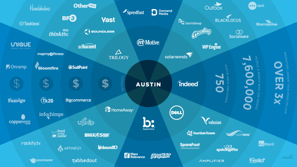
We’re extremely proud to be part of Capital Factory, where President Obama visited last week. As a buzzing technology hub it’s no surprise that President Obama and the CTO of the United States chose to visit Austin.

President Obama Visits Our Office

We’re extremely proud to be part of Capital Factory, a technology incubator, where President Obama visited last week. Austin is a buzzing technology hub so it’s no surprise that President Obama and the CTO of the United States chose to visit. He discussed a wide range of topics with us, from the JOBS act to the new Open Data Executive Order. It was an honor to meet him and an amazing spotlight on the Austin technology community.

We wanted to share some highlights from the President’s visit:

Celebrating Innovators

We are lucky enough to get to work with creative and technology professionals every day at The Site Slinger, so it was great to hear Joshua Baer quoting now Austin-resident, Dr. Bob Metcalfe (inventor of ethernet), say, “Celebrate our entrepreneurs like we celebrate our athletes.” to President Obama.

The President’s visit certainly did this, and we hope there’s a continued effort to highlight the creative and entrepreneurial people like you that we get to work with from Austin to Australia!

Why Austin?

When it comes to growth in technology, Austin is a unique place. The innovative spirit of Austin combined with the physical space at Capital Factory creates the density necessary for fast growth. It’s great to see this happening not only in Austin, but all over the globe in technology hubs.

Austin Tech Hub

How to Use Photoshop Layer Comps

If you’re one of those designers who prefer to design within a single master PSD file, while still being able to reuse elements and see design variations, then you’ll find the Layer Comps feature of Photoshop particularly useful. For comparing different design variations, don’t waste your time remembering the different layer positions, visibility states, and layer style settings. Keep your workflow efficient and your file easily deciphered by your developer, client or project manager.

If you’re one of those designers who prefer to design within a single master PSD file, while still being able to reuse elements and see design variations, then you’ll find the Layer Comps feature of Photoshop particularly useful. We know we do with our PSD to HTML projects.

For comparing different design variations, don’t waste your time remembering the different layer positions, visibility states, and layer style settings. Keep your workflow efficient and your file easily deciphered by your developer, client or project manager.

Enter Layer Comps

Layer Comps are an underused and incredibly helpful feature Adobe introduced in Photoshop CS. Layer Comps, or compositions, allow you to create and manage variations of your design without having to resort to multiple PSD files. Simply put, it gives you a snapshot of a state of the Layers panel. For web designers, this lets you clearly define what a page state should look like. It will also allow your developer the convenience of quickly moving between views, or referring back to the original state, without toggling the visibility of layers or shifting layer positions.

How to create a Layer Comp:
1. Adjust your layers into the design variation you want to save
2. Open the Layer Comps window (Window>>Layer Comps)
3. Click the ‘paper’ icon to “Create New Layer Comp” and name it
4. Repeat these steps for all variations you’d like to later view and manage

Options you can set for Layer Comps:
• Layer visibility – show or hide
• Layer position – save the position of each layer within the design
• Layer appearance – save the Layer Styles settings applied to each layer

Layer Comps
Image courtesy of Adobe.

We recommend using the Layer Comps feature of Photoshop for your PSD to HTML projects so you can communicate your design more clearly, and developers can easily see the variation or different page states. If you wanted to later, you could even save the Layer Comps into individual PSD files (File>>Scripts>>Layer Comps to Files), so there’s no loss in flexibility there. The organization of your designs and shareability of the PSD file will be improved, and your client, project manager and developer will love you for it!

You can read more about the specifics of using layer comps directly from Adobe, here.

10 Reasons NOT to code your own HTML

At The Site Slinger, we see LOTS of different kinds of web designs from our customers, and we hear lots of different reasons why they choose us to turn their designs into code. I wanted to share 10 of these reasons with you to show you the ways The Site Slinger helps you bring your designs to life, whether you are building a simple landing page, a complex web application, a WordPress theme, or even a great looking HTML email.

10 great reasons not to code your own HTML for your next project.

10. You can’t code.
Design to code services are for people just like you, no technical experience required. Don’t worry, developers don’t bite.

9. You are on a deadline (or multiple deadlines)
Rapidly approaching deadlines are not good for your stress level. If you don’t know how you will get the job done in time we have RUSH PSD to HTML options available.

8. You need jQuery or JavaScript animations
Most design to code services charge extra for JavaScript animations, we include it in the per page price.

7. Your client doesn’t want to pay for you to code by the hour
Using a design to code service for your website will be a fraction of what it would cost to code by the hour. We’ll even give you a PDF estimate to take to your client!

6. You don’t know any reliable web developers
Finding any good developer is hard, finding reliable outsourced development is even harder. You need someone you can count on who knows how to make you happy.

5. You have a LOT of pages to develop
If you build large, complex applications with extensive views, design to code services save you time so you aren’t wasting developer time coding HTML.

4. Your development team is backlogged
Your team is great, but they are busy building out your application. Don’t slow them down!

3. You are building a WordPress theme
WordPress sites are overtaking the web — everybody wants one and now you don’t have to be an expert to give it to them.

2. You build lots of web applications
We work with Bootstrap, 1140gridCSS, 960gsZurb and many other responsive web application frameworks. Get your prototype up in 5 days or less.

1. You are the smartest person on the planet and realize The Site Slinger should code your designs, not you.
We are happy to help!

Want to Learn More? See Examples!