Responsive Design: Why You’re Doing It Wrong

Responsive design isn’t a fad that arose because of a cool CSS technique, it’s an answer to a problem. Always remember that and constantly ask yourself whether or not you’re really adequately addressing that problem. If you’re using copy and paste to insert your media query breakpoints, your solution might be flawed.

Responsive design isn’t a fad that arose because of a cool CSS technique, it’s an answer to a problem. Always remember that and constantly ask yourself whether or not you’re really adequately addressing that problem. If you’re using copy and paste to insert your media query breakpoints, your solution might be flawed.

Let’s discuss why media queries exist and how we can leverage them to truly solve the quandary of the ubiquitous web. Let’s talk about why you should let your content determine the breakpoints of a layout, not hypothetical screen sizes.

This article is part of our series on “looking beyond desktop design”, brought to you in partnership with Heart Internet VPS.

The Idea Behind Media Queries

Responsive Design PSD to Responsive Screenshot

To begin this debate correctly, it’s necessary to discuss why media queries have suddenly become so popular. The answer is of course that “Responsive Design,” a term coined by Ethan Marcotte, is a fantastic way to address an ever-growing problem for web designers.

While everyone was ranting on and on about how the “mobile web” was going to overtake the traditional one, the revolution that took place was much more drastic: the web became ubiquitous.

This “problem” is great for the world as a whole, but a real headache for us. In the past decade, the worldwide web has transformed into something new. It’s no longer bound by the walls that we had previously established. I’ve said this before but it’s worth repeating. While everyone was ranting on and on about how the “mobile web” was going to overtake the traditional one, the revolution that took place was much more drastic: the web became ubiquitous.

At this point in time, we don’t access the web from a single point. We didn’t give up our laptops in favor of smartphones as “experts” predicted. Instead, the web is everywhere we are. It’s not only in our phones and computers, it’s in our tablets, iPods, gaming systems, televisions and even cars.

This trend will only continue as time goes on. Responsive design brings us past a season of creating separate mobile sites and into an era where we develop one site that evolves and adapts to the device that it’s being viewed on. Using media queries, we can present specific CSS to any number of different viewport sizes and make sure that everyone has the best possible experience.

The Problem With Responsive Design

The section above isn’t a semi-historical rant meant to fill space, it’s an important look at the goals that responsive design is meant to achieve. The question then becomes, does it meet these goals? Does responsive design adequately address the problem of ubiquity?

The answer is complicated, at best I can say, “it depends on how you do it.” That’s a confusing statement isn’t it? Responsive design is straightforward: use media queries to serve up custom CSS to different viewport sizes. This is how everyone approaches it right? So how can there be a right and wrong way?

screenshot

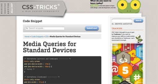
The complexity arises when we begin to discuss a crucial part of this technique: which media queries should I use? Or put a different way, which “breakpoints” should I target for custom CSS? The current popular answer predictably starts with the best “mobile” devices around: the iPhone and iPad (cue angry Android user comments). From these archetypes we establish so-called “generic” smartphone and tablet sizes. Then we move up and address laptops and small desktops and finally large screens. A standard set of media queries, like this one from CSS-Tricks, typically has nine or ten pre-established breakpoints.

What if we focused on the needs of a specific design instead of a hypothetical device use case? What if we built layouts that simply worked everywhere?

To be fair, this system does work to a certain degree. We’ve all seen lots of great responsive sites built using a set similar to Coyier’s above. However, I can’t help but think that this is somehow repeating the same mistake that we made by designing “mobile sites” a few years ago. The entire focus here is on the device viewing the site. Before we even build the site, we have these breakpoints in mind.

But devices change. We’ve already established that the web is being connected to pretty much everything with a power switch, so why are we once again placing so much emphasis on currently common screen sizes? Is there a better alternative? What if we focused on the needs of a specific design instead of a hypothetical device use case? What if we built layouts that simply worked everywhere?

Content Focused Responsive Design

The aforementioned problems with pre-established media queries occurred to me only as I dug in and really started producing responsive work on my own. In theory, the standard suggestions are great but once you apply them to a complex design you’ll discover that those breakpoints don’t always cover it. The problem, as the Boston Globe designers found quickly found out once the site went live, is that issues arise “in the in-between” (for the record, that project is fantastic and any layout issues have largely been addressed). Things get messy when the design is at a size that you didn’t account for and you have to go in and patch the holes after the fact.

I say this as an avid Apple fanboy: stop designing websites for the iPhone.


My question is, why don’t we start there? Instead of going into a project with a set of devices, and consequently media queries, in mind, why don’t we let the design decide? Every web page layout has a point where the browser size lessens its integrity. Our job as designers, in light of the problem of ubiquity, should be to find that size and account for it, then lather, rinse and repeat until all of the weak points are accounted for.

I say this as an avid Apple fanboy: stop designing websites for the iPhone. Instead, design a website that maintains its integrity as its viewport size is reduced to any feasible state. Do keep specific devices in mind as a guide for your design (example: smaller devices tend to be touch-based, so make links large), but don’t put your blinders on and fail to look at the bigger picture: that your design should look good on any screen.

A New Workflow

So what does a content focused responsive design workflow look like? It’s simpler than you think. Obviously, you need a starting point of some kind. If you want to start mobile and go up, great. If you want to start large and come down, also great. I personally find it very difficult to really dig into a design and do it right if I’m starting at the mobile level, but there are many solid arguments for doing it this way.

Something magic happens when you follow this workflow.

Hypothetically, let’s say you started with a large, 1020px wide site. Check it out on the largest screen you can get your hands on and make sure it looks great. Now drag the window and make it smaller until the design gets ugly. There’s your first breakpoint. Set a media query for that point and fix everything that you need to address. Once you’re finished, grab that window and find the next point of ugliness. Repeat these steps until you’re satisfied with the range that you’ve accounted for.

But what about the iPad? What about the Kindle Fire or Samsung’s latest attempt at being relevant? Something magic happens when you follow this workflow. You just made it so that the layout looks good at just about any size. If you did it right, then when you pull it up on your phone or tablet, it’s going to look great.

Layout Only
Keep in mind this discussion refers to layout ratios only. You absolutely don’t get out of testing functionality on different browsers and devices. Responsive design does nothing to account for the fact that different browser engines interpret HTML, CSS and JavaScript differently.

Conclusion

To sum up, media queries and responsive design provide us with an incredibly powerful tool to account for the fact that websites are being viewed by all manner of screens and viewport sizes. However, once we start pegging our designs to a handful of devices, we’re right back where we started. Your goal instead should be to build a layout that’s so versatile that it can handle almost any viewport size thrown at it.

This is all nice in theory, but where’s the example? The jumping off point of this discussion came from a recent attempt of mine to build a responsive image gallery. Check out that article for a look at how a content focused responsive design workflow might look in the wild.

50 Awesome Portfolios From Female Designers and Illustrators

Think that design is a man’s world? Think again. Today we’ve got over 50 stunning portfolios from extremely talented female designers hailing from all over the planet.

screenshot

Think that design is a man’s world? Think again. Today we’ve got over 50 stunning portfolios from extremely talented female designers hailing from all over the planet.


Why All Girls?

Let’s say you’re a female designer looking to build an online portfolio and you want to get some inspiration from what other female designers have done. Where would you look? A recent survey from A List Apart of over 26,000 web designers revealed that nearly 83% were male. This becomes quite evident when you start browsing through the plethora of portfolio roundups on design blogs, they’re typically all from guys! This post is meant to serve as inspiration for all the ladies out there looking to build a name in this industry.

The portfolios below absolutely blew me away in terms of talent on display. One reoccurring theme that simply can’t be ignored is how many female designers happen to be extremely gifted illustrators. I’m not sure if girls are more inclined to be artistically talented or not but this ratio seems to be much lower among males.

It doesn’t stop there though, you’ll see a strong display of proficiency in HTML, CSS, JavaScript, design theory and every other relevant skill to web design. Man or woman, this post should inspire you to be a better designer.

The Portfolios

Winnie Ho

“Hi, I’m Winnie, and this is my site. I live in Edmonton. I was born in Hong Kong. I love online gaming and creating web apps. I’m happiest when I’m playing games, designing, or building something that didn’t exist before.”

screenshot

Tanya Merone

“I am a Graphic Designer based in New York, specializing in User Interface Design and Development. I build clean, appealing, and functional interfaces which comply with the latest web standards. But that’s just a part of it. Design is my life. It’s my five-star spa. It’s my roller-coaster. It’s something I do before going to bed, and something I can’t wait to do in the mornings. Without it, my world would be black and white.”

screenshot

Meagan Fisher

“Raised in Florida, a new New Yorker via Boston. When not making websites, I try to write and speak about making websites.”

screenshot

Veerle Pieters

“I’m a graphic/web designer living in Belgium. My personal journal reflects my journeys through design, the web, and life, and I share them here with you.”

screenshot

Jessica Hische

“Jessica Hische is a letterer, illustrator and designer working in Brooklyn. You may already be familiar with one of her side projects such as Daily Drop Cap or her Should I Work for Free? flowchart. If not, howdy and pleasure to meet you!”

screenshot

Sarah Parmenter

“Sarah lives in Leigh-on-Sea, in Essex, about 40 minutes outside London, with her husband and little dog, Alfie. Sarah was sat infront of an Atari by her Dad at the age of 3 and always knew her career would involve a computer, somehow. At the age of 14, Sarah started dabbling in web design. At 19 she decided to pursue this as her full time career and started her studio ‘You Know Who’ and hasn’t looked back since. Now 27, Sarah has been lucky enough to work with some great remote colleagues and peers over the years and even luckier to call some of them great friends.”

screenshot

Tanya Maifat

“I am a freelance designer and digital/game artist. I enjoy designing game graphics, icons, teasers and tiny beautiful & smart illustrations for your websites and other projects.”

screenshot

Tina Roth Eisenberg

“I grew up in Speicher (AR), Switzerland, influenced by renowned Swiss design and a lot of fresh mountain air. In 1999, after completing my design studies in Geneva and Munich, I crossed the Atlantic and began designing in New York. Since then, I have worked at several prominent NYC design firms, including Thinkmap, where I served as Design Director and helped design the award-winning Visual Thesaurus. I now run my own studio, swissmiss, with recent clients including the Museum of Modern Art and the Food Network. My aesthetics reveal my Swiss roots – I am a firm believer in white space and clean, elegant design.”

screenshot

Jina Bolton

“Jina is a user experience designer at Engine Yard. Previously, she worked as a visual interaction designer and front-end web developer for super rad companies including Crush + Lovely and Apple, Inc. She enjoys creating beautiful experiences, and then she likes writing and speaking about it.”

screenshot

Shyama Golden

“I’m basically a one woman shop for art and design, though I do hire a couple of brilliant interface designers and developers at times. As a child, I learned how to write code because I figured one day this internet thing would help me share my art with nice people all over the world.”

screenshot

Hillary Hopper

“I am a creative. I can never seem to stop creating anything. There is always an idea, new picture, or some business idea running through my head. I can’t help but see a picture before I see words on it. I am drawn to color and the beauty around me. I have always been drawn to art and design. Growing up I was constantly in my sketch book or having some kind of craft happening on the dining room table.”

screenshot

Allison House

“My background in user interface design is accented by a multi-disciplinary skillset that includes visual design, UX methods, content strategy and project management. The result is beautiful, well-planned websites that are intuitive, engaging, and persuasive.”

screenshot

Natalie Nash

“My name is Natalie Nash, but I also go by my pseudonym, Pinky von Pout. I am 29 years old and I am a Graphic Designer. I have been married for 5 years, and live in a small Welsh town with my Husband, Jeremy and our three terriers: Sam, Jake and Tim.”

screenshot

Janna Hagan

“My name is Janna Hagan and I am 19 year old web designer originally from the beautiful province of Alberta. I am currently in my second year of Web Design & Development at Durham College in Oshawa, Ontario. I am a hard working individual with a great attention to detail. I enjoy new and challenging projects that push me to learn more in the great field of web design. Throughout college, I have gained great time managment skills that allow me to work on multiple projects at once.”

screenshot

Allison Nold

“As a professional graphic and web designer, I bring a range of art and design disciplines to every project I work on. From brand strategy and user interface design to creative writing and front-end development, my work exemplifies an appreciation for complete brand experiences.”

screenshot

Iris Sousa

“I provide UI design & products for web, desktop & mobile applications.”

screenshot

Dana Tanamachi

“Dana Tanamachi is a graphic designer and custom chalk letterer living in Brooklyn, New York.
She currently works at Louise Fili Ltd.”

screenshot

Naomi Atkinson

“An English Designer and Illustrator, passionate about the web.”

screenshot

Claire Coullon

“A freelance graphic designer specialising in typography, I work primarily with logo design, custom & hand drawn lettering and expressive typography. I also love print related work, especially book design & writing. Originally from France and currently living in Prague, Czech Republic, I co-run Op45 Creative Design Agency.”

screenshot

Adelle Charles

“A designer and entrepreneur at heart, Adelle Charles currently acts as Chief Creative Officer at Fuel Brand Inc. where she oversees all creative and strategic direction for the company. She is a known twitter addict with a geeky love for typography and Starbucks. Charles has a Bachelor of Fine Arts degree in Graphic Design from RIT and has won various awards for her past work in television.”

screenshot

Erica Schoonmaker

“I’m a graphic designer and native New Yorker currently living in San Francisco, CA. I love paper and books just as much as I love the internet and enjoy designing all types of projects across both web and print mediums.”

screenshot

Samantha Warren

“I love fusing smart concepts with creative, standards-based, accessible web design. I know that listening, understanding business and user experience goals, and adhering to standards are keys to well-executed design online.”

screenshot

Lindsay Burtner

“I’m a Rochester Institute of Technology New Media Design & Imaging 2009 Alumni. I worked at MODE in Charlotte, NC as an Interactive Designer/Developer.”

screenshot

Heath Waller

“I discovered my passion for web design quite by accident. The experience of teaching myself about this field has been both challenging and extremely rewarding. I wake up excited about continuing to grow in this rapidly-evolving industry.”

screenshot

Larissa Meek

“I have over 9 years of experience designing for the web and consider myself a standards enthusiast with a passion for visual design. I am well versed in design trends and usability with a strong handle on CSS and HTML. As an ACD at AgencyNet, I’ve had the pleasure to work on a multitude of diverse brands such as Fuse, Oxygen Networks, Bacardi, Ruby Tuesday, iN Demand, Howard Stern, Warner Brothers and many more.”

screenshot

Sara White

“Sara is a twenty-four year old living in the rainy yet beautiful city of Victoria, Canada. She has a degree in business but chose to ignore the corporate world and pursue her passion, design, instead. She’s currently the Creative Director at MetaLab and likes to spend her free time in the kitchen, dabbling in interior design, and occasionally taking pictures.”

screenshot

Geri Coady

“I’m Geri Coady — a Designer, Illustrator and Photographer working in St. John’s, Newfoundland — the oldest and most Easterly city in North America. Art, illustration, web design, graphic design, photography, typography, printing, advertising — how can I choose just one? My wide interest means I’m never bored — just the way I like it. I’m currently working as a Senior Designer at a local advertising agency where every day brings a new challenge.”

screenshot

Denise Chandler

“Hi, my name is Denise and I specialize in designing and building websites for small businesses and personal use.”

screenshot

Meg Hunt

“Hi! My name is Meg. I’m a self-professed jack of all trades, but currently work as an illustrator. My goal is to fill the world with my creations, and make people happy in the process. I want to explore and try new things; it’s my goal to branch out beyond editorial and into the living breathing world we inhabit. One day I would like to illustrate gift cards and childrens’ books and stationery and textiles and packaging and oh, all sorts of things. What do you say?”

screenshot

Laura Kalbag

“I’m Laura Kalbag and I design web sites. Sometimes I do design for other digital media and print, but I find web design inspiring, exciting, and I’ll go on about it for hours.”

screenshot

Inayaili de León

“Hi! My name is Inayaili de León and I’m a web designer. That means I make websites both beautiful and easy to use—I can make a lot of amorphous content look clean and easy to understand. I also take a lot of pleasure in coding mine and other people’s designs to make them work online.”

screenshot

Beth Dean

“I’m a user experience designer specializing in billing and payments for transactional sites, and mobile design.”

screenshot

Sneh Roy

“I am Sneh. I Design. I am the co-founder of LBOI, a design studio in Sydney, Australia. I love creating logos and wacky characters the most. I also design and develop websites, create original content for the web, blog about design here on LBOI and about food on Gel’s Kitchen. I also write design related articles for other websites and blogs.”

screenshot

Kelli Anderson

“Hi. I’m an artist/designer and tinkerer who is always experimenting with new means of making images and experiences. I draw, photograph, cut, print, code, and create a variety of designed things for myself and others. ”

screenshot

Andrea Garza

screenshot

Sarah Kaiser

“Currently I am a fourth year New Media Design student with Rochester Institute of Technology. I’m passionate about design, illustration, 3d and motion and possess some skills in development, print and web as well.”

screenshot

Amber Weinberg

“Specializing in the development of HTML5, CSS3 and WordPress using valid and semantic coding practices.
I also make apps for fun and write a blog.”

screenshot

Valerie Jar

“I’m a 24-year-old designer/illustrator located in Salt Lake City. Currently, I’m working at StruckAxiom. I’m inspired by art deco, vintage signs, hand-lettering, tattoo art and people. Art and bikes are two of my favorite things. I love the hidden symbolism and meanings behind common objects and everyday things, and oftentimes, that fascination will play a role in my design and illustration.”

screenshot

Megan Kirby

“Art director and graphic designer specializing in luxury brand development with multidisciplinary experience refining the brand story with illustration, print and interactive design.”

screenshot

Erika Van Der Bent

“Erika van der Bent, Freelance Designer for online / digital media , age 27.
Born and raised in The Netherlands. Started to discover the world of webdesign when I was 12 and I felt in love. Over the years I have worked for and with several different web-design companies.
A beautiful interface makes me happy!”

screenshot

Susan Murphy

“Once upon there was a freckly Irish girl name Sue. She studied Visual Communications in Dublin, is currently studying for a Masters in the USA and will soon be moving to work in the Netherlands. Never defined by a place or a thing, she always aims to try and be a master of all trades, a jack of none. ”

screenshot

Dever Thomas

“Dever Thomas is an aspiring graphic designer, illustrator, creative person, and soon-to-be graduate of Indiana University.”

screenshot

Melissa Pohl

“Like many designers, I grew up with a passion for drawing and artistic pursuits of all kinds. After high school, this love of creating lead me in various directions which included becoming a tattoo artist, hair-stylist, and painter. As soon as I was introduced to the world of digital graphics however, I fell in love.”

screenshot

Laura Javier

“I’ve got one foot in the world of print, one foot in the world of pixels, and a love for both. I’m graduating this spring with a degree in Communication Design, a sense of humor, and a mission to find some amazing people to work with.”

screenshot

Emma Taylor

“A creative freelance web and graphic designer based on the sunny island of Cyprus. With an ultimate passion for website design and development, branding and advertising material. Focusing on designing simple, clean attractive websites that fully comply with today’s web standards for wonderful clients across the globe.”

screenshot

Christina Fowler

“Who is she? She’s the descendant of generations of magic designers (since 2008). And she’s no ordinary woman. She’s girly. Full of personality. A good communicator. And – more.”

screenshot

Abigail (Ruby Too)

“I work full-time in ‘Ye Olde Web Towne’ at Harmonix. I do some visual design but I spend most of my days knee-deep in CSS & HTML (and learning JavaScript). I get to work with some of the most talented and entertaining people I’ve ever come across. I love my job.”

screenshot

Ciara panacchia

“My name is Ciara (pronounced Kee-rah). I come from a small town in Ireland called Carlow, but found a place to call home in U.S. when I moved to Illinois in 2005. Although my love of the Arts started at a very early age (since I could hold a pencil), I have been a dedicated student of design since 1998, I don’t think it is something you ever stop learning.”

screenshot

Heather Grossman

“I’ve been a web designer for more than a decade. I’ve learned many things about web design since starting out in this industry, and the things I’ve learned have helped me develop processes that benefit everyone involved in the projects I work on.”

screenshot

Susie Ghahremani

“Susie Ghahremani is a 2002 graduate of the Rhode Island School of Design (RISD) with a BFA in Illustration. Her artwork combines her love of nature, animals, music and patterns. Born and raised in Chicago, Susie now happily spends her time painting, drawing, crafting and tending to her pet finches and cat in San Diego, CA. ”

screenshot

Melissa Washin

“I am a designer and developer who builds websites and creates print materials for small businesses and agencies.”

screenshot

Aubrey Klein

“Hi, I’m Aubrey, a graphic designer living in Dallas, TX. I specialize in web, illustration, tweeting and thing-making.”

screenshot

Bianca Mangels

“My name is Bianca and I’m a Screen and Web Designer from Frankfurt (Germany). I love design in every form and I can’t get enough inspiration.”

screenshot

Courtney Joy

“I currently work full-time for a creative firm in Dallas called Vintage 56. We offer services in graphic design, audio engineering, video production and web development. My role, as the graphic designer, includes branding/logo marks, business cards, stationeries, brochures, occasional web UI, product packaging and keynote presentations.”

screenshot

Show Us Yours!

This post doesn’t even scratch the surface of extremely talented females in the design industry. If you’re one of them, leave a comment below with a link to your portfolio so we can check it out!

30 Gorgeous and Versatile CSS Menus

Sometimes the navigation menu can be one of trickiest parts of the design process. This single area can set the tone for the usability of the entire site. When you turn your PSDs into HTML, make sure your navigation is legit!

Sometimes the navigation menu can be one of trickiest parts of the design process. This single area can set the tone for the usability of the entire site.

Today we’ll look at 30 inspiring examples of good menu design. Though many are pure CSS, others add in some images and/or JavaScript to increase the aesthetic and functionality.

Delving Deeper

It’s always more helpful to get a feel for the process of the development than to merely see an image, so in this section we’ll briefly discuss the aesthetic of each menu and how the developer accomplished the effect. This way you can gain inspiration into how to use new methods to create your own unique menus.

Silk Tide

This is one of the most minimal menus on the list. It’s basically just plain text with an extended blue box rollover but it’s really easy to implement and results in a nice effect.

screenshot

Glenn Sorrentino

This example uses CSS borders on the top and bottom of the menu that increase in thickness when you hover over them.

screenshot

Strutta

If you have a textured background, consider using transparency in your menu to increase the aesthetic. This could easily be done with RGBa in CSS3.

screenshot

Elbow Park

Another example of transparency in the navigation area. This one uses a similar effect to the first example with the selection box extending up to the top of the page. This increases visibility and makes for a more seamless design.

screenshot

Thoughtbot

As you rollover these buttons the background changes to a brighter red. This combined with the glossy look (accomplished with a transparent PNG) creates the illusion of the area lighting up.

screenshot

Toffee Nut Design

This beautiful example uses CSS sprites for the navigation. The entire menu is one PNG showing each of the tabs in three states: off, on, and on+selected.

screenshot

Safarista

Here we see each section of the navigation as a hybrid of image and text. The icon, gradient and smaller background make each section’s image while the larger text is styled HTML with a underline hover effect.

screenshot

David Jonsson

Another simple hover effect that bleeds to the top. This one had hidden icons that only display when you mouse over. A nice effect!

screenshot

Asvalia

I really like the colors and the crooked text on this menu. The glowing rollovers are perfect.

screenshot

Bonsai Studios

This one is an extremely simple vertical menu with transparency and a darkening hover. It gets the job done, looks great and can be built in minutes.

screenshot

Great Expectations Church

Another vertical navigation menu. This one implements some basic but attractive icons and a background GIF with a gradient for the hover.

screenshot

Ryan Couser

This one uses some simple sprites to accomplish the hover. Each icon is an image with both the on and off states.

screenshot

Kk Media

Here we see a vertical menu with more detailed icons. Each link is an HTML list item with a simple background image applied in CSS.

screenshot

Bite Club

I really loved this navigation bar. The brightness really grabs your attention and the reversal of the colors makes a perfect rollover. This also uses a sprite for each menu item, each with three states.

screenshot

Capital City Equipment Company

I though the house shaped navigation selection was clever on this one. The text in each link is part of the image, if you replicate something like this it would be simple just to use live text over the background image instead.

screenshot

Strawberry Leisure

This dropdown menu uses a small repeating transparent PNG to pull of the reduced opacity effect. Again, we can look forward to this being much easier in the near future with RGBa when more browsers get on board.

screenshot

Artificial Studio

Yep you guessed it, more image sprites (sensing a trend here?). The big buttons and excellent gradients make for a beautiful navigation area.

screenshot

Cognigen

This was by far one of the most original concepts I came across in my search. To pull of the unique 3D effect, the designer has used a whopping four states for each button that change depending on whether the button is selected, hovered over, or has an adjacent selection.

screenshot

More CSS Menu Goodness

Now that we’ve discussed quite a few great examples, here are a bunch more to check out. Use your browser’s inspect feature to check out the code and images behind any that you like!

Manndible Cafe

screenshot

Code Greene

screenshot

Opera

screenshot

Mac Rabbit

screenshot

Clark Builders

screenshot

Mr. B and Friends

screenshot

Subvert

screenshot

The Swish Life

screenshot

Mystery Tin

screenshot

LiveResto

screenshot

FeelSocial

screenshot

Gowalla

screenshot

NZ Festival

screenshot

Download Prebuilt Menus!

Need a good starting point for your own CSS menus? Check out these great free resources.

Now Show Us Yours

Do you have a CSS menu that you’re particularly proud of? Use the comments below and leave a link so we can see. Also let us know which of the examples above you liked best.