Take Your Advertising Campaigns to the Next Level with Our HTML5 Banners

Our HTML 5 Banners

Advertising has always had a huge significance for businesses of all kinds. In the tough and highly competitive world of commerce today, though, it has acquired even greater importance than ever. 

Nowadays, all companies realize the value that online advertising can bring them. The leading position among online promotion methods is rightly occupied by the HTML5 banner ads.

HTML5 banners are highly engaging, visually attractive, and efficient means of conveying business messages and acquiring leads.

We at the Site Slinger saw the value of HTML5 banners right from the start. Now, after many years and thousands of successfully completed projects, we proudly hold the status of a leading provider of this type of display ads. Want to know exactly what we can offer you? Read on.

WHY HTML5? 

First, a few words about the technology itself. This is what makes HTML5 so desirable for making banners:

HTML5 Benefits

  • HTML5 banners will look perfect, regardless of the screen resolution of the device where they’re displayed. The Site Slinger builds completely responsive banner ads. 
  • A number of major advertising networks (e.g., Google Ads) accept ads built by using HTML5 and nothing else (e.g., Flash). 
  • HTML5 banners can have moving design elements. 
  • No add-ons are necessary. The target audience will see your message without fail. This is not always possible with Flash if a user has disabled it in their browser or simply forgot to update it. 
  • HTML5 banners weigh much less than ads built with the use of other technologies such as animated gifs. This significantly increases the page loading speed, contributing to better user experience and higher click-through rates.

These and other advantages of the HTML5 technology convinced our banner development professionals to make it our principal tool of the trade, and we’ve never regretted our choice. We’ve already built thousands of beautiful-looking, high-quality HTML5 banners of the following types. Take your pick!

Interactive

Interactive Banner One

As the name suggests, visitors can interact with this type of banner. For instance, they can see more information about the advertised products by using a slider right inside an ad or play a simple game without leaving an ad. 

In the end, a prospect or customer is taken to a landing page where they can view the corresponding offer in detail. That contributes to better brand recognition, plus a higher conversion and increased click-through rates. 

It’s true that interactive banners are the most expensive type of HTML5 ads we build: $124 for one. That’s because they require more effort and time it takes us to make one such banner. That said, interactive banners can hit the target three times more often than other types of ads on average. 

Simple Animated and Complex Animated 

Simple animated

Complex Animated Banner

While just a bit less engaging than interactive ads, these types of HTML5 banners are still very powerful tools in any digital advertiser’s arsenal. 

They represent design elements that move, hiding other design elements that appeared before them or taking their positions inside other elements at certain time intervals. Thanks to this effect, you have an opportunity to provide more information about your business propositions within the same square or rectangular area. 

Images or other design components can move once only in accordance with a specific animation effect (e.g., slowly appear on the background or float from one side of the ad to another) or do that a specified number of times. In addition, some elements can remain stationary while others are moving. The final price depends on how elaborate and effect-rich the ad is. 

Even though one complex animated banner costs $86, this is not expensive, considering what benefits these display ads can bring you (higher click-through rates and better engagement). 

Static 

Static Banner

Owing to relative simplicity, one such ad is way less expensive than its more exquisite “relatives.” Our price is $22 a piece. 

There are other positive aspects:

  •  Static ads are not annoying, taking up their portion of a page without “dancing” before a user’s eyes.
  • You can still send your message to the world loud and clear.
  • Static ads are always in sight. That contributes to better brand awareness.

The types of HTML5 banners we build

WE CAN HANDLE ANY OF YOUR REQUESTS  

We know that you may require something unique, something to produce the wow effect among your target audience. This is why our HTML5 banner ad service is not limited by the banner varieties we’ve described above. Just tell us what you need. We’ll implement any feature not included in our list. 

Have no design yet? No problem. We take care of the full development cycle, starting from the initial design and ending with the final delivery, and all this within one business day on average. We can also integrate a video file into your banner if necessary. 

In addition, we’ll make sure that your HTML5 banners seamlessly integrate with any advertising network, including IAB, Display & Video 360, Celtra, Google Ads, SIzmek, and others. 

So select a standard HTML5 banner or give us your own ideas. The Site Slinger is always here for you!

10 Reasons NOT to code your own HTML

At The Site Slinger, we see LOTS of different kinds of web designs from our customers, and we hear lots of different reasons why they choose us to turn their designs into code. I wanted to share 10 of these reasons with you to show you the ways The Site Slinger helps you bring your designs to life, whether you are building a simple landing page, a complex web application, a WordPress theme, or even a great looking HTML email.

10 great reasons not to code your own HTML for your next project.

10. You can’t code.
Design to code services are for people just like you, no technical experience required. Don’t worry, developers don’t bite.

9. You are on a deadline (or multiple deadlines)
Rapidly approaching deadlines are not good for your stress level. If you don’t know how you will get the job done in time we have RUSH PSD to HTML options available.

8. You need jQuery or JavaScript animations
Most design to code services charge extra for JavaScript animations, we include it in the per page price.

7. Your client doesn’t want to pay for you to code by the hour
Using a design to code service for your website will be a fraction of what it would cost to code by the hour. We’ll even give you a PDF estimate to take to your client!

6. You don’t know any reliable web developers
Finding any good developer is hard, finding reliable outsourced development is even harder. You need someone you can count on who knows how to make you happy.

5. You have a LOT of pages to develop
If you build large, complex applications with extensive views, design to code services save you time so you aren’t wasting developer time coding HTML.

4. Your development team is backlogged
Your team is great, but they are busy building out your application. Don’t slow them down!

3. You are building a WordPress theme
WordPress sites are overtaking the web — everybody wants one and now you don’t have to be an expert to give it to them.

2. You build lots of web applications
We work with Bootstrap, 1140gridCSS, 960gsZurb and many other responsive web application frameworks. Get your prototype up in 5 days or less.

1. You are the smartest person on the planet and realize The Site Slinger should code your designs, not you.
We are happy to help!

Want to Learn More? See Examples!

The Site Slinger Makes Design to Code Easy.

The Site Slinger makes design to code easy. Headquartered in Austin, our quality, reliability, and speed makes us different than other PSD to HTML companies. We are the only company to offer easy online ordering and a fully transparent development process.

The Easiest Way to Order PSD to HTML

We’ve just recreated The Site Slinger from the ground up focused on offering you the easiest PSD to HTML option, and we want to know what you think! Create an account, upload designs and we will get you a quote in 24 hours or less. Our easy to use online ordering system makes it simple to check the status of your current projects, submit new projects, see order history, and connect with the developers.

We love to code and we know how bad outsourced development can be. Try us for your next PSD to HTML project and get $100 off your first order. Please reach out if you have questions or comments, we would love to hear your feedback!

Follow us on Twitter and Facebook for the latest updates.

Responsive Design: Why You’re Doing It Wrong

Responsive design isn’t a fad that arose because of a cool CSS technique, it’s an answer to a problem. Always remember that and constantly ask yourself whether or not you’re really adequately addressing that problem. If you’re using copy and paste to insert your media query breakpoints, your solution might be flawed.

Responsive design isn’t a fad that arose because of a cool CSS technique, it’s an answer to a problem. Always remember that and constantly ask yourself whether or not you’re really adequately addressing that problem. If you’re using copy and paste to insert your media query breakpoints, your solution might be flawed.

Let’s discuss why media queries exist and how we can leverage them to truly solve the quandary of the ubiquitous web. Let’s talk about why you should let your content determine the breakpoints of a layout, not hypothetical screen sizes.

This article is part of our series on “looking beyond desktop design”, brought to you in partnership with Heart Internet VPS.

The Idea Behind Media Queries

Responsive Design PSD to Responsive Screenshot

To begin this debate correctly, it’s necessary to discuss why media queries have suddenly become so popular. The answer is of course that “Responsive Design,” a term coined by Ethan Marcotte, is a fantastic way to address an ever-growing problem for web designers.

While everyone was ranting on and on about how the “mobile web” was going to overtake the traditional one, the revolution that took place was much more drastic: the web became ubiquitous.

This “problem” is great for the world as a whole, but a real headache for us. In the past decade, the worldwide web has transformed into something new. It’s no longer bound by the walls that we had previously established. I’ve said this before but it’s worth repeating. While everyone was ranting on and on about how the “mobile web” was going to overtake the traditional one, the revolution that took place was much more drastic: the web became ubiquitous.

At this point in time, we don’t access the web from a single point. We didn’t give up our laptops in favor of smartphones as “experts” predicted. Instead, the web is everywhere we are. It’s not only in our phones and computers, it’s in our tablets, iPods, gaming systems, televisions and even cars.

This trend will only continue as time goes on. Responsive design brings us past a season of creating separate mobile sites and into an era where we develop one site that evolves and adapts to the device that it’s being viewed on. Using media queries, we can present specific CSS to any number of different viewport sizes and make sure that everyone has the best possible experience.

The Problem With Responsive Design

The section above isn’t a semi-historical rant meant to fill space, it’s an important look at the goals that responsive design is meant to achieve. The question then becomes, does it meet these goals? Does responsive design adequately address the problem of ubiquity?

The answer is complicated, at best I can say, “it depends on how you do it.” That’s a confusing statement isn’t it? Responsive design is straightforward: use media queries to serve up custom CSS to different viewport sizes. This is how everyone approaches it right? So how can there be a right and wrong way?

screenshot

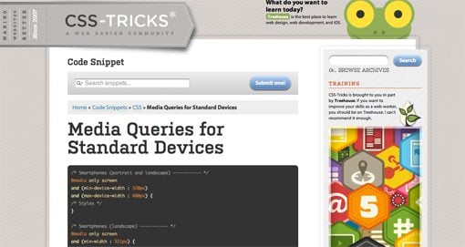
The complexity arises when we begin to discuss a crucial part of this technique: which media queries should I use? Or put a different way, which “breakpoints” should I target for custom CSS? The current popular answer predictably starts with the best “mobile” devices around: the iPhone and iPad (cue angry Android user comments). From these archetypes we establish so-called “generic” smartphone and tablet sizes. Then we move up and address laptops and small desktops and finally large screens. A standard set of media queries, like this one from CSS-Tricks, typically has nine or ten pre-established breakpoints.

What if we focused on the needs of a specific design instead of a hypothetical device use case? What if we built layouts that simply worked everywhere?

To be fair, this system does work to a certain degree. We’ve all seen lots of great responsive sites built using a set similar to Coyier’s above. However, I can’t help but think that this is somehow repeating the same mistake that we made by designing “mobile sites” a few years ago. The entire focus here is on the device viewing the site. Before we even build the site, we have these breakpoints in mind.

But devices change. We’ve already established that the web is being connected to pretty much everything with a power switch, so why are we once again placing so much emphasis on currently common screen sizes? Is there a better alternative? What if we focused on the needs of a specific design instead of a hypothetical device use case? What if we built layouts that simply worked everywhere?

Content Focused Responsive Design

The aforementioned problems with pre-established media queries occurred to me only as I dug in and really started producing responsive work on my own. In theory, the standard suggestions are great but once you apply them to a complex design you’ll discover that those breakpoints don’t always cover it. The problem, as the Boston Globe designers found quickly found out once the site went live, is that issues arise “in the in-between” (for the record, that project is fantastic and any layout issues have largely been addressed). Things get messy when the design is at a size that you didn’t account for and you have to go in and patch the holes after the fact.

I say this as an avid Apple fanboy: stop designing websites for the iPhone.


My question is, why don’t we start there? Instead of going into a project with a set of devices, and consequently media queries, in mind, why don’t we let the design decide? Every web page layout has a point where the browser size lessens its integrity. Our job as designers, in light of the problem of ubiquity, should be to find that size and account for it, then lather, rinse and repeat until all of the weak points are accounted for.

I say this as an avid Apple fanboy: stop designing websites for the iPhone. Instead, design a website that maintains its integrity as its viewport size is reduced to any feasible state. Do keep specific devices in mind as a guide for your design (example: smaller devices tend to be touch-based, so make links large), but don’t put your blinders on and fail to look at the bigger picture: that your design should look good on any screen.

A New Workflow

So what does a content focused responsive design workflow look like? It’s simpler than you think. Obviously, you need a starting point of some kind. If you want to start mobile and go up, great. If you want to start large and come down, also great. I personally find it very difficult to really dig into a design and do it right if I’m starting at the mobile level, but there are many solid arguments for doing it this way.

Something magic happens when you follow this workflow.

Hypothetically, let’s say you started with a large, 1020px wide site. Check it out on the largest screen you can get your hands on and make sure it looks great. Now drag the window and make it smaller until the design gets ugly. There’s your first breakpoint. Set a media query for that point and fix everything that you need to address. Once you’re finished, grab that window and find the next point of ugliness. Repeat these steps until you’re satisfied with the range that you’ve accounted for.

But what about the iPad? What about the Kindle Fire or Samsung’s latest attempt at being relevant? Something magic happens when you follow this workflow. You just made it so that the layout looks good at just about any size. If you did it right, then when you pull it up on your phone or tablet, it’s going to look great.

Layout Only
Keep in mind this discussion refers to layout ratios only. You absolutely don’t get out of testing functionality on different browsers and devices. Responsive design does nothing to account for the fact that different browser engines interpret HTML, CSS and JavaScript differently.

Conclusion

To sum up, media queries and responsive design provide us with an incredibly powerful tool to account for the fact that websites are being viewed by all manner of screens and viewport sizes. However, once we start pegging our designs to a handful of devices, we’re right back where we started. Your goal instead should be to build a layout that’s so versatile that it can handle almost any viewport size thrown at it.

This is all nice in theory, but where’s the example? The jumping off point of this discussion came from a recent attempt of mine to build a responsive image gallery. Check out that article for a look at how a content focused responsive design workflow might look in the wild.

30 Gorgeous and Versatile CSS Menus

Sometimes the navigation menu can be one of trickiest parts of the design process. This single area can set the tone for the usability of the entire site. When you turn your PSDs into HTML, make sure your navigation is legit!

Sometimes the navigation menu can be one of trickiest parts of the design process. This single area can set the tone for the usability of the entire site.

Today we’ll look at 30 inspiring examples of good menu design. Though many are pure CSS, others add in some images and/or JavaScript to increase the aesthetic and functionality.

Delving Deeper

It’s always more helpful to get a feel for the process of the development than to merely see an image, so in this section we’ll briefly discuss the aesthetic of each menu and how the developer accomplished the effect. This way you can gain inspiration into how to use new methods to create your own unique menus.

Silk Tide

This is one of the most minimal menus on the list. It’s basically just plain text with an extended blue box rollover but it’s really easy to implement and results in a nice effect.

screenshot

Glenn Sorrentino

This example uses CSS borders on the top and bottom of the menu that increase in thickness when you hover over them.

screenshot

Strutta

If you have a textured background, consider using transparency in your menu to increase the aesthetic. This could easily be done with RGBa in CSS3.

screenshot

Elbow Park

Another example of transparency in the navigation area. This one uses a similar effect to the first example with the selection box extending up to the top of the page. This increases visibility and makes for a more seamless design.

screenshot

Thoughtbot

As you rollover these buttons the background changes to a brighter red. This combined with the glossy look (accomplished with a transparent PNG) creates the illusion of the area lighting up.

screenshot

Toffee Nut Design

This beautiful example uses CSS sprites for the navigation. The entire menu is one PNG showing each of the tabs in three states: off, on, and on+selected.

screenshot

Safarista

Here we see each section of the navigation as a hybrid of image and text. The icon, gradient and smaller background make each section’s image while the larger text is styled HTML with a underline hover effect.

screenshot

David Jonsson

Another simple hover effect that bleeds to the top. This one had hidden icons that only display when you mouse over. A nice effect!

screenshot

Asvalia

I really like the colors and the crooked text on this menu. The glowing rollovers are perfect.

screenshot

Bonsai Studios

This one is an extremely simple vertical menu with transparency and a darkening hover. It gets the job done, looks great and can be built in minutes.

screenshot

Great Expectations Church

Another vertical navigation menu. This one implements some basic but attractive icons and a background GIF with a gradient for the hover.

screenshot

Ryan Couser

This one uses some simple sprites to accomplish the hover. Each icon is an image with both the on and off states.

screenshot

Kk Media

Here we see a vertical menu with more detailed icons. Each link is an HTML list item with a simple background image applied in CSS.

screenshot

Bite Club

I really loved this navigation bar. The brightness really grabs your attention and the reversal of the colors makes a perfect rollover. This also uses a sprite for each menu item, each with three states.

screenshot

Capital City Equipment Company

I though the house shaped navigation selection was clever on this one. The text in each link is part of the image, if you replicate something like this it would be simple just to use live text over the background image instead.

screenshot

Strawberry Leisure

This dropdown menu uses a small repeating transparent PNG to pull of the reduced opacity effect. Again, we can look forward to this being much easier in the near future with RGBa when more browsers get on board.

screenshot

Artificial Studio

Yep you guessed it, more image sprites (sensing a trend here?). The big buttons and excellent gradients make for a beautiful navigation area.

screenshot

Cognigen

This was by far one of the most original concepts I came across in my search. To pull of the unique 3D effect, the designer has used a whopping four states for each button that change depending on whether the button is selected, hovered over, or has an adjacent selection.

screenshot

More CSS Menu Goodness

Now that we’ve discussed quite a few great examples, here are a bunch more to check out. Use your browser’s inspect feature to check out the code and images behind any that you like!

Manndible Cafe

screenshot

Code Greene

screenshot

Opera

screenshot

Mac Rabbit

screenshot

Clark Builders

screenshot

Mr. B and Friends

screenshot

Subvert

screenshot

The Swish Life

screenshot

Mystery Tin

screenshot

LiveResto

screenshot

FeelSocial

screenshot

Gowalla

screenshot

NZ Festival

screenshot

Download Prebuilt Menus!

Need a good starting point for your own CSS menus? Check out these great free resources.

Now Show Us Yours

Do you have a CSS menu that you’re particularly proud of? Use the comments below and leave a link so we can see. Also let us know which of the examples above you liked best.